As had become usual, last December, I shot some more photos for publication in the Feb/March issue of Santa Cruz Waves Magazine. Our crew was largely similar to past shoots with Christa Martin of The Penny Rose producing, beauty by Salon on the Square, Beau Gillette assisting, and myself, Nick Chao, photographing and retouching. For this shoot we worked with a new model, Heather Chase. She was awesome and we hope to work with her again. Since most of the team was familiar with each other, we know that we work well together and it was a pretty smooth shoot.
Before I go on, here is an awesome little behind the scenes video shot by Deva Anderson for The Penny Rose. Always fun to see what goes on around the lens:
Location for this shoot was the San Lorenzo Garden Center in Santa Cruz CA. Since the photos were going to be in the early Spring issue of the print Magazine, we wanted to have a location that reflected that. We had looked for a more natural, garden sort of location but weren't able to find/get access to one in time so we decided to use the Garden Center. I think it worked out pretty well since Spring is the time many people start getting back into their gardens. It gives a bit of a narrative to the woman in the photographs. (Funny though, since we shot this in December before Christmas, there were many Christmas flowers around the place. We just accepted that and shot with them anyway.)
Prior to the shoot, I hadn't been to that place in quite a few years but Christa had gone and taken some photos of what it looked like. After seeing those I could tell it would work for what we wanted so we went ahead with the shoot. Upon arrival, while the others were setting up and getting situated, I took a quick run around the place to see what little spots would work best. The place that stood out the most to me was a greenhouse area that held many shelves of colorful plants. The light within was pretty ideal to work with since it was super diffused by the semi-opaque window panes and the naturally low angle of the sun at the time. That made it pretty easy to dial in an exposure for the background and then turn up my key light until it looked good. The light inside was actually low enough for me to need a pretty slow shutter speed and since I just happened to have accidentally left the stabilization off on my lens, a fair number of the shots ended up having a little camera shake in the backgrounds. Enough of them turned out well that it was fine but its definitely something I'll try not to let happen again.
Here are a few behind the scenes shots of while we were shooting in the greenhouse:
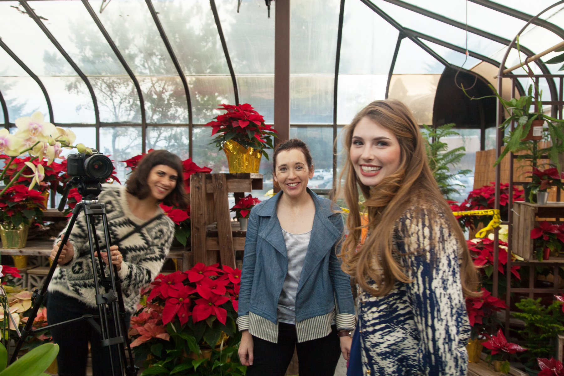
Beau holding the light in position (Alien Bees B800 with a 60" Photek Softlighter powered with a Vagabond Mini and triggered with Pocket Wizards) while Deva touches up the model. One thing about shooting in a room made of windows is the inevitable reflection issues. In many angles, the large umbrella would reflect and show up in the photos so it required careful framing and some retouching.
Deva, Christa, and Heather. Deva setting up to record the behind the scenes video for The Penny Rose
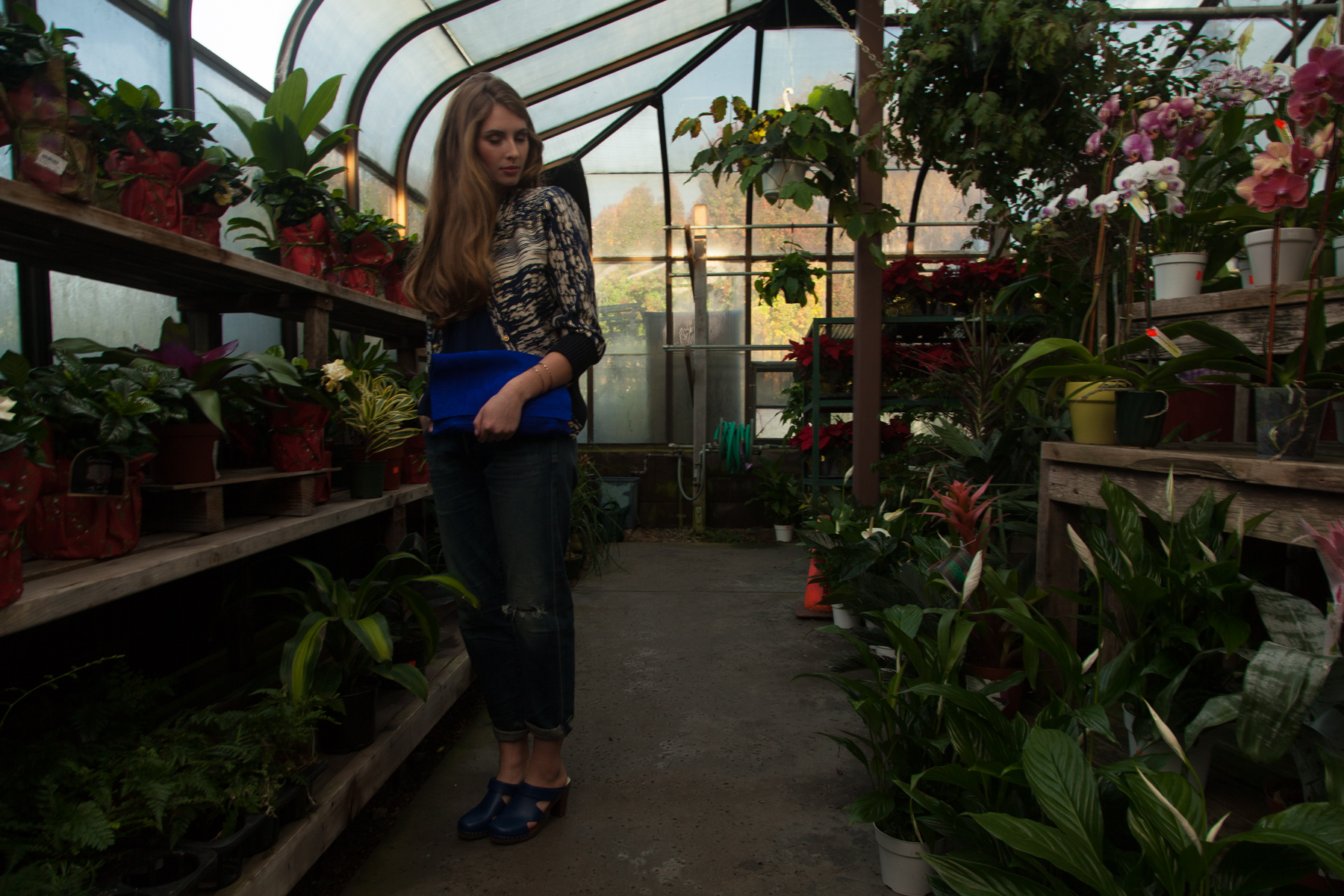
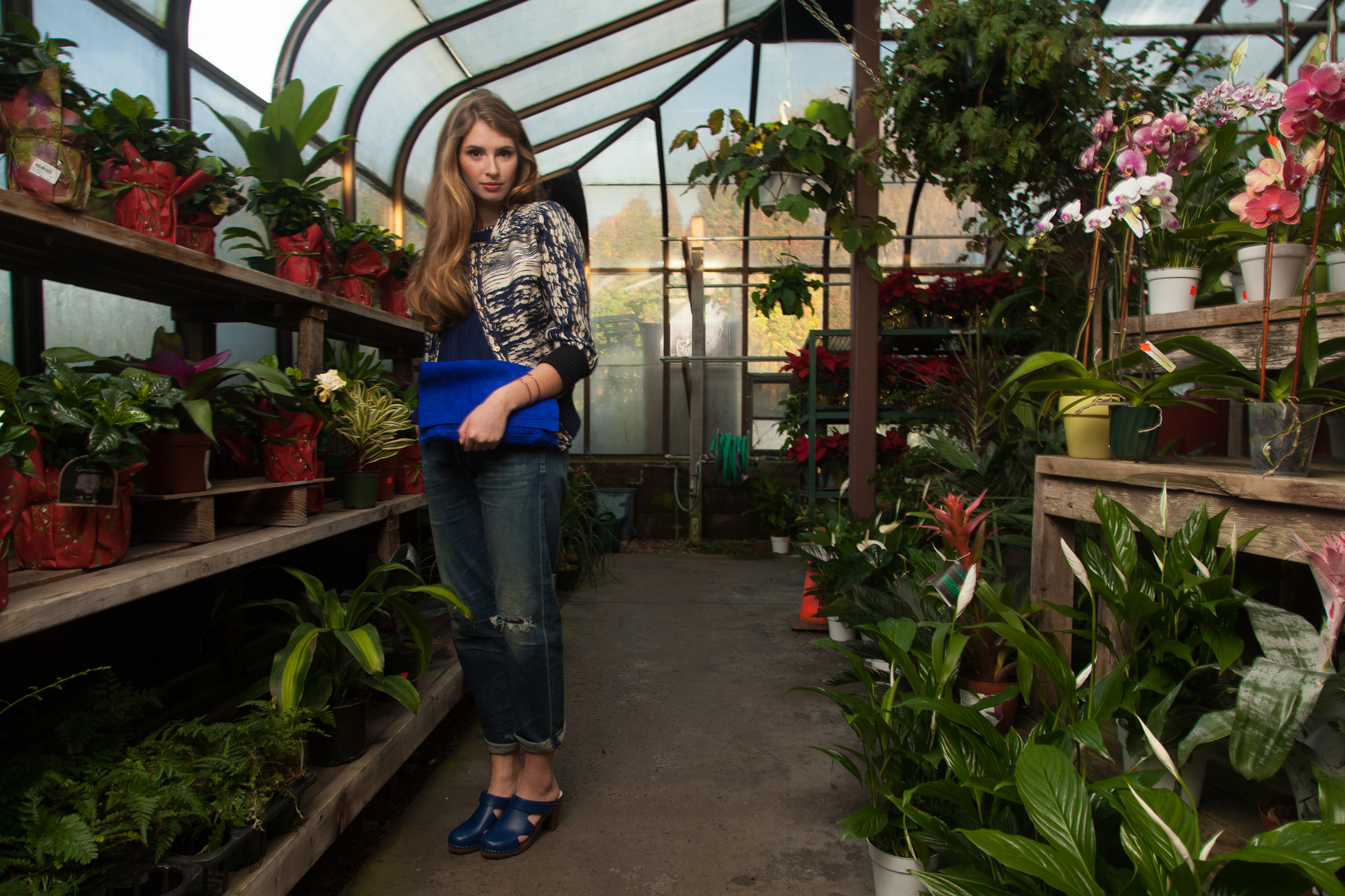
Below you can see a couple pictures that show the difference between the photos with just natural light and when I add my flash to the mix. Every situation is different and if I was really shooting just natural light I would probably use a wide aperture and just blow out the background to make sure the model looked good. For this shoot at least, I wanted my usual mix of flash and ambient so thats what I worked towards.
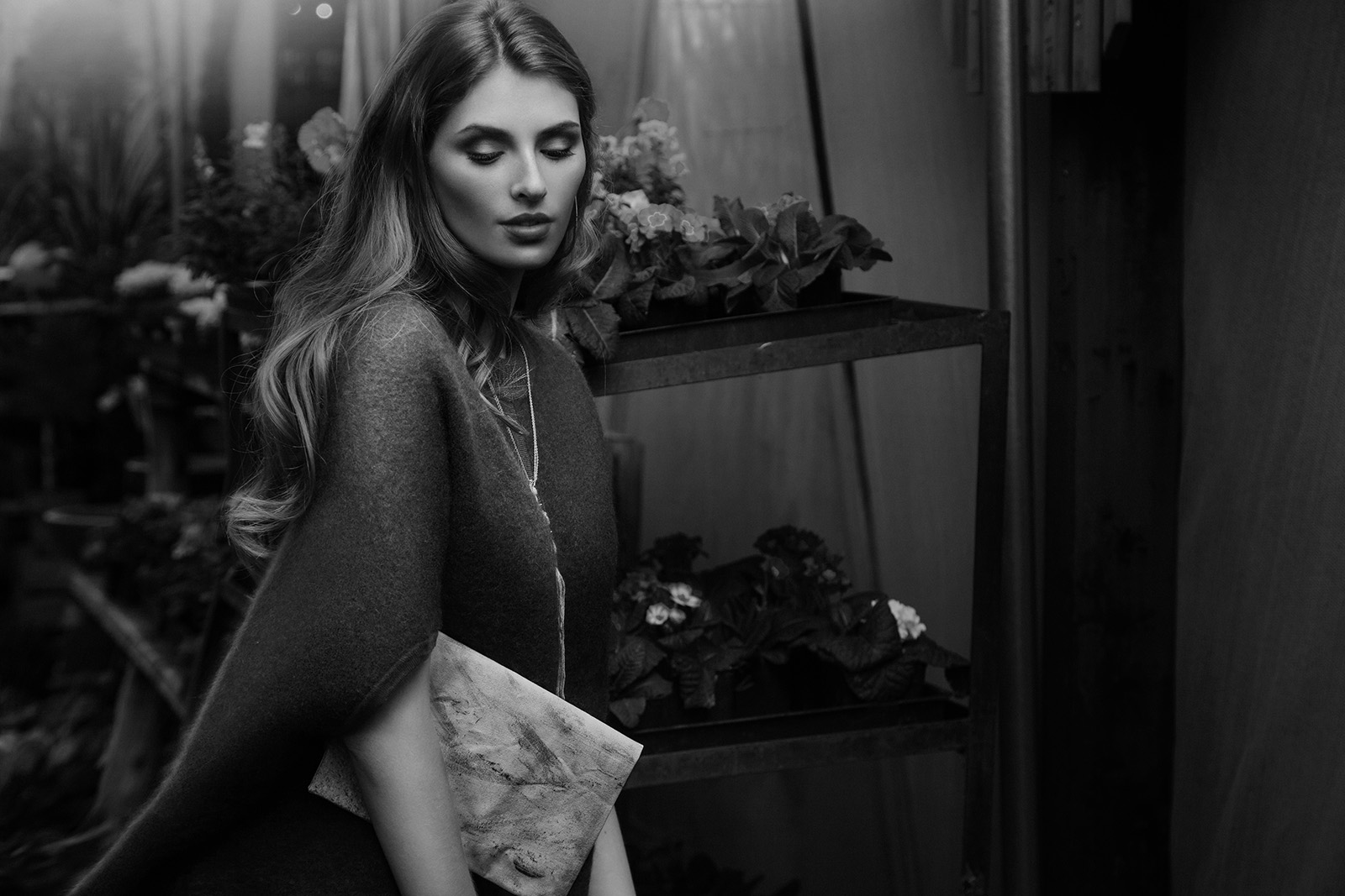
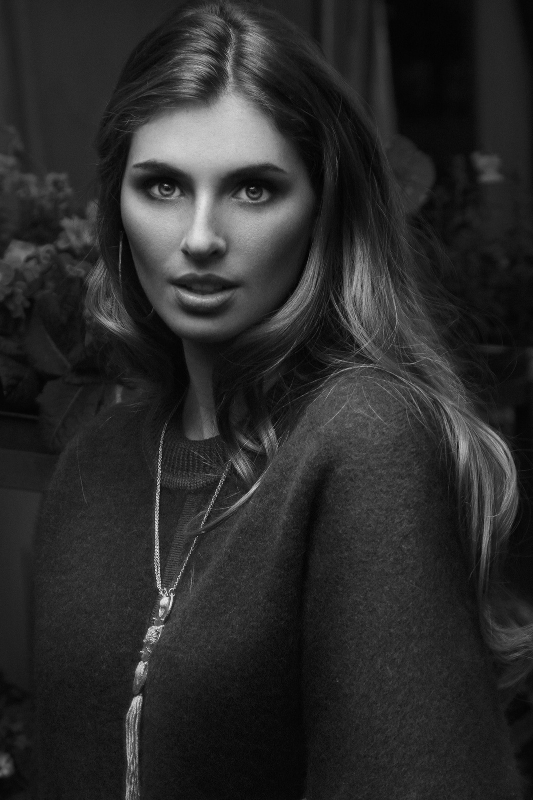
And here are some final retouched images from that location:
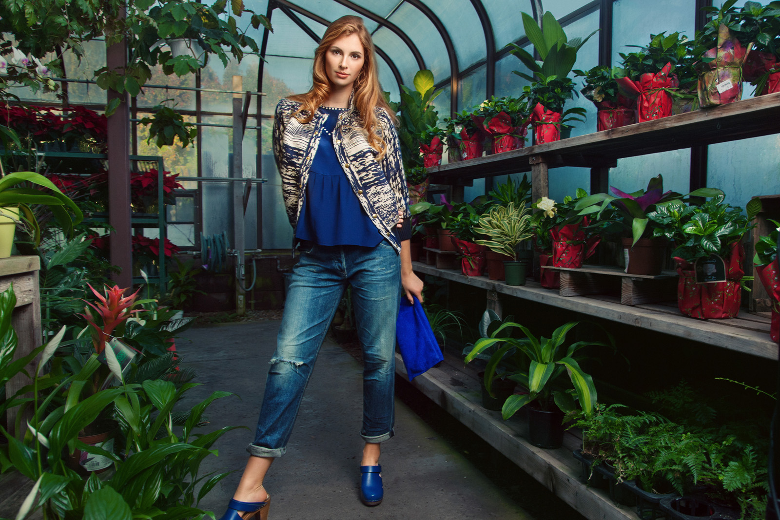
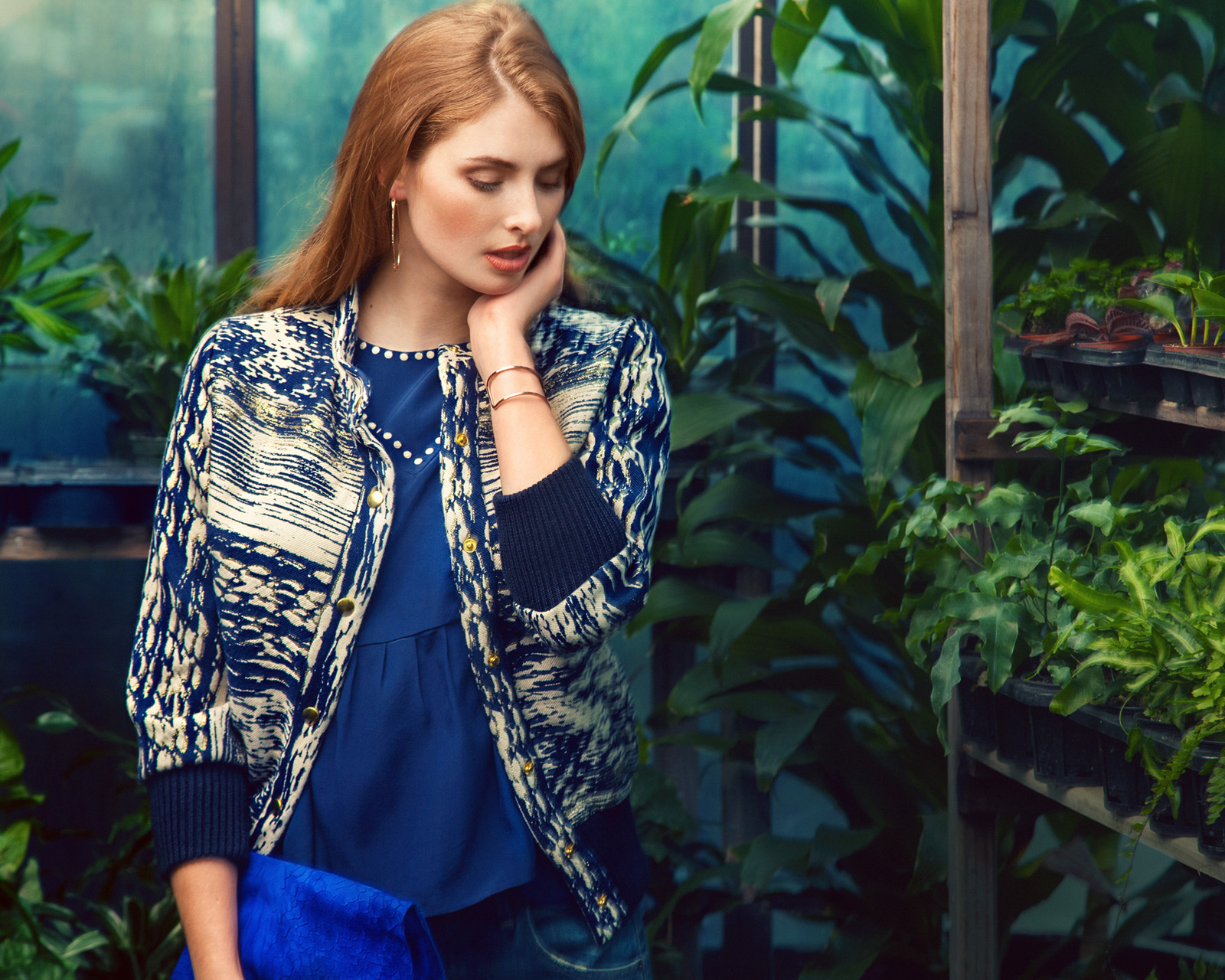
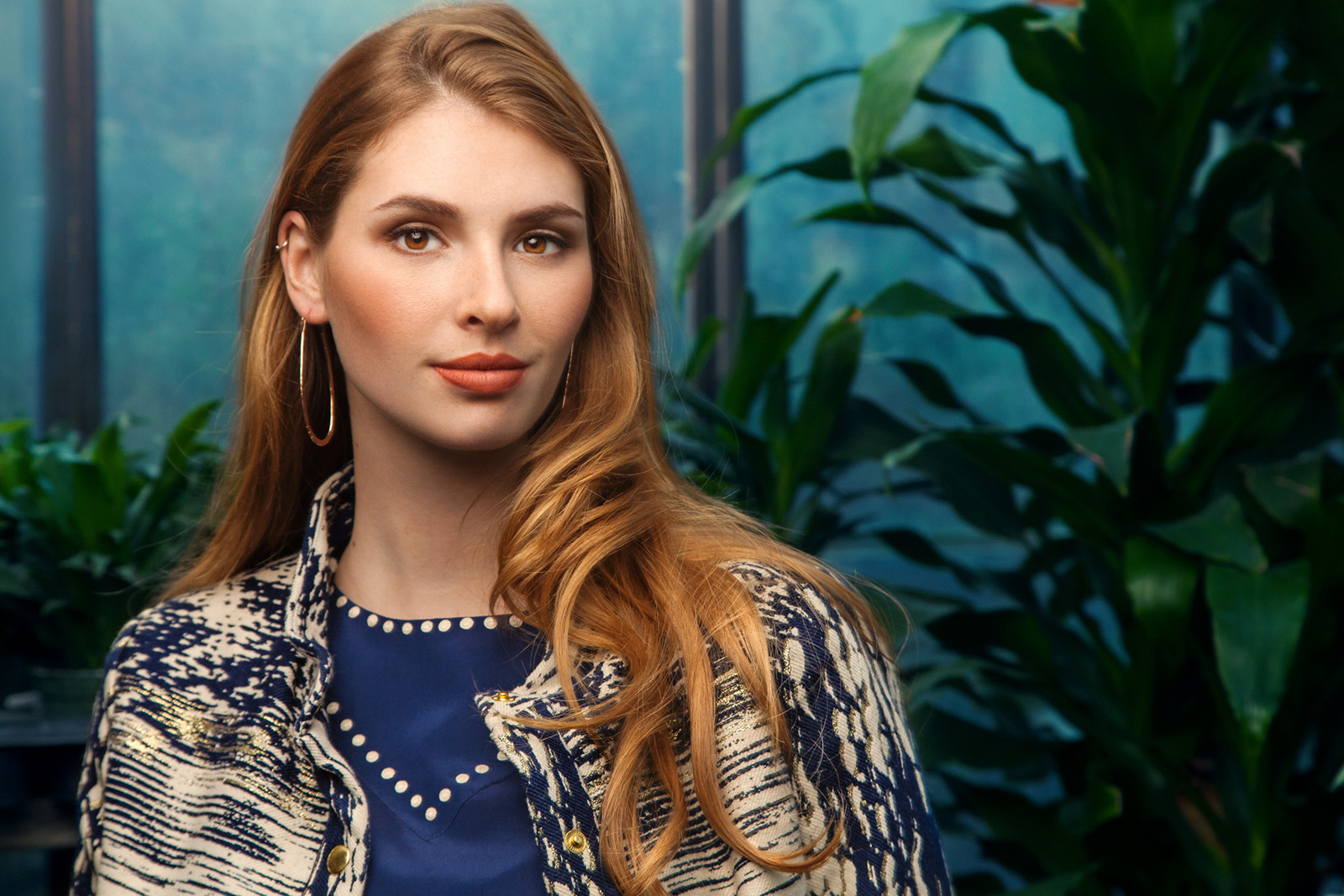
Sometimes for my shoots for Santa Cruz Waves we would just shoot one look but for this shoot we had two different outfits for her so she got changed and we headed to some other locations. We continued to shoot outside amongst the rows of plants and then went underneath the sheltered area they have for the shade plants.
Here are some shots of the 2nd little location:
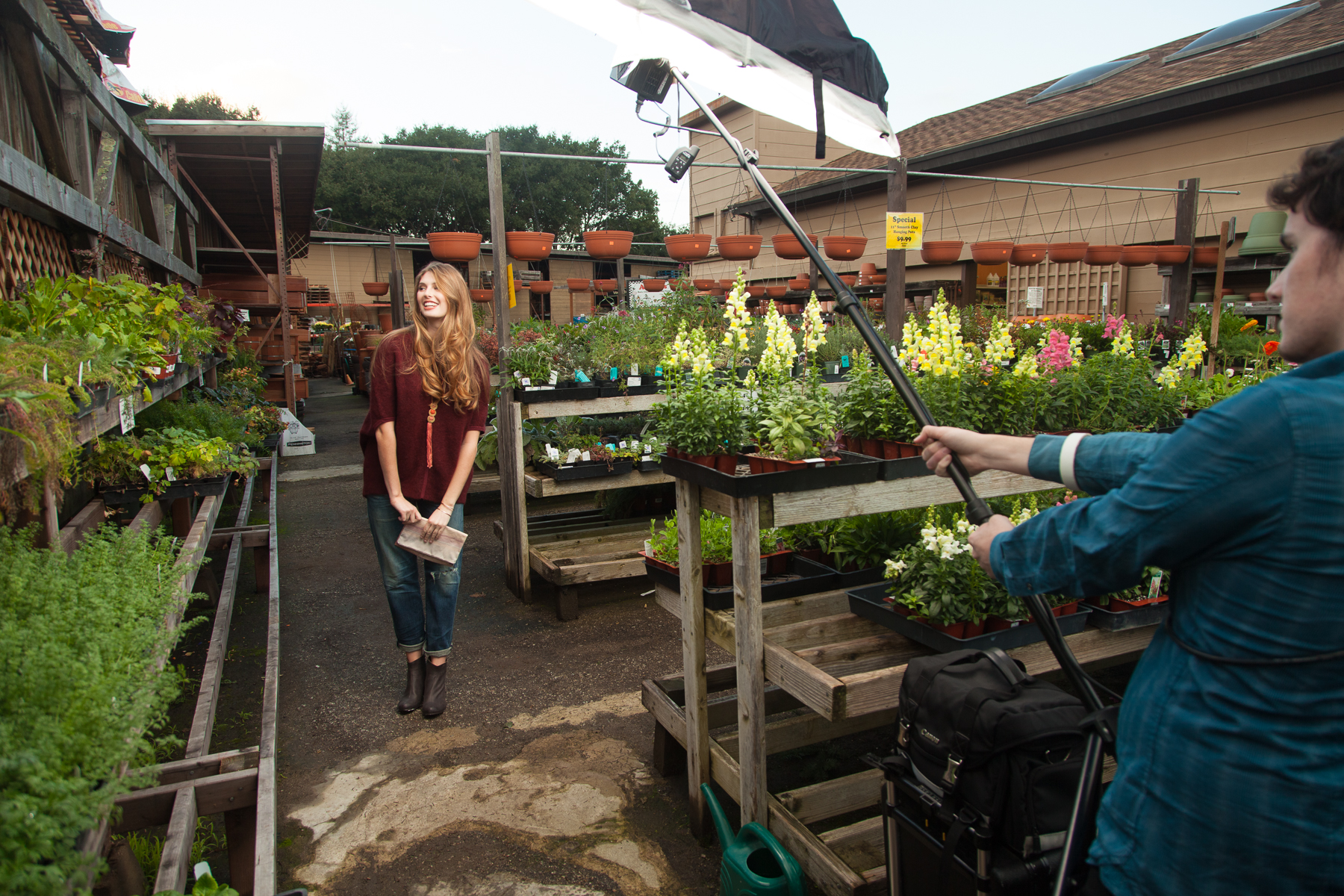
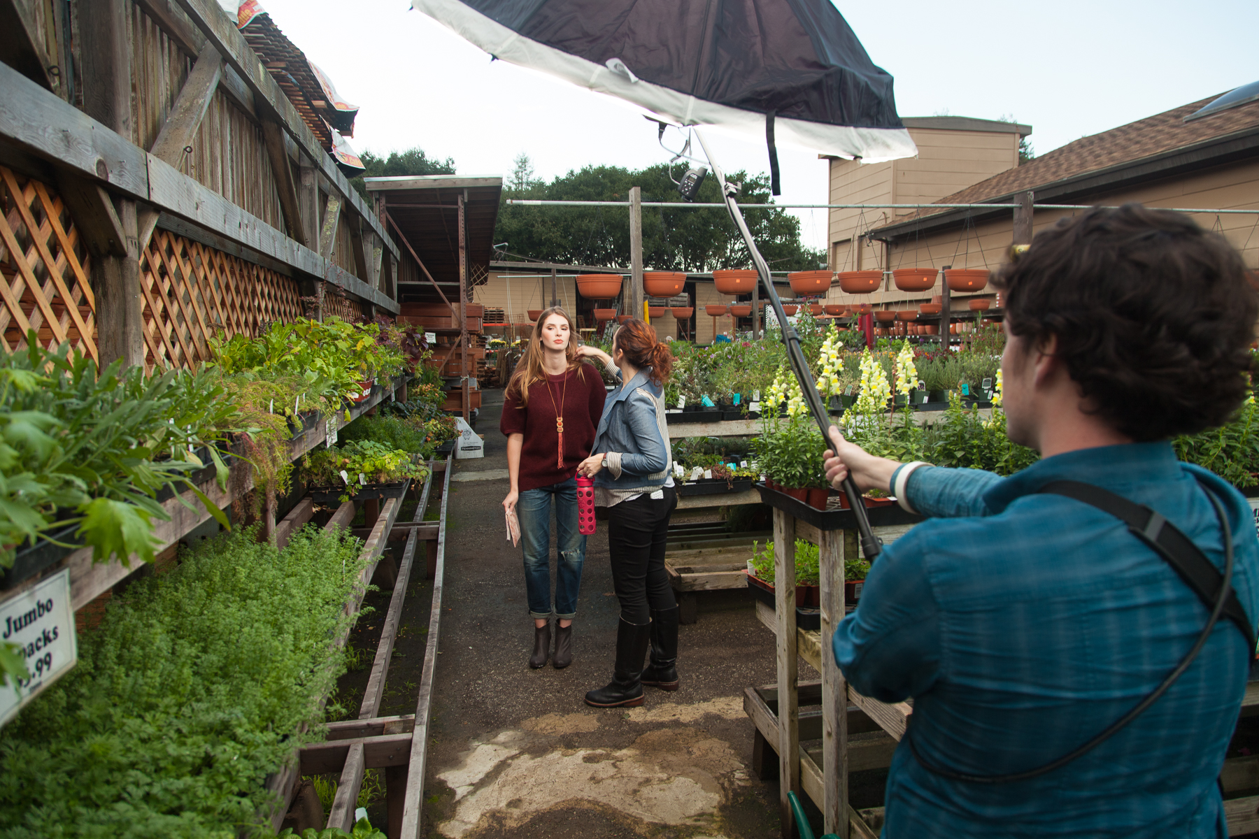
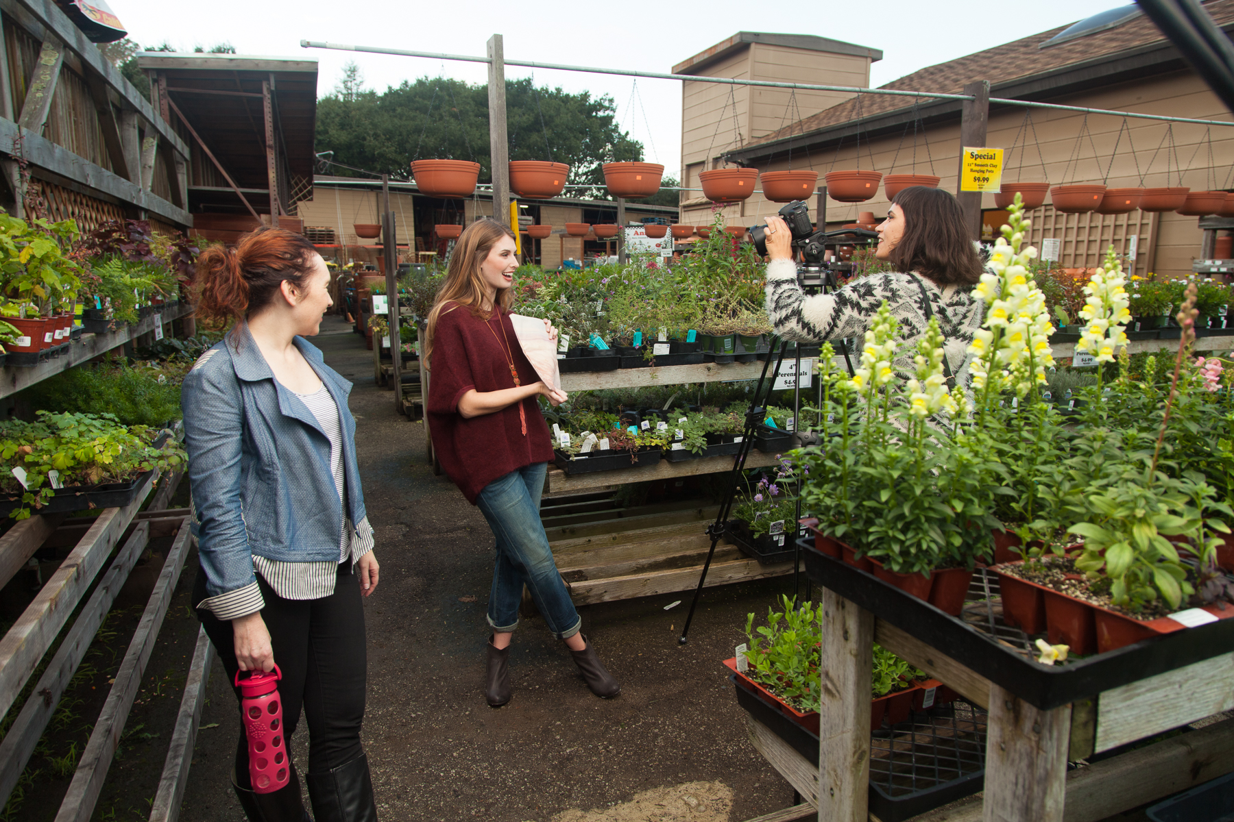
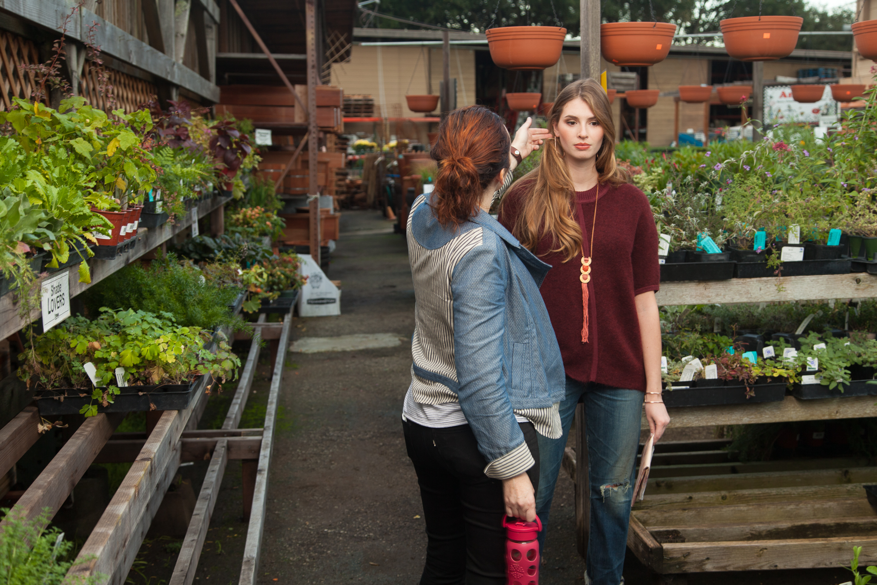
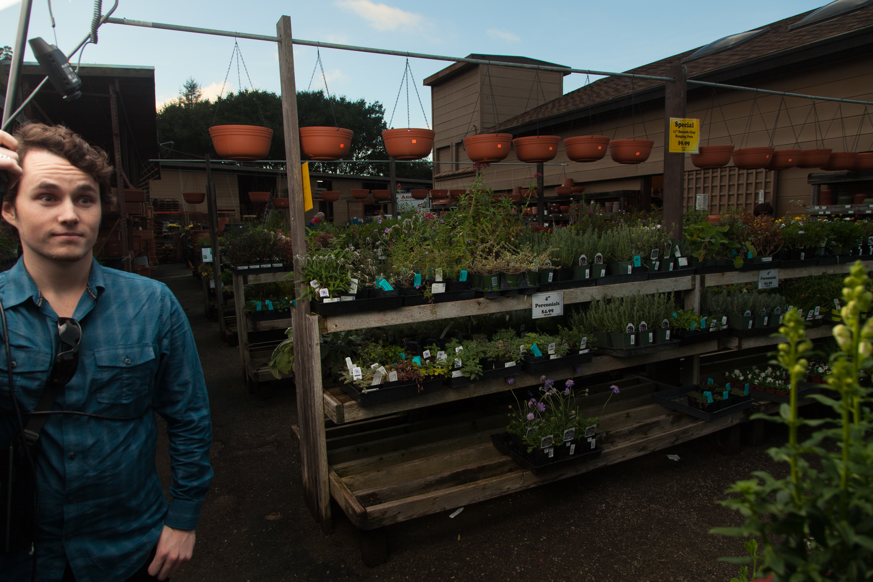
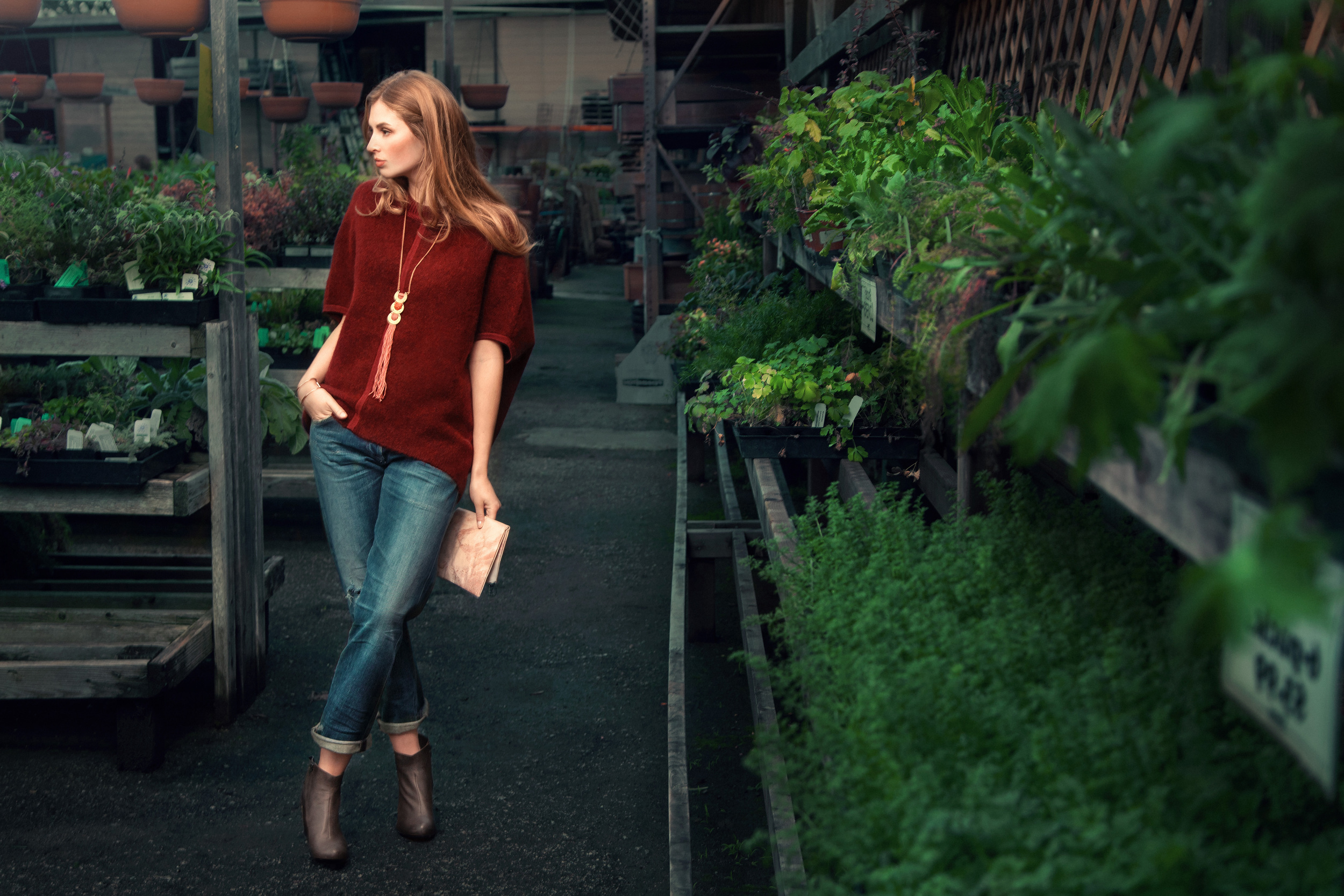
Getting a good mix of strobe and ambient was a little more challenging for me out here. The background also, while interesting, required some thought. The final image from here is decent but not one of my favorites:
I couldn't find a way to make the background look as good as I wanted it to with it brighter than this so the photo overall ended up looking kind of dark. (sometimes easier to just knock down a background than try and fight for the perfect balance). Also, for some reason the skin tone looks a bit punchier than I remember making it but I guess thats alright. They ended up printing this one in the magazine so I'm happy that they liked it.
Continuing in the same look, we walked a few feet to a little alleyway location and shot some more:
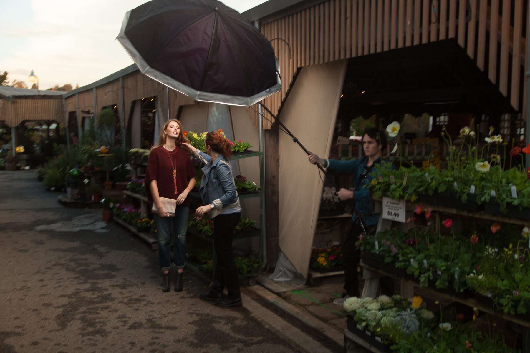
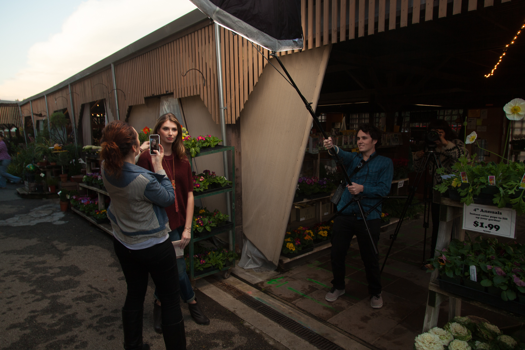
And some of the final images:
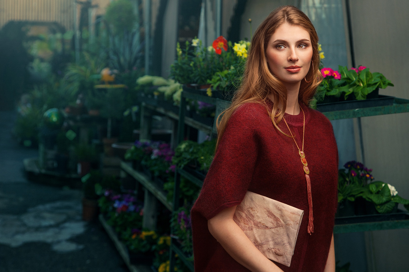
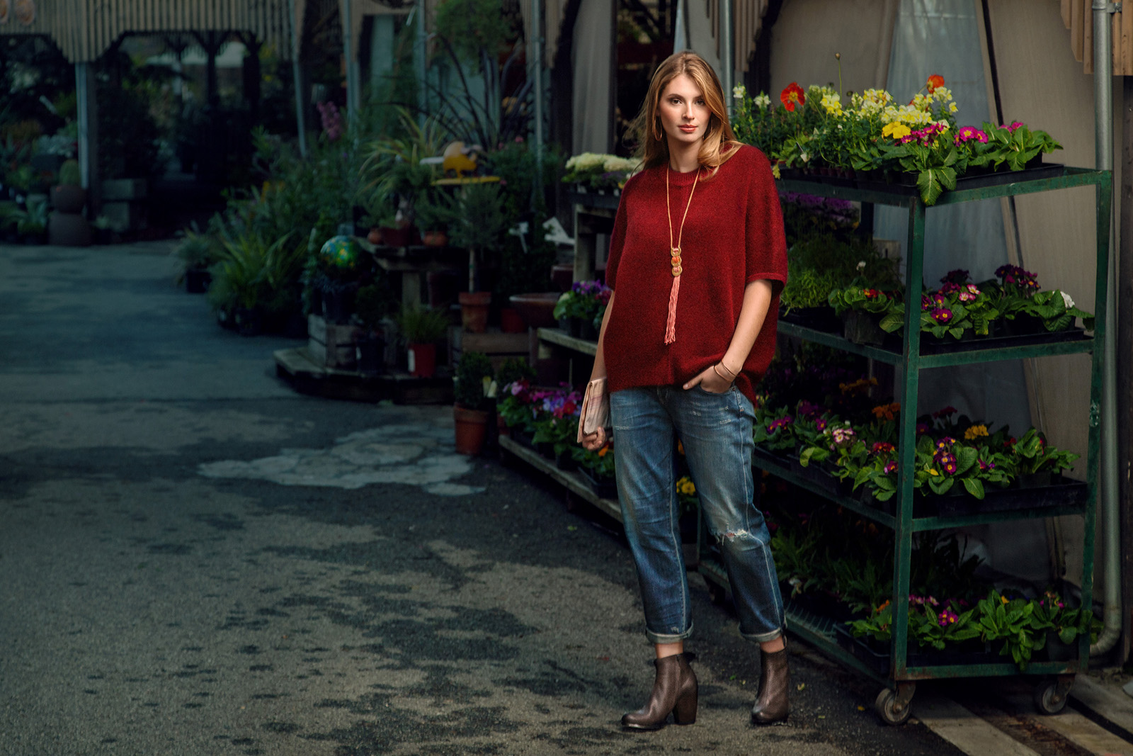
I didn't really get any behind the scenes picture of it but we went to one more little location and shot a bit more. Here is the last image:
I like the range of color in this one. The cool blues outside and the warm colors around her. I actually have a "Cool Down Shadows" Photoshop action that I made and use all the time to add cool tones to various parts of my photos. Maybe I'll share it here some time.
All in all, a nice shoot. Other than my forgetting to switch on my lens stabilization which would've helped retain some sharpness in some of the scenes, most of the photos worked out pretty well. Its a nice little challenge to walk around a location and work on finding a good way to balance my light with the light that is already there.
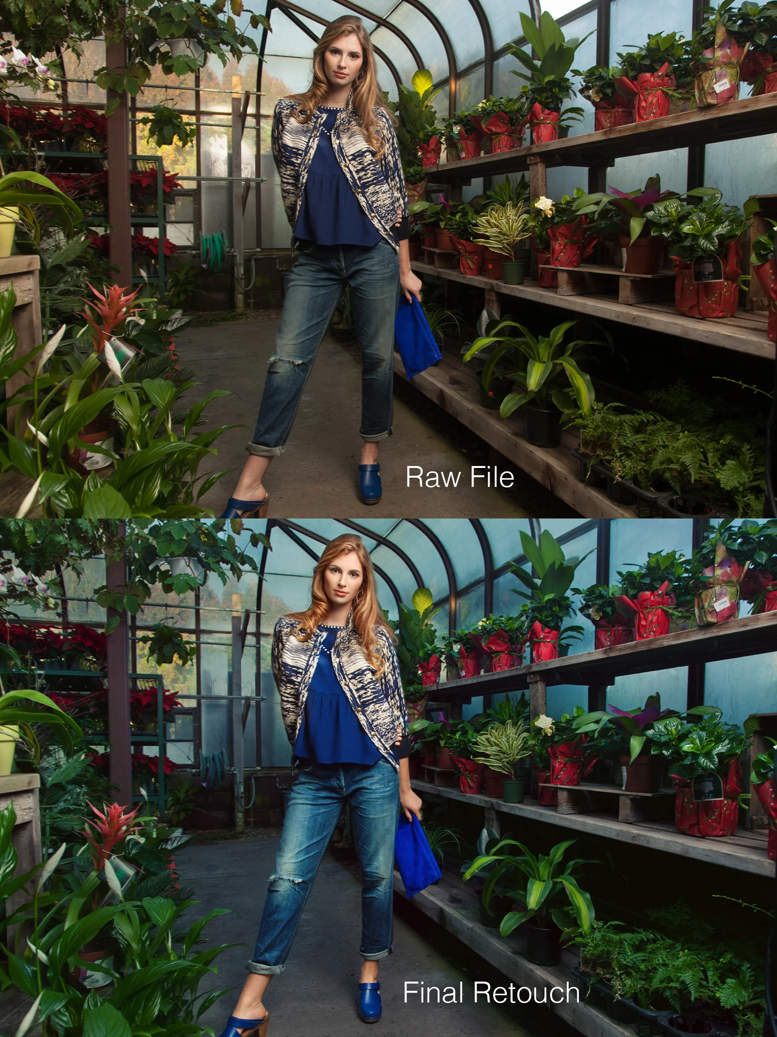
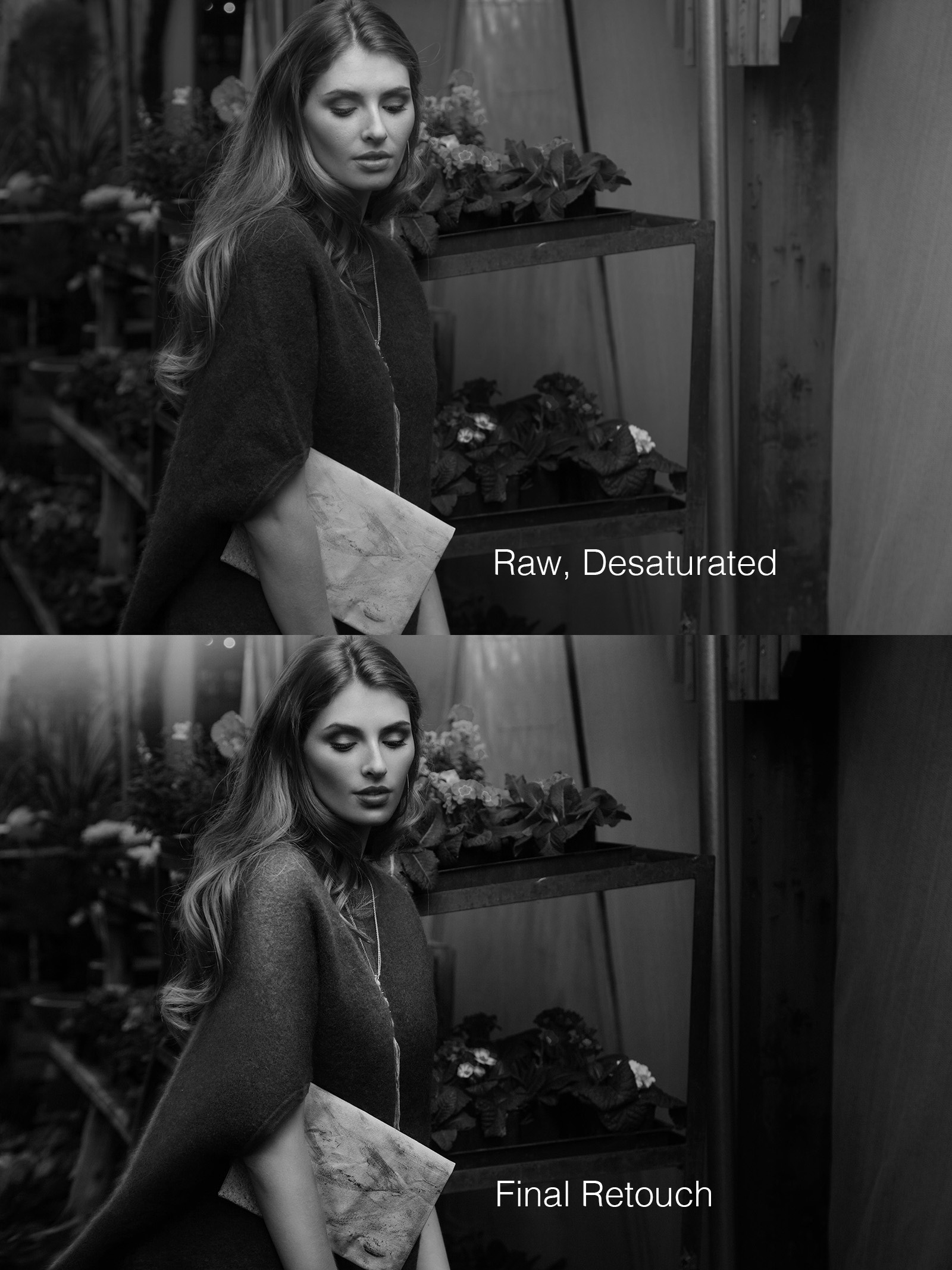
And of course, here are a couple of before/after retouching comparisons: (original on top, final on bottom)
Did a lot of color work with this and finessed the light on the model. I usually shoot with light that is pretty close to what I want and then retouch the image later into what I envisioned it to look like. You can see in the unretouched photo the reflection of the light behind her and how all the windows in the original have different looks. I evened them all out with a sort of aquatic blue color that I think went well with the greens and tied in with her clothes. I realize that her foot got cut off so that isn't good but everything else about it was good enough to me that it was worth working on.
Mostly just basic retouching work on this one and a decent amount contrast added in different ways.
As always, thanks for reading! I actually have a few new creative shoots planned that I want to execute soon so hopefully I can share those before too long.


