Blog

Behind the scenes, reviews, and other commentary.

Kodak Ektachrome E100 Impressions/Review


27850002 Title.jpg

Its been a while since I’ve posted much to this blog and I thought I would start up again with a post about the recent reintroduction by Kodak of their Ektachrome slide film.

Throughout the last few years, I’ve been shooting a lot of film with a variety of film cameras. I took a part time job at a photo lab at the end of summer 2016 and the availability of film and processing has enabled me to dive into the world of analog photography. I say analog but I suppose that’s only half true since the two film cameras I use most are a Pentax 645n and a Canon EOS 3, both of which are heavily automated and then I machine process my film. Regardless, I’ve fallen in love with the aesthetic of film so when I heard that Kodak was reviving a slide film I got pretty excited.

Most of what I shoot is color print film so I don’t have a ton of experience with positive films. Out of the roughly 150 rolls I shot in 2018, only 3 or 4 were E6. When the exposure is nailed, I’ve been really pleased with how slide film can look and there really isn’t anything like looking directly at slide film on a light table or held up to a bright light. Its so luminous and sharp and colorful. You get close with a modern high resolution phone or computer display with the brightness turned up but those still don’t seem quite as sharp and beautiful.

As soon as I read that preorders were available for Ektachrome in August or September of 2018, I put my name down for a few rolls to see what all the excitement was about. Since the older Ektachrome emulsion was discontinued before my interest in film photography really began, my main frame of reference would be color negative films.

Because E100 is relatively costly ($13 per roll at B&H as of Feb 2019) and the development is usually more expensive than C41, I held on to my rolls for a while until I could decide what to shoot with them. Nothing very interesting came up for a few months so on Christmas day I just decided to put a roll of E100 into my Nikon F3 and take some snapshots of my family.

(All of the photos in this post have been scanned on a Noritsu film scanner. Many have had minor edits made that I’ll try to summarize in captions)

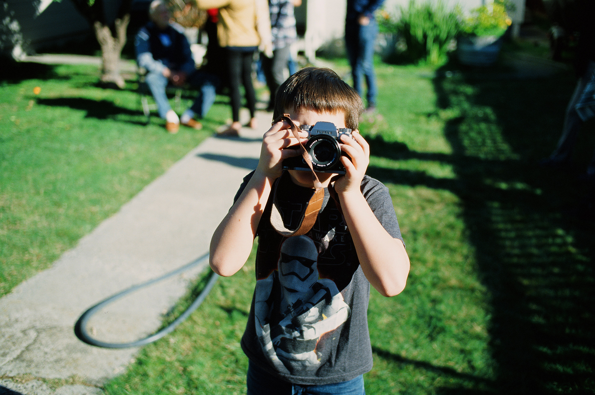
Minor adjustment made to color balance but otherwise a pretty good example of the color you get from Ektachrome. Nice skin tones and a definitely bias toward blue-teal-green.

Minor adjustment made to color balance but otherwise a pretty good example of the color you get from Ektachrome. Nice skin tones and a definitely bias toward blue-teal-green.

Here you can see one of the signature aspects of slide film with the highlight blowout on the right. For these kinds of everyday photos, I don’t find it to detract from most photos. If smooth, detailed highlights are what you’re after, you shoot col…

Here you can see one of the signature aspects of slide film with the highlight blowout on the right. For these kinds of everyday photos, I don’t find it to detract from most photos. If smooth, detailed highlights are what you’re after, you shoot color negative or a good digital system. I really like the bright reds that you can get with Ektachrome.

This is essentially a straight scan from the Noritsu. I sharpened it a little and darkened it slightly but this is the kind of look you’ll get in midday sun. I think I had the meter set incorrectly so a lot of my photos were slightly overexposed. So…

This is essentially a straight scan from the Noritsu. I sharpened it a little and darkened it slightly but this is the kind of look you’ll get in midday sun. I think I had the meter set incorrectly so a lot of my photos were slightly overexposed. Something I’ve avoided in subsequent rolls. I think green is the most saturated color that Ektachrome produces. I could see this being an awesome film to take somewhere tropical and colorful.

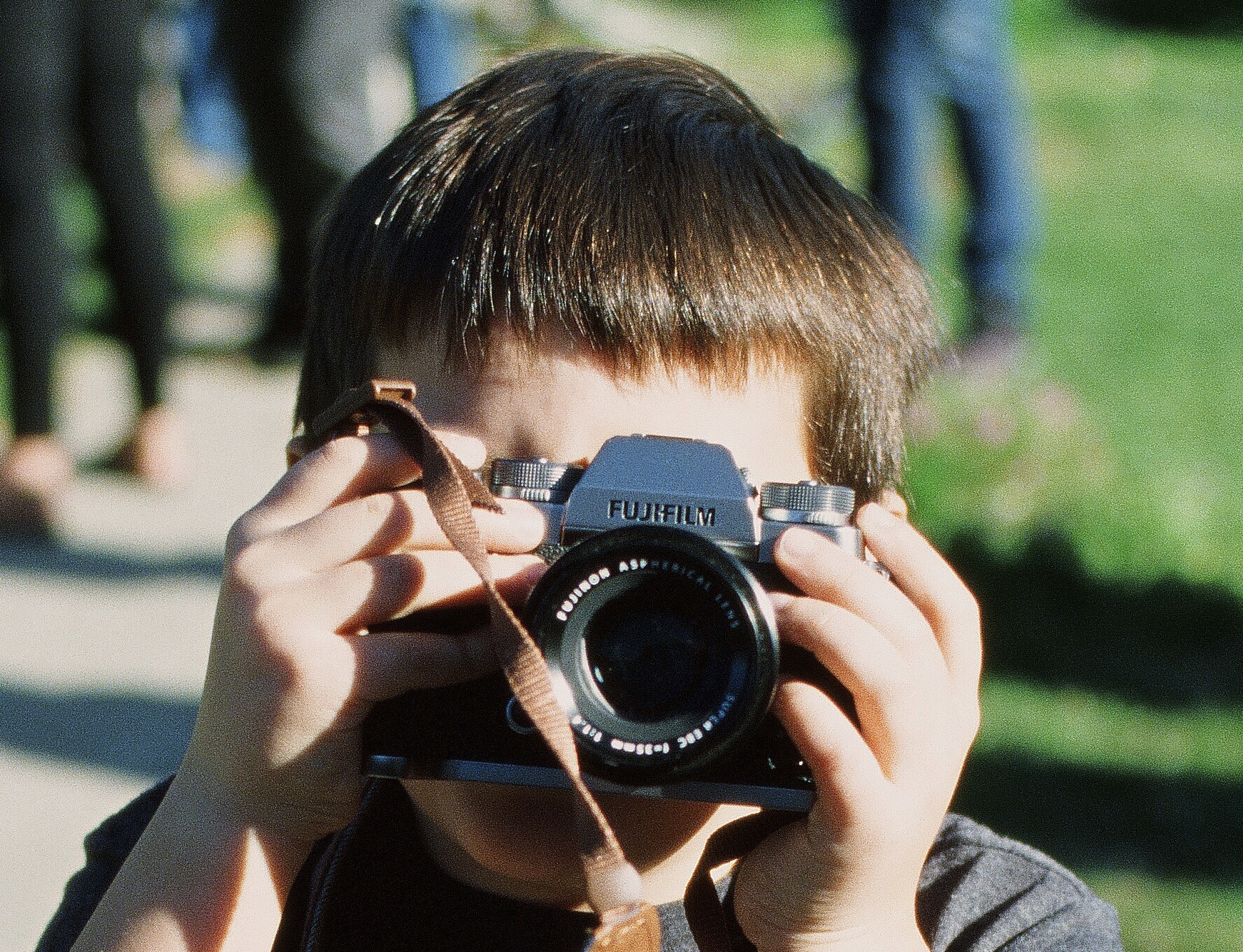
Check out this sharpness!

Check out this sharpness!

I had to warm this photo up a fair amount to get rid of the blue-green cast that it scanned with. I’ve scanned all of my rolls of Ektachrome on the same Noritsu scanner and all of them have come out needing some compensation for the cold color balan…

I had to warm this photo up a fair amount to get rid of the blue-green cast that it scanned with. I’ve scanned all of my rolls of Ektachrome on the same Noritsu scanner and all of them have come out needing some compensation for the cold color balance. That same scanner does a fantastic job with all my other rolls of film so I’m not sure if its just something to do with scanning slide film with it or if its just inherent in Ektachrome to need warmth added to the scans.

After processing and scanning that first roll, my biggest impression was that I needed to shoot more of it and that I was a little surprised how cool the color rendition was. This isn’t a film that displays any of that Portra/Gold warmth in portraits without doing some adjustment after scanning. You can of course affect the color balance per frame when scanning with a Noritsu scanner but I usually like to only do a little of that and then do main edits afterward in Photoshop or Capture One. Something about the color balance adjustment in scanning seems to work better with color negative compared with slide films.

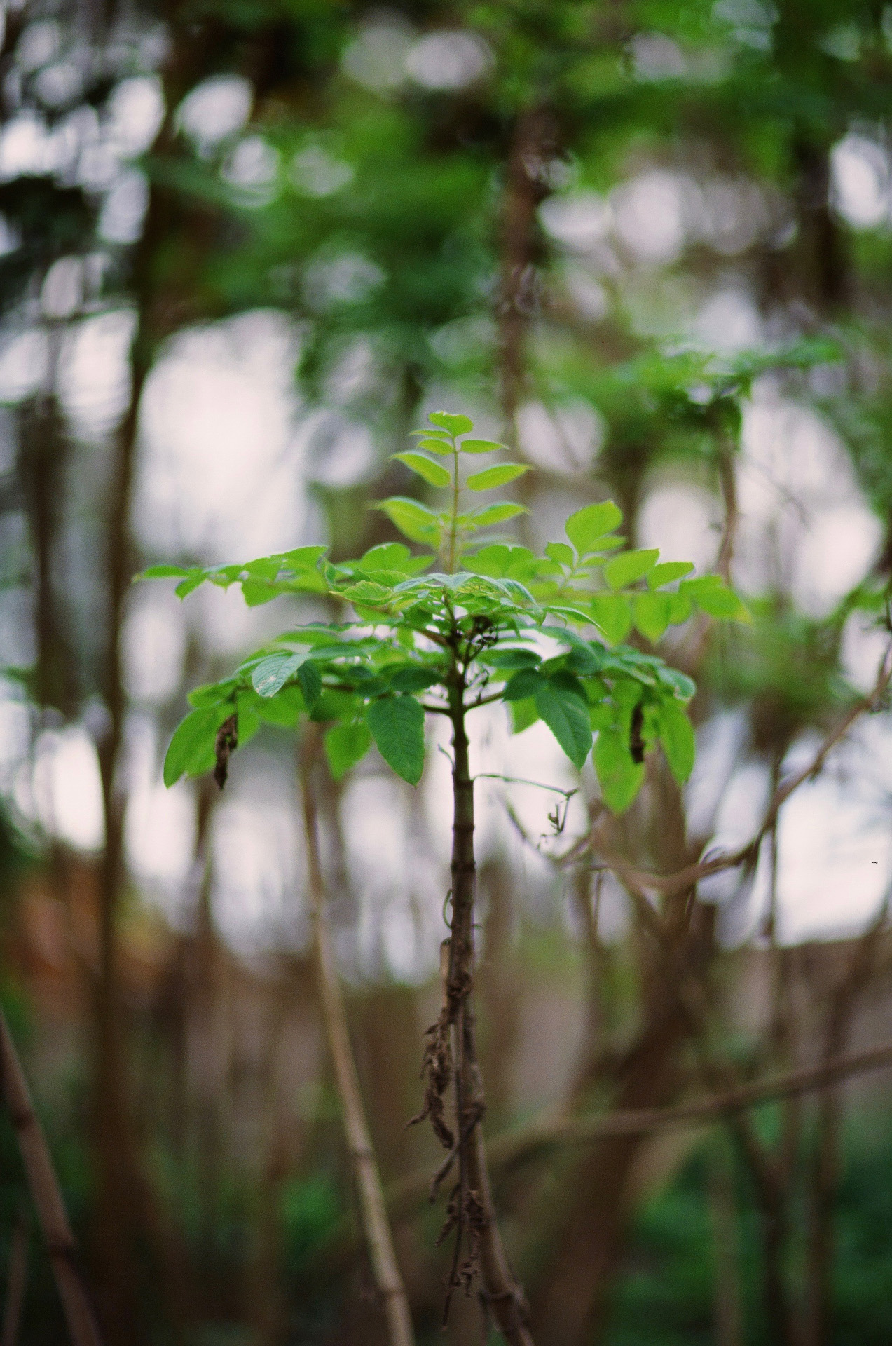
Since Christmas, my first creative/portrait shoot has been with my friend and awesome model, Cierra. I’ve photographed her a lot in the past and its always fun to work with her. We went up the coast to Greyhound Rock Beach and did some simple portraits with a crown prop I had made and a simple red drapery. At the time I was borrowing a Canon 85mm F/1.2 that I’ve since purchased. It was my first time working with that lens and I was super excited to use it in conjunction with Ektachrome for some portraits.

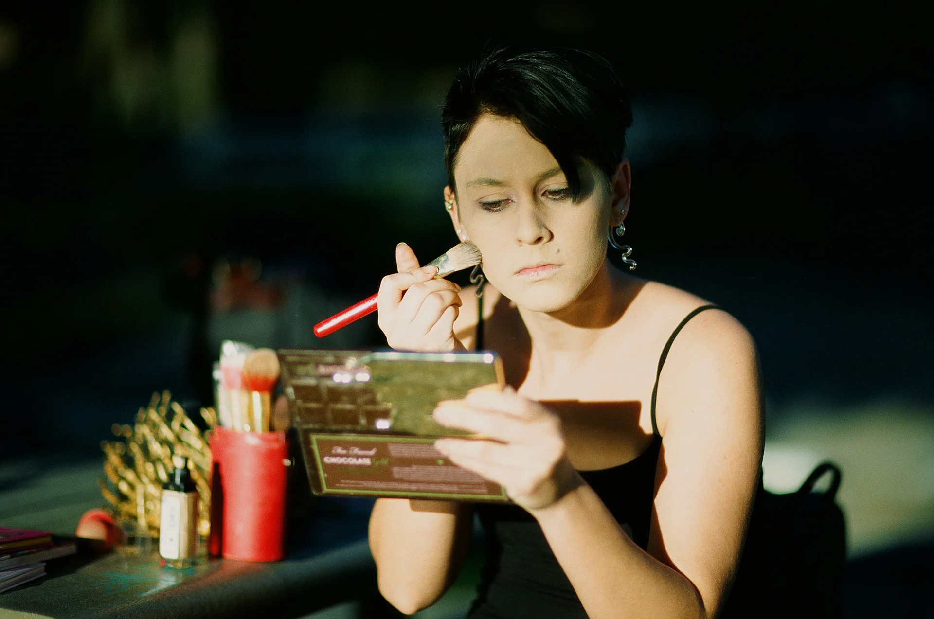
Unedited scan. Had to try and darken this in scanning because it was overexposed. Also notice the green cast. This was taken as she was prepping and the sunlight was so strong that it was overexposed at 1/8000th F/1.2. This was just on the edge of t…

Unedited scan. Had to try and darken this in scanning because it was overexposed. Also notice the green cast. This was taken as she was prepping and the sunlight was so strong that it was overexposed at 1/8000th F/1.2. This was just on the edge of totally overexposed but with a bit of detail left. Since it was just a behind the scenes snapshot it was fine but I used my handheld light meter for the actual shoot.

Unedited, straight scan. For photos like this, the strong cool tones of the film work really well. Checking out the scans afterward, I was surprised how many were in focus at F1.2. Props to the EOS 3 for being able to autofocus that beastly lens so …

Unedited, straight scan. For photos like this, the strong cool tones of the film work really well. Checking out the scans afterward, I was surprised how many were in focus at F1.2. Props to the EOS 3 for being able to autofocus that beastly lens so well.

This was metered for the mid tones and while some detail was lost in the shadows, its what I was going for. Something warm and contrasty. It’s interesting how using such a shallow depth of field can soften the skin and make it look kind of retouched…

This was metered for the mid tones and while some detail was lost in the shadows, its what I was going for. Something warm and contrasty. It’s interesting how using such a shallow depth of field can soften the skin and make it look kind of retouched. I did a little detail retouching but nothing major on this shot. I shifted the yellows a little more orange but otherwise the color came out nicely in this scan.

This shot was warmed up considerably in Photoshop to make the background look as warm as the light on her skin. I was afraid that the highlights would blow out harshly in a lot of these but they seem to have turned out fine. I mostly metered for the…

This shot was warmed up considerably in Photoshop to make the background look as warm as the light on her skin. I was afraid that the highlights would blow out harshly in a lot of these but they seem to have turned out fine. I mostly metered for the mid/skin tones and let the rest fall where they would.

Close up of the point of focus of the previous photo. Pretty good sharpness for a film scan and F1.2 lens.

Close up of the point of focus of the previous photo. Pretty good sharpness for a film scan and F1.2 lens.

Straight scan, slightly cropped.

Straight scan, slightly cropped.

Detail.

Detail.

Using Ektachrome at a normal photo shoot was an interesting experience. Because everyone always talks about the narrow exposure latitude of slide film, I was paranoid that I would overexpose and blow out too much highlight detail, especially in the metallic bits. Simple use of a handheld light meter seemed to work fine though. I just held the meter in front of the model’s face that was receiving the most direct light and took a reading. I probably could have actually increased my exposure slightly and gotten a bit more detail in the shadows but I’m also happy with how they look with the deep shadows so at that point it would have just been a subjective difference and not necessarily better or worse. I think it’ll take shooting many more rolls before I get a real feel for the best way to meter and when to over or underexpose according to meter reading.

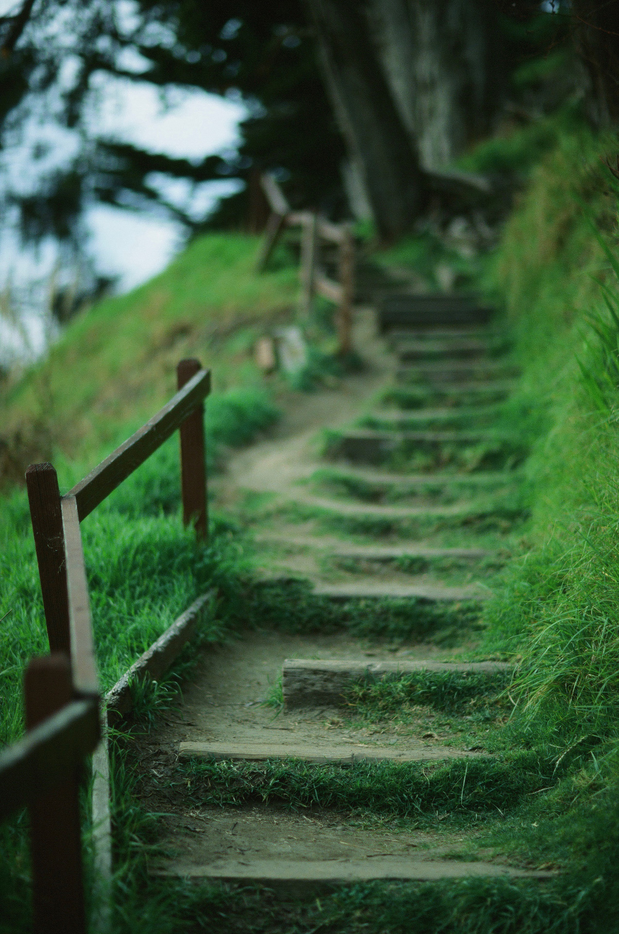
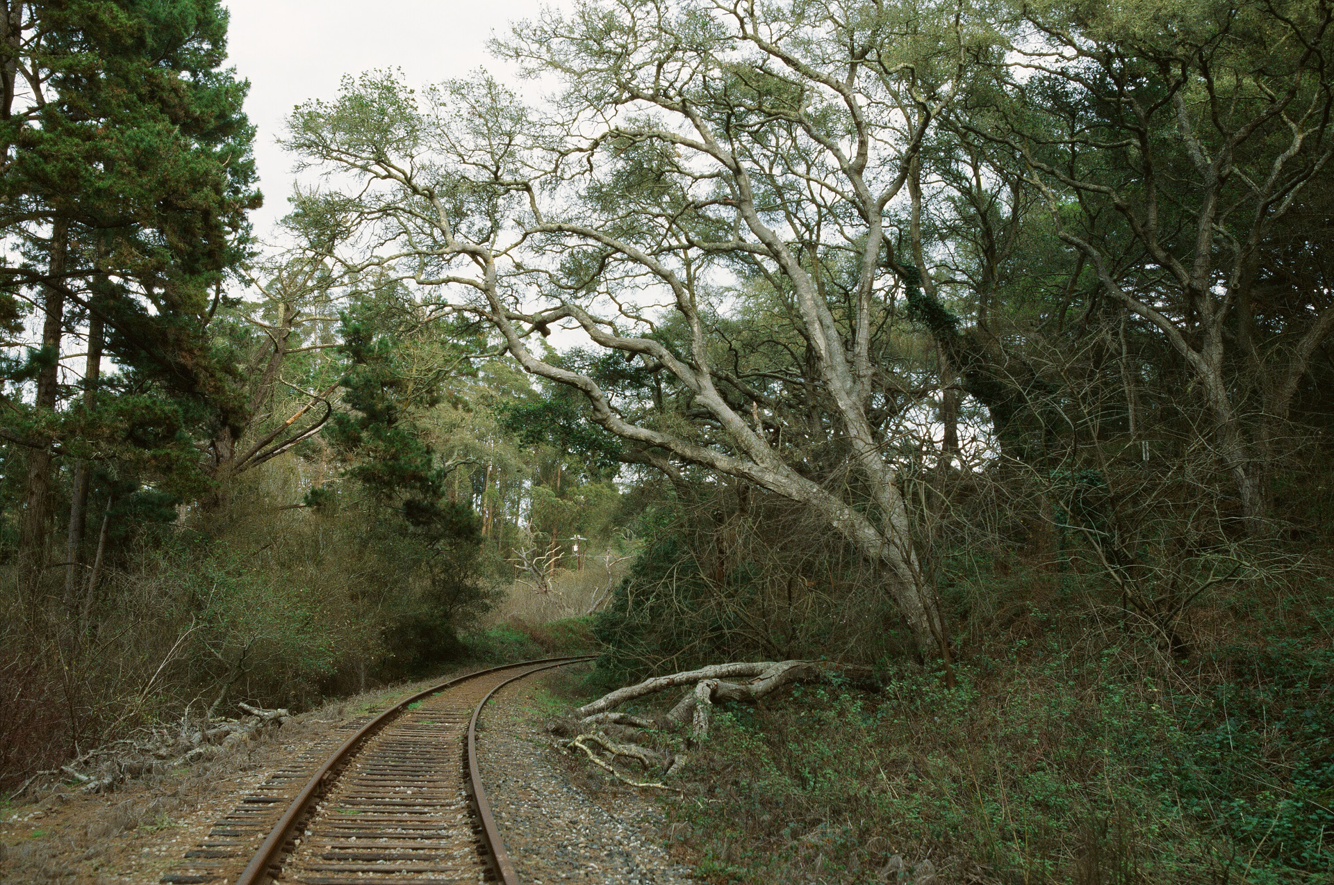
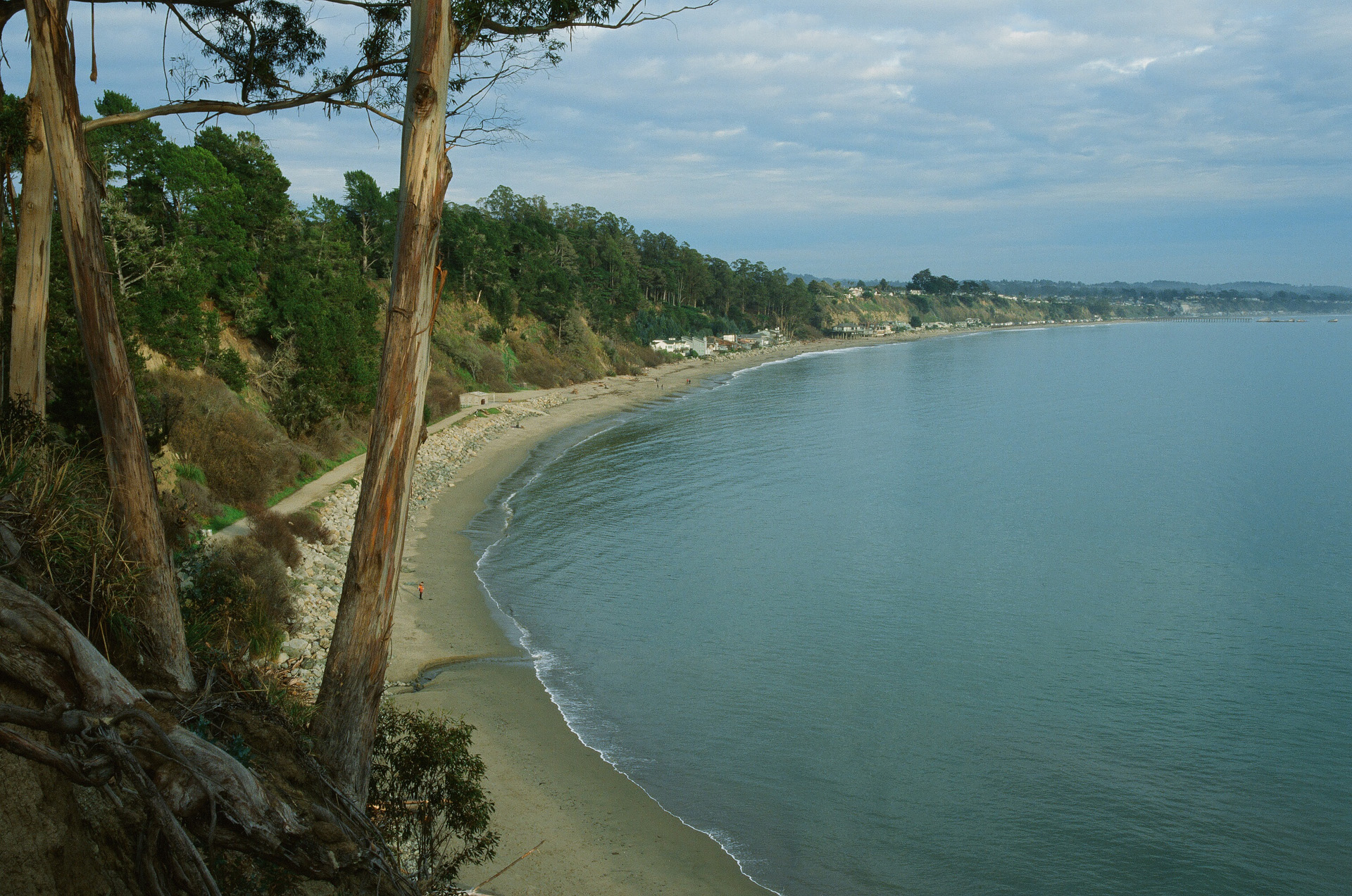
After that shoot, I shot one more roll of E100. I took a walk from a beach in Aptos and up along the train tracks over to Capitola. Shot with my EOS 3 and the 35 F1.4 and 85 F1.2, these photos aren’t anything particularly interesting but I just wanted to shoot some more Ektachrome and see how it worked under different conditions. The following photos are unedited from the scanner other than resizing for the web.

27900028.jpg
27900019_1.jpg
27900020_1.jpg
27900022_1.jpg
27900001_1.jpg
27900005_1.jpg
27900007_1.jpg
27900025_1.jpg
27900013_1.jpg

My overall impression of this film stock is positive (hah!). Its definitely not as easy to use as the color negative films. With those you have a large range of exposure values you can use and still get a great exposure/scan. Slide films are more limited so you have to be a little more deliberate and exact if you are after perfect results. This isn’t necessarily a film I would recommend to a beginner who wants to throw it into a point and shoot or someone who is learning photography with a manual slr. Other than the snapshots of my family where I just used the basic built in meter of my F3 and didn’t think much about it, I either metered by hand or used the EOS 3’s meter and still compensated manually for each subject based on whether I felt it needed more or less light. If I was shooting a flower or something with a bright background then I would set the exposure comp to between +1 and +2 depending on the scene to make sure the subject didn’t turn out way too dark. With color negative film loaded in my camera I could have just walked around all day with it sat to +1 or +2 and everything would have looked great.

I shoot weddings on film and I can’t see using this film on a job since its so common to have to shoot huge contrast ranges (dark suits, white dresses, bright sunlight) that are difficult with slide film. I’ll probably reserve Ektachrome for my art portraiture or for personal stuff.

After shooting those three rolls, I ordered a handful more and look forward to shooting them. I think Ektachrome and slide films in general are great at capturing strong colors so I’ll have to think of some cool situations that can show that off. Kodak recently announced that they are planning to release E100 in 120 format as well. I can’t wait to get my hands on some and try it out. Its already so sharp in 35mm that I bet the medium format version will make for some fantastic scans. I’m curious to shoot something really detailed with a medium format camera on Ektachrome and then have it drum scanned.

I’ll probably make more posts in the future when I’ve shot more Ektachrome/slide film and have more opinions on using it or cool examples to share.

Putrefaction (Shoot BTS + 100mm F2.8L Thoughts)

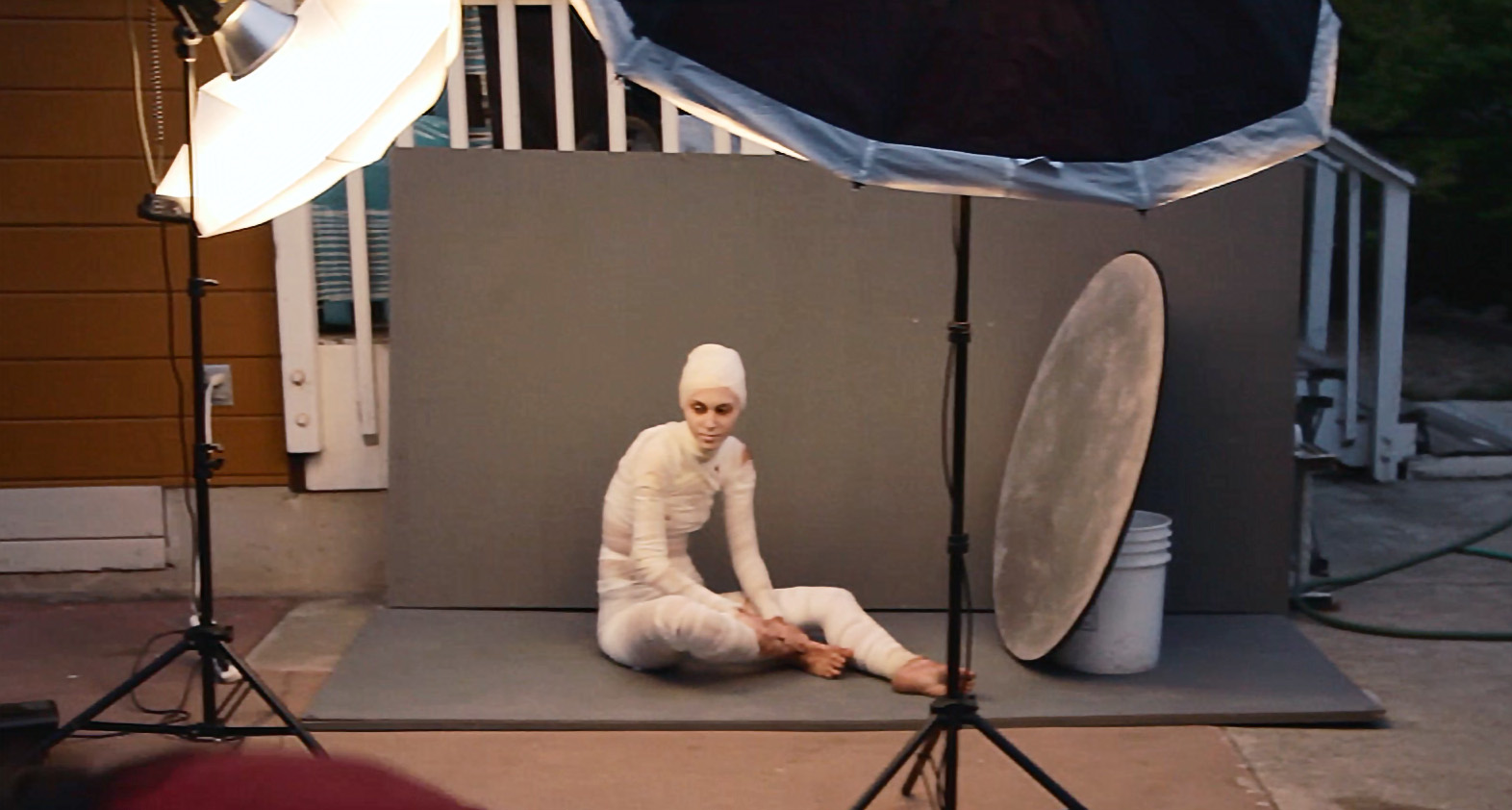
While this isn't super sharp as it is a screenshot from the behind the scenes video we made, it shows the setup of lights and background around Cierra. 

While this isn't super sharp as it is a screenshot from the behind the scenes video we made, it shows the setup of lights and background around Cierra. 

      As most people who have seen some of my photography can guess, I'm into some slightly darker/creepy imagery. Honestly I don't really see most of what I do as "dark" since it is executed in a very lit and often saturated way but when it comes down to subject matter, I suppose a person completely bandaged with festering wounds isn't exactly a happy, smiling portrait.

      October is a pretty inspiring month with the weather finally mellowing out into cooler autumn and of course Halloween at the end of the month. I hadn't been taking a whole lot of personal photos/doing the fine art portrait thing recently and I hadn't really realized how much I missed it until finally doing a few new shoots. The model, Cierra, is a friend of mine who I've known for a while and used photograph a lot but for various reasons hadn't worked with in a couple years. Knowing her look and her ability to move in interesting ways in front of the camera, I thought she would be perfect to wrap up completely and turn into a kind of dead looking sickly person. 

      Shortly before the shoot I got a new Canon 100mm F2.8L IS lens that I intend to use for some product photography that I sometimes do but given the length and fantastic quality of the lens in general, I was looking forward to trying it out for some portraits. 

The Canon 100mm F2.8L IS Macro mounted on my 6D. While built of plastic, it feels modern and very well made. It is relatively large compared some shorter and squatter primes like my 50mm F1.4  or 85mm F1.8 but it still balances pretty well and …

The Canon 100mm F2.8L IS Macro mounted on my 6D. While built of plastic, it feels modern and very well made. It is relatively large compared some shorter and squatter primes like my 50mm F1.4  or 85mm F1.8 but it still balances pretty well and feels great to shoot. The stabilizer seems to work very well. Even if you are shooting with strobes or high shutter speeds, it can be nice to have a stabilizer viewfinder to help with composition. Focus speed is very fast when you have the focus range limiter switch set to the correct setting for your subject. If you aren't shooting at macro distances, its best to keep it focussing from .5m-infinity so it doesn't spend any time hunting for focus at close range. 

      In terms of image quality, I'm pretty impressed with it so far. As of this writing (Nov 8 2015) I've only used it for this one shoot but it was super sharp and performed basically as expected. I do a significant amount of research on camera gear/tech and all that I had read about this lens were great things so I can definitely say it seems to live up to its reputation. In fact, I think I saw a bit of aliasing in some of the files. Sure, I may have exacerbated it with a bit of over sharpening but still, this lens provides some really sharp results. Always better to have something too sharp than not sharp enough. I bet the crispiness/possible aliasing was a result of me being used to having to do much more sharpening on the files I get from my 24-105mm than the files from this lens and sharpening too much. Regardless, I'm happy with it and look forward to using it for some more shoots in the future.  
      New lens thoughts aside, this shoot was really fun. I'm always looking for cheap but visually impactful ideas and this kind of sick, decaying look was just what I was looking for. The gauze was acquired easily after a quick search on Amazon and the rest was mostly just staining it with a mixture of coffee and tea and then wrapping it around her. She did some makeup too of course but it wasn't anything too extreme. A lot of the grossness of the look comes from the overlaying and painting of textures in Photoshop. You can see the extent that retouching played here: 
There weren't any massive changes. Just a bunch of little things. It was fun being able to spend time retouching the skin to look more textured and gross as opposed to the usual cleaning and fixing that goes on with that. 

There weren't any massive changes. Just a bunch of little things. It was fun being able to spend time retouching the skin to look more textured and gross as opposed to the usual cleaning and fixing that goes on with that. 

      I was lucky to have a friend with me during the shoot who could take a bit of behind the scenes video too so I edited that together and you can see some of the shoot here:

      Overall I was pretty happy with this shoot. It was one of those things where I had a rough idea of how I wanted everything to look but hadn't really visualized it in detail and figured it would all come together during the shoot. Luckily, it did. I'm most happy with the the way the light looks and how the background worked out. There isn't anything particularly striking about the light, I suppose, but I think its well balanced and I love achieving that kind of soft, luminous quality with a few diffused sources. The background was made of a couple thing wall stands that I had used in years previous to show my work against when I was doing a little local art show. I weathered and stained them a bit and they looked perfect for this shoot. Clean enough to kind of look like a studio background but rough enough to hint at a kind of darker, creepy location. 

      Its funny, I had written half of this blog post in November of 2015 (up to the retouching before/after photo) and then never finished it until now, July 2016. I guess I just assumed that I had finished it and it sat there as a draft for all this time. Looking at this again makes me realize how much I need to do more creative stuff. The weddings I've posted about shooting this year have been fun learning experiences but my heart still lies with the more darkly beautiful things. Hopefully I can keep that going. 

      All of that said, here are the final images from this shoot:

New Video, Retouch Time Lapse

      Getting back into making some videos after saying I would and then kind of forgetting about it for months.. Here is a quickie of me retouching a simple portrait, sped up to about 10x real time. I don't give detailed descriptions of the process but there are little notes during various parts of the video that mention kind of what is going on. Hopefully I'll stay motivated and come up with some more cool tutorial videos soon. 

iPhone gets the job done: Foggy Garden Portraits

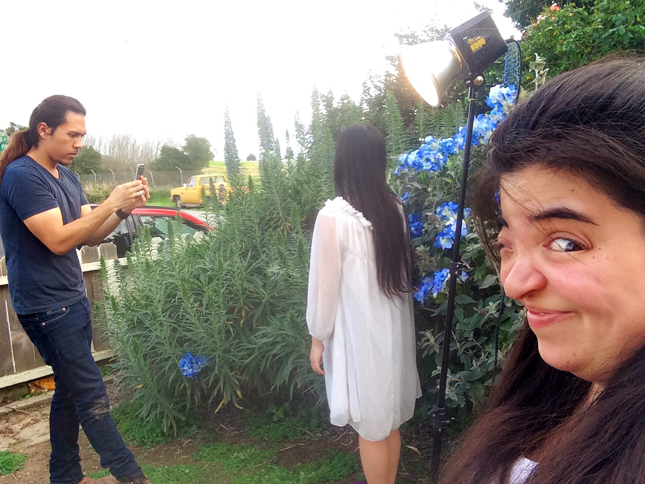
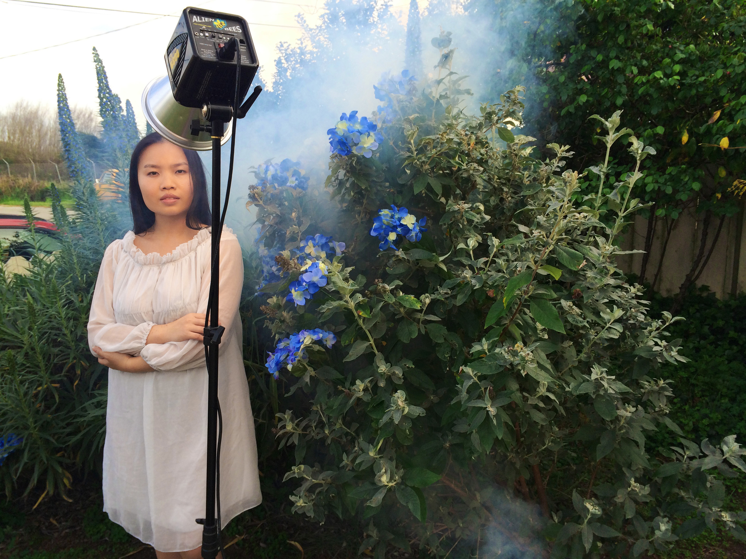
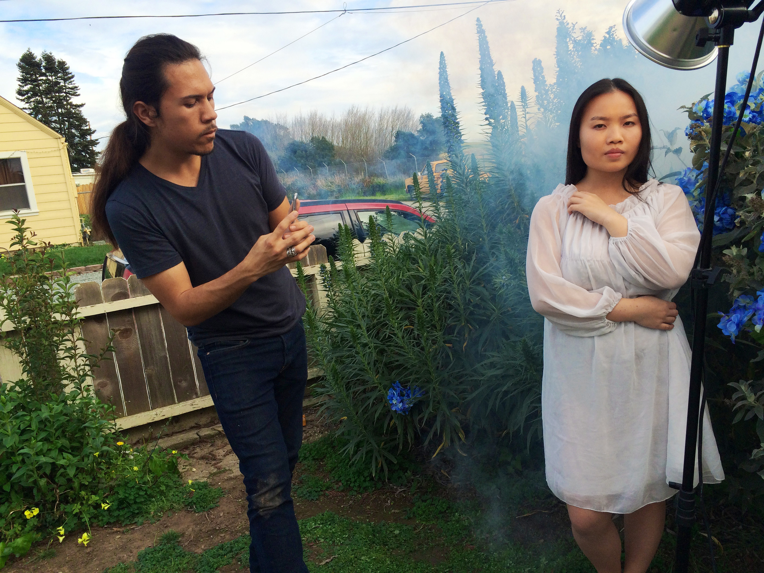
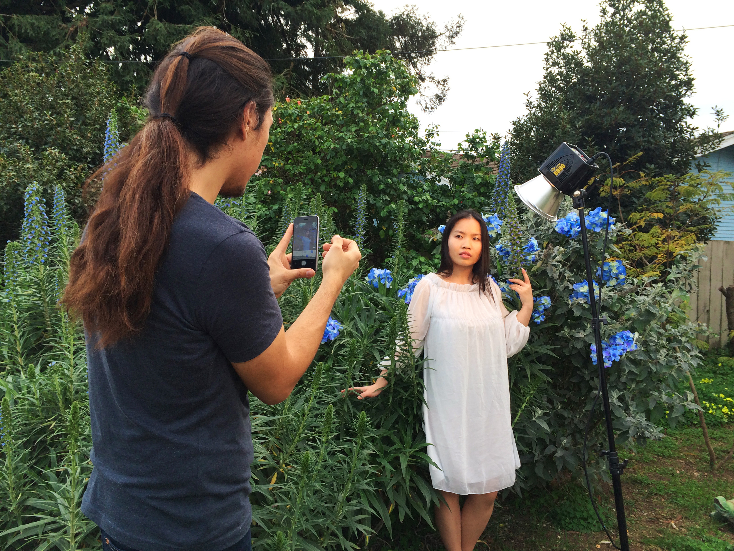
Shooting with my iPhone. I'll explain this below.. 

Shooting with my iPhone. I'll explain this below.. 

     Recently I've had a few ideas for some shoots but they weren't getting done so I decided to ask a friend of mine, Jade, to come over and we would just come up with something. I have various supplies lying around and for this shoot we used some flowers and the fog machine to make some simple, atmospheric portraits. 

     For a bit of a story before I talk some more about the shoot: A few weeks ago I was at a shoot with a portrait client at a lighthouse down at the beach and needed to put my camera down for a moment to adjust the light. There was a spot near the rocks that appeared to have been fairly dry for a while so I set my camera there and just as I turned away a massive wave crashed over the area. I looked over to my camera and it was totally dowsed. I am normally someone who is very careful with his tech so I'm pretty surprised that I let that happen. Needless to say, the camera doesn't shoot anymore. It was my 5D Mark ii with a 24-105mm mounted. The lens is weather sealed but the camera isn't. I've since tested the lens and it (other than some sometimes ominous scraping noises from sand that got in) seems to be fine. The camera is giving me error codes and will need to be fixed.  

     Anyway, although I was pretty bummed about my 5D2, I still had my original 5D in my bag so I could at least use that for a while. Well that is what I was thinking until this shoot when I go to start taking pictures and look through the viewfinder and find it obstructed. There was no cap on the lens so I was pretty puzzled but taking off the lens revealed the mirror had fallen out. 

Oh no! Not a happy sight.. 

Oh no! Not a happy sight.. 

     I'd read before that this mirror issue is not uncommon with earlier production 5Ds but since it hasn't happened until now, I had mostly disregarded it. Its a near 10 year old model by now and I bought it used in 2009 so although I'm disappointed that its broken, I'm still happy with all the use I've gotten out of it. Just considering the problem, it doesn't seem like too hard a fix. I could attempt a superglue job myself but I don't know if that would be too imprecise. I don't know if it would worth spending whatever Canon would charge for factory service since its such an old camera. 

     So now I don't have any working cameras. (I have an old Rebel but the shutter button is jacked up) Until I can get together some funds to get them fixed, I suppose I can borrow cameras or something. Even if/when I get the 5D2 fixed, I'm still weary. I don't really trust a camera that has suffered a salt water intrusion. Hopefully I'll be able to get at least a 6D or possibly a 5D3 (or in my dreams, a 5DS..) some time this year. We'll see.. 

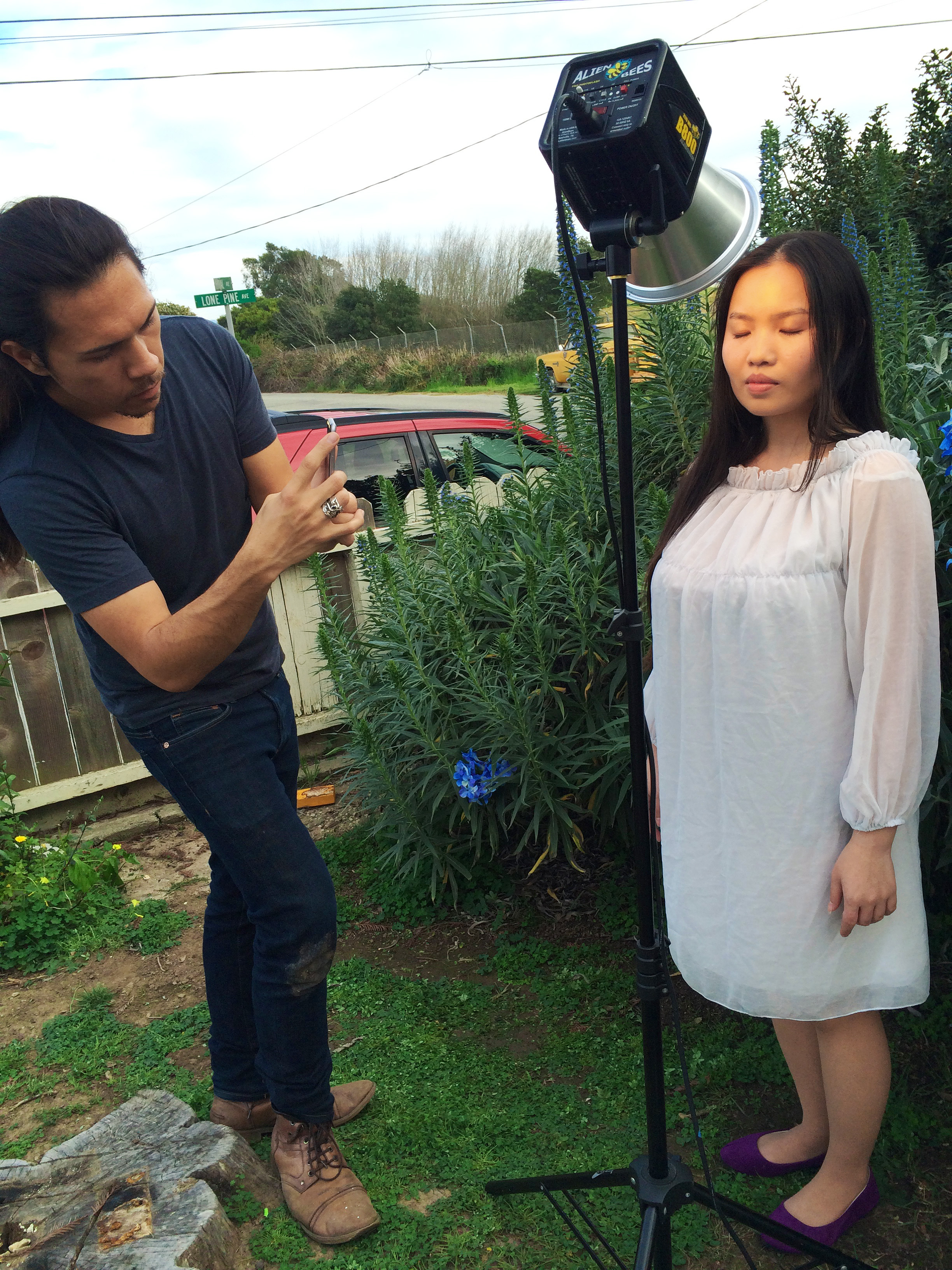
     So with Jade and Alison over for a shoot and everything set up, I just shot with the camera I had that wasn't broken. My iPhone. 

If you showed this photo to me a few years ago, I probably wouldn't be able to immediately tell it wasn't taken with one of my DSLRs. Of course it would be obvious on closer inspection but I'm pretty happy with what I got from the iPhone here. 

If you showed this photo to me a few years ago, I probably wouldn't be able to immediately tell it wasn't taken with one of my DSLRs. Of course it would be obvious on closer inspection but I'm pretty happy with what I got from the iPhone here. 

     Using the Camera+ app, I could manually set the camera and was able to get some pretty cool shots. Keeping the ISO down at like 32 or 40 was necessary since these little sensors aren't so good with higher sensitivities. Luckily it was a nice cloudy day and I had the modeling light from my flash to augment it. Since it was just a personal shoot, I wasn't that freaked out about using a super high quality camera and it became a sort of fun challenge to try and work through the limitations of using an iPhone at a shoot. 

A bit of a challenge using the iPhone's 29mm (equivalent) lens to frame portraits. 

A bit of a challenge using the iPhone's 29mm (equivalent) lens to frame portraits. 

     I was originally planning to shoot with a wide aperture and a medium/wide (35-50mm) lens for some painterly rendering of the background but since that was off the table, the photos ended up having a different look. The depth of the field on these cameras is massive. In most cases, essentially everything is in focus unless the subject is very close to the lens. In a way its kind of cool to see that because I so rarely go for an entirely sharp look. Its different. 

     The biggest problem I thought I would have was using my flash. You can't (as far as I have seen) trigger a pocket wizard/sync cable with an iPhone so the only light I could use was the ambient light and the modeling light of my flash. (which is equivalent to something like a 100 watt standard bulb). Getting a balance between the week modeling lamp and the afternoon light was iffy at first but as the sun went down, it became easier to control. 

     I think the coolest thing about this shoot was the affirmation for me that I can still make some cool looking photos with much more limited equipment. These photos pretty much look like they are done in my style but were taken with an iPhone instead of a DSLR and a bare modeling light bulb in place of a more powerful flash and diffuser. 

I love using the fog machine to add atmosphere to images. 

I love using the fog machine to add atmosphere to images. 

     Overall I'm pretty impressed with the iPhone 6 camera. It can't compete at all with a decent dedicated camera but for a phone, its pretty good. Maybe I'll continue doing some low tech shoots for fun. 

     Here are a few more behind the scenes photos taken by Alison who was with us that day to hang out and assist: 

     I'm happy with the photos from this shoot and I'm curious to see what they might look like in print compared to my usual files so I ordered a few 12x16" reproductions to see if they hold up. I think they will. Recently Apple has been printing building size billboard ads that were shot on iPhone 6 so if they can do that, I think my little portraits will look good in print too. 

     I considered just using iPhone apps to retouch the photos but the comforts of using Photoshop on my Mac won out. There wasn't a whole lot done to them. Mostly refining the color and a bit of general retouching. Having the fog machine there in real life really makes that kind of atmospheric look really convenient to achieve. Its possible to create something similar in Photoshop but there is something about the look of real smoke/fog that I prefer. I guess if you are really proficient in a 3D modeling app you could reconstruct the scene in 3D and render the smoke you want around it with an alpha channel and then layer that in over the photo so it would look pretty real but that seems like a much larger effort than a $20 smoke machine and a gentle breeze.

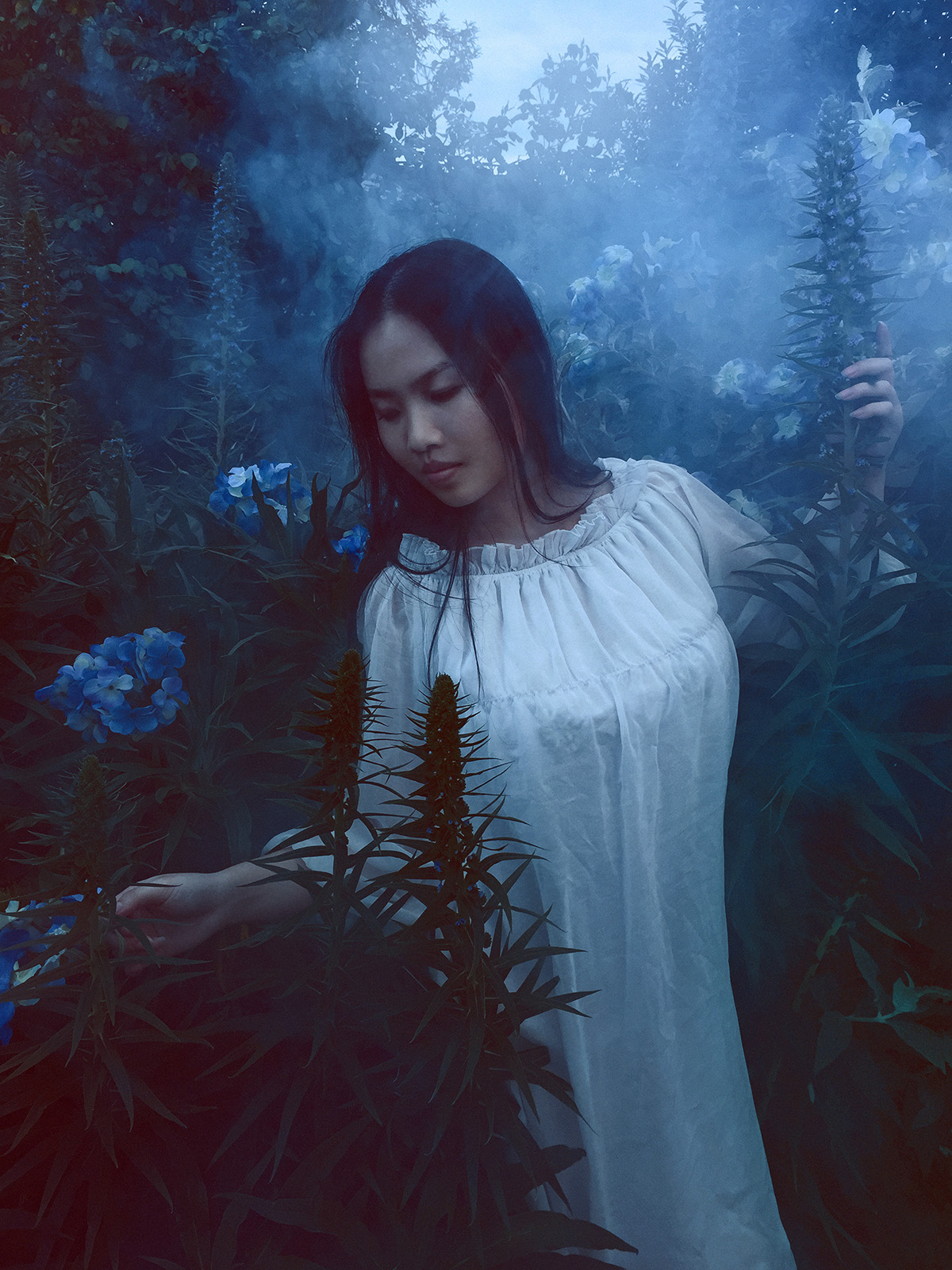
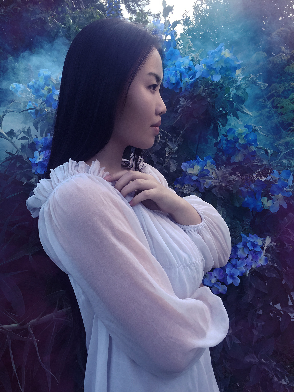
     Here are a few more of the final images:

I love how you can take an ordinary location (front yard of a house) and through selective framing (and maybe a bit of Photoshop work) make it look like it could be anywhere. I know where it was taken and what was immediately around it but anyone wh…

I love how you can take an ordinary location (front yard of a house) and through selective framing (and maybe a bit of Photoshop work) make it look like it could be anywhere. I know where it was taken and what was immediately around it but anyone who isn't familiar with the location is left to imagine the area for themselves. Fun fact: the blue flowers were found at the dollar store. Its great what you can do with $20 of cheap fake flowers in the right context. 

Since this shoot was pretty free form, I hadn't considered all of the elements in too much detail. I like how the ruffle edge of the dress on her shoulder echoes the flowers in the background. 

Since this shoot was pretty free form, I hadn't considered all of the elements in too much detail. I like how the ruffle edge of the dress on her shoulder echoes the flowers in the background. 

I love the depth that fog creates when you can see the density build up through plants or trees. The light on her wasn't quite as optimal as I'd usual have it but it is still close to my usual look. Colors are a bit different in this once compared w…

I love the depth that fog creates when you can see the density build up through plants or trees. The light on her wasn't quite as optimal as I'd usual have it but it is still close to my usual look. Colors are a bit different in this once compared with the others from this shoot. Less red in the shadows. I guess I just feel like this one works being primarily cold cyans. 

     So that is that. Fun shoot. I hope to do some more spontaneous creative shoots like this. I need to shoot more and I find that sometimes it can be good to just make something happen even if the ideas aren't fully formed. 

Feb/March issue of Santa Cruz Waves - Fashion

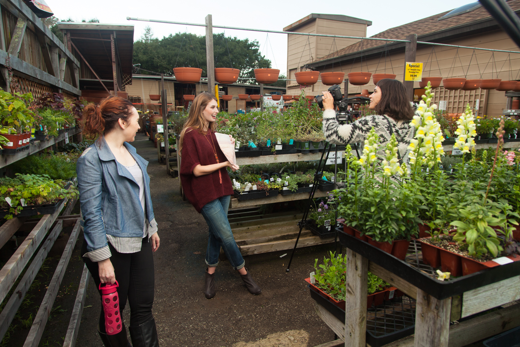
     As had become usual, last December, I shot some more photos for publication in the Feb/March issue of Santa Cruz Waves Magazine. Our crew was largely similar to past shoots with Christa Martin of The Penny Rose producing, beauty by Salon on the Square, Beau Gillette assisting, and myself, Nick Chao, photographing and retouching.  For this shoot we worked with a new model, Heather Chase. She was awesome and we hope to work with her again. Since most of the team was familiar with each other, we know that we work well together and it was a pretty smooth shoot. 

Before I go on, here is an awesome little behind the scenes video shot by Deva Anderson for The Penny Rose. Always fun to see what goes on around the lens: 

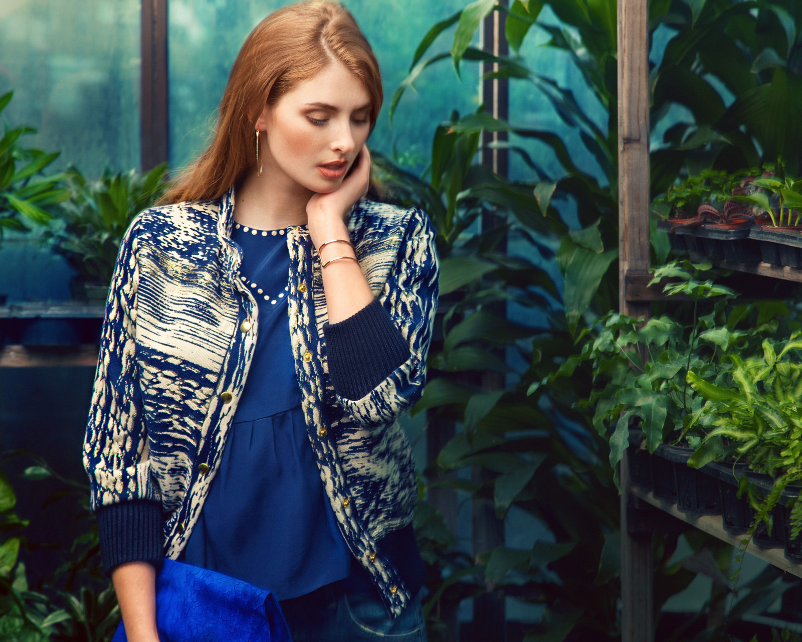
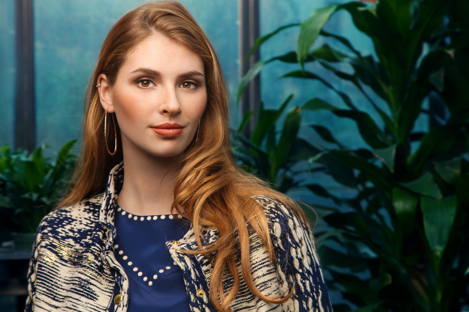
     Location for this shoot was the San Lorenzo Garden Center in Santa Cruz CA. Since the photos were going to be in the early Spring issue of the print Magazine, we wanted to have a location that reflected that. We had looked for a more natural, garden sort of location but weren't able to find/get access to one in time so we decided to use the Garden Center. I think it worked out pretty well since Spring is the time many people start getting back into their gardens. It gives a bit of a narrative to the woman in the photographs. (Funny though, since we shot this in December before Christmas, there were many Christmas flowers around the place. We just accepted that and shot with them anyway.) 

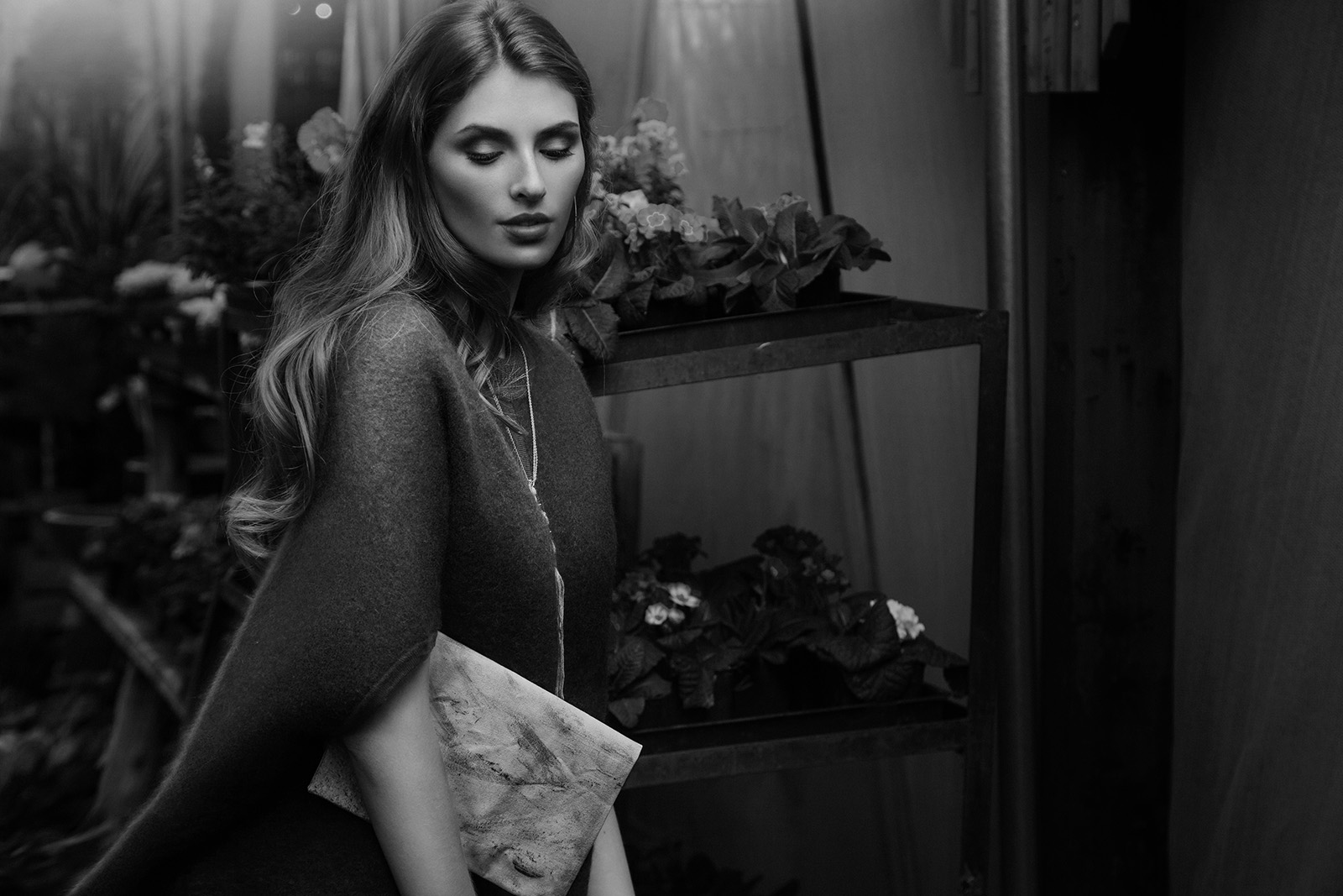
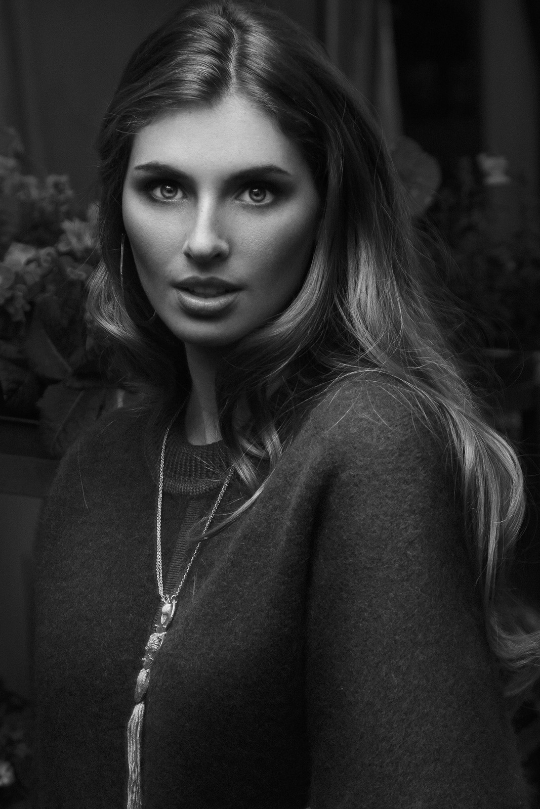
     Prior to the shoot, I hadn't been to that place in quite a few years but Christa had gone and taken some photos of what it looked like. After seeing those I could tell it would work for what we wanted so we went ahead with the shoot. Upon arrival, while the others were setting up and getting situated, I took a quick run around the place to see what little spots would work best. The place that stood out the most to me was a greenhouse area that held many shelves of colorful plants. The light within was pretty ideal to work with since it was super diffused by the semi-opaque window panes and the naturally low angle of the sun at the time. That made it pretty easy to dial in an exposure for the background and then turn up my key light until it looked good. The light inside was actually low enough for me to need a pretty slow shutter speed and since I just happened to have accidentally left the stabilization off on my lens, a fair number of the shots ended up having a little camera shake in the backgrounds. Enough of them turned out well that it was fine but its definitely something I'll try not to let happen again. 

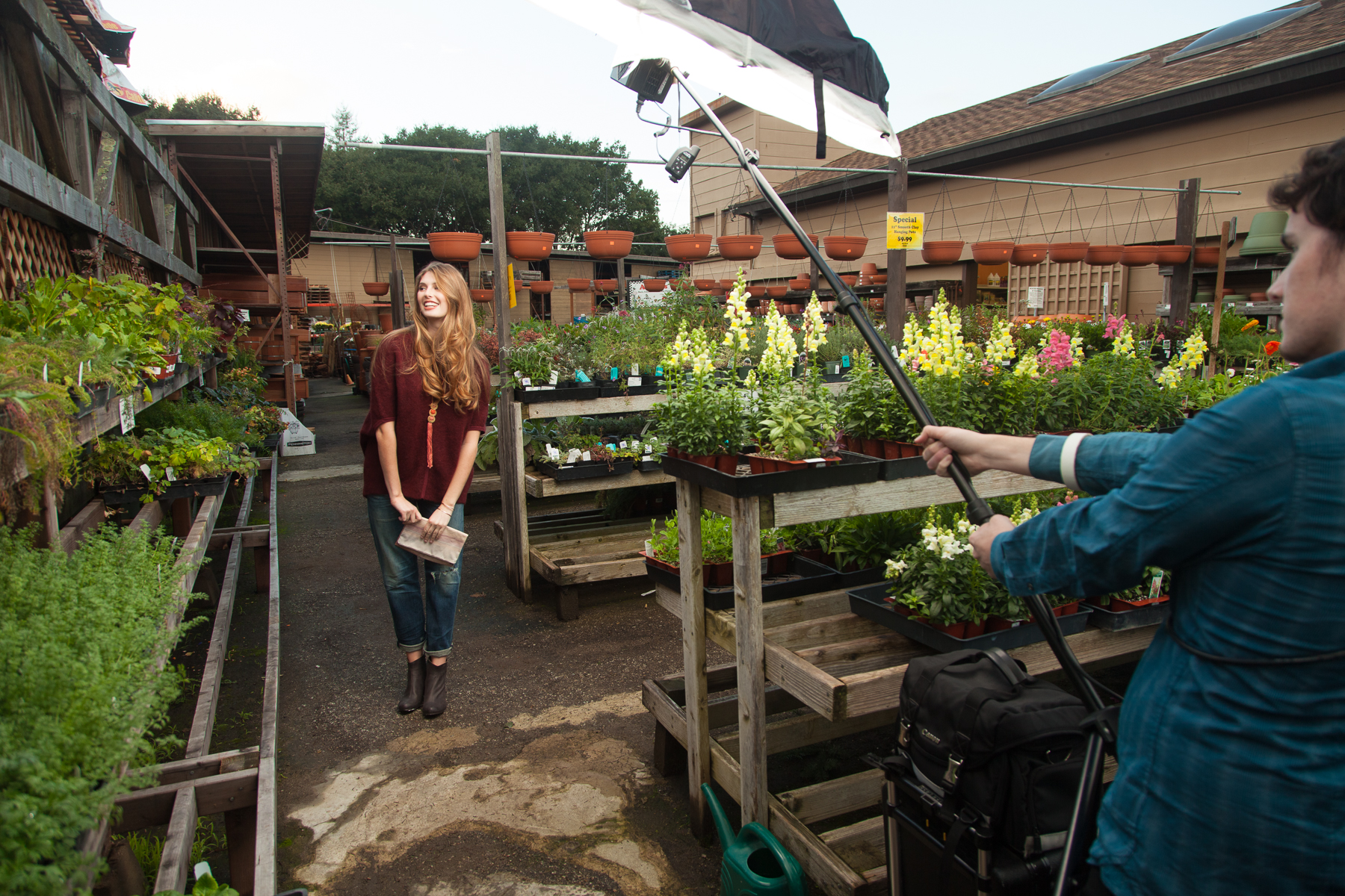
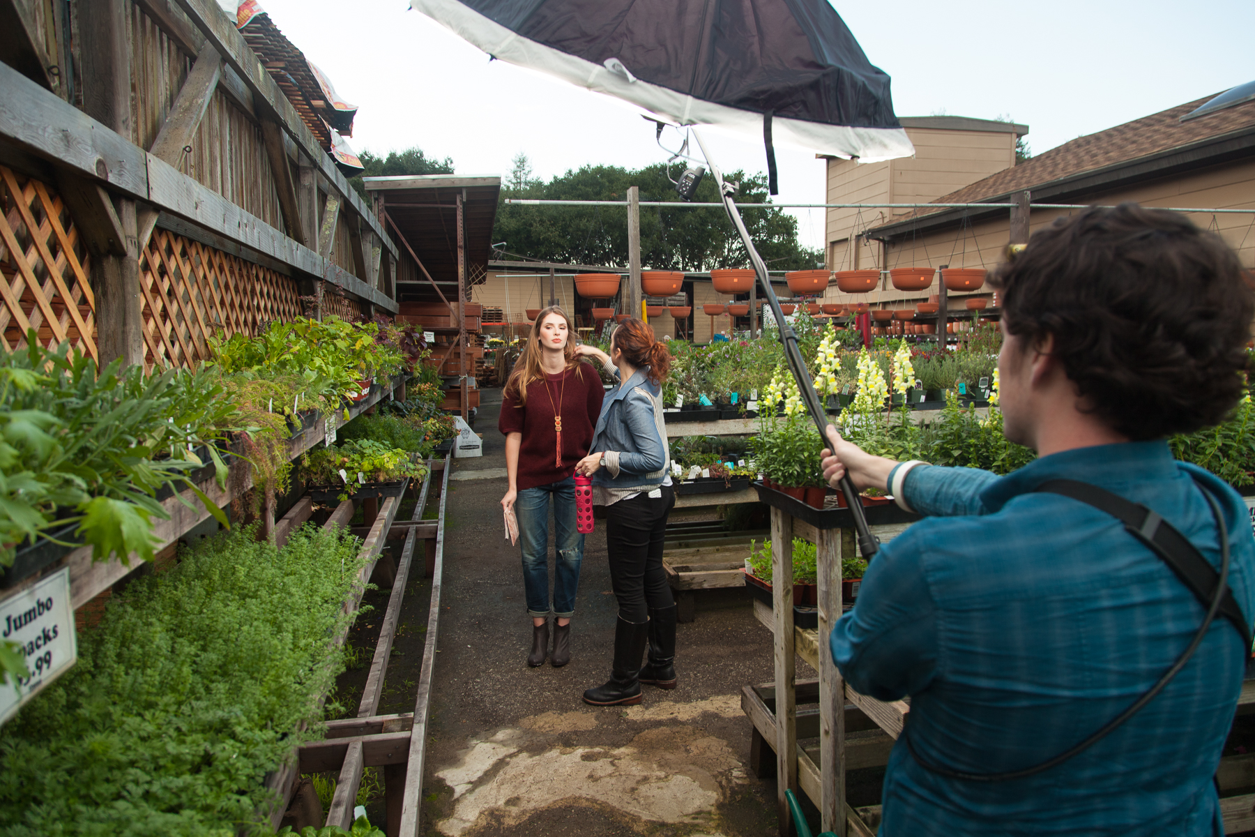
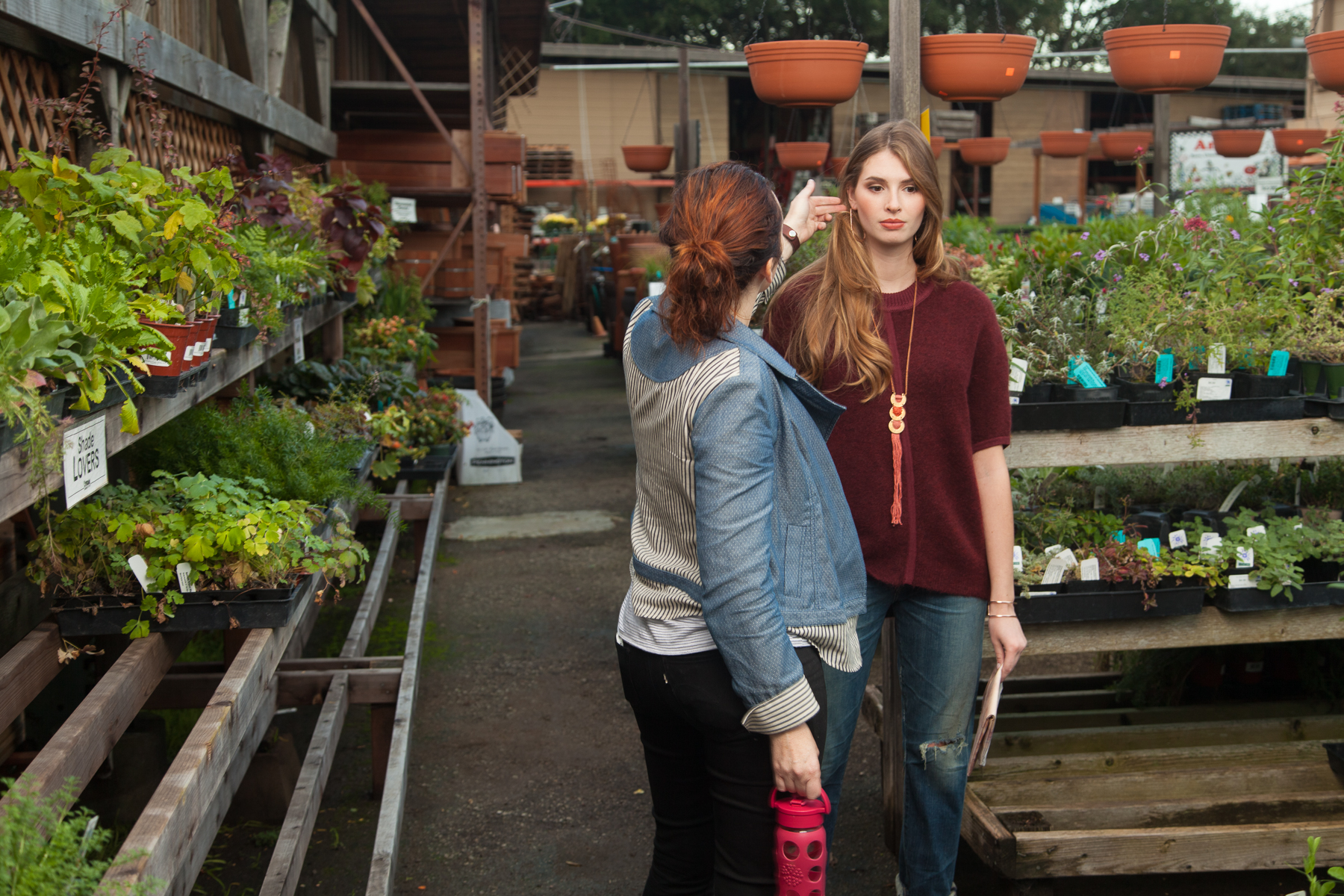
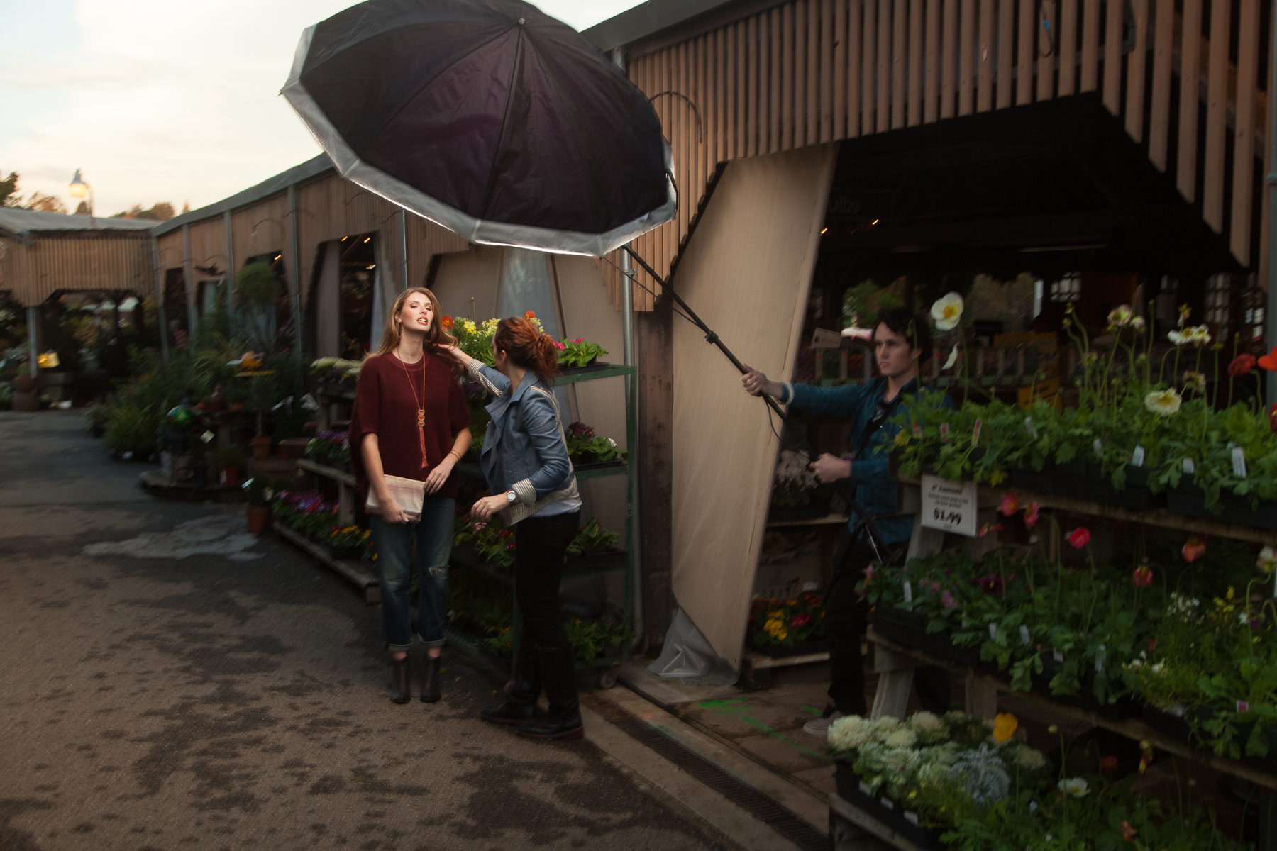
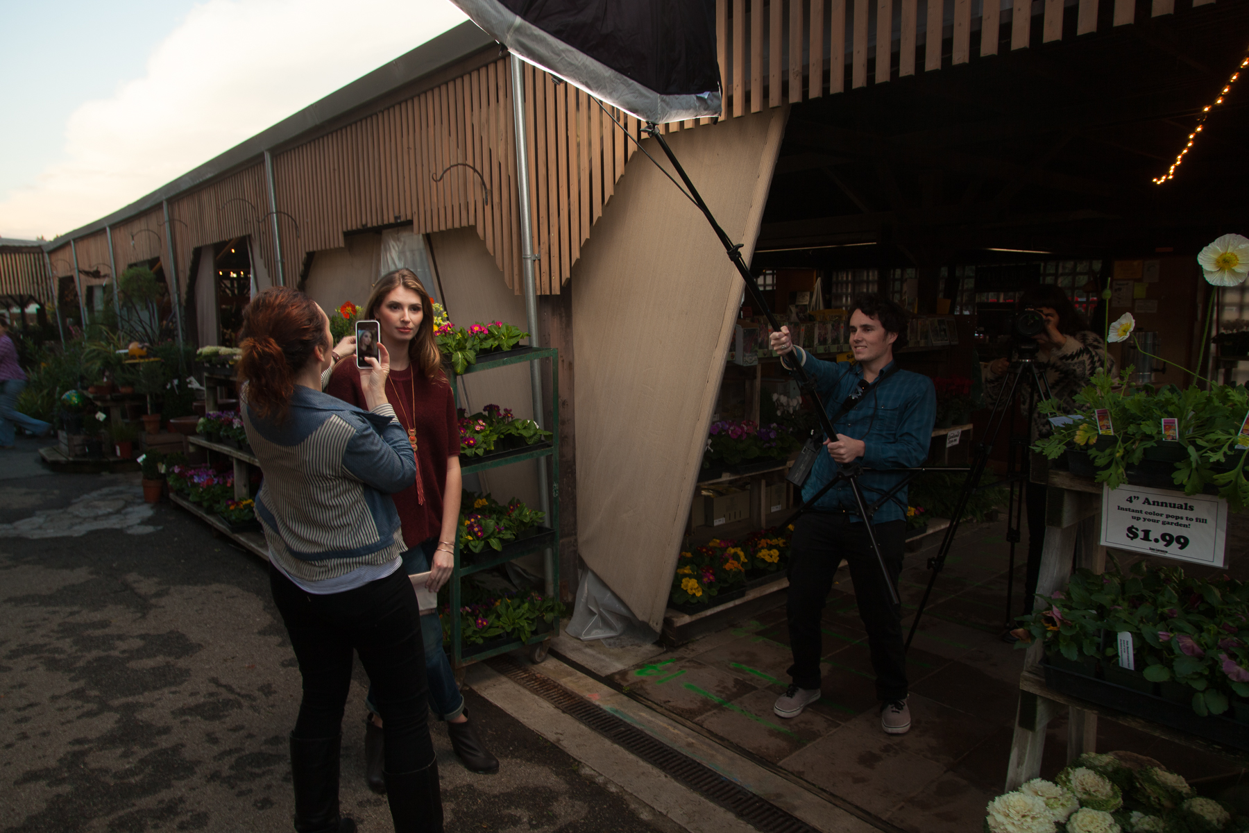
     Here are a few behind the scenes shots of while we were shooting in the greenhouse:      

Beau holding the light in position (Alien Bees B800 with a 60" Photek Softlighter powered with a Vagabond Mini and triggered with  Pocket Wizards) while Deva touches up the model. One thing about shooting in a room made of windows is …

Beau holding the light in position (Alien Bees B800 with a 60" Photek Softlighter powered with a Vagabond Mini and triggered with  Pocket Wizards) while Deva touches up the model. One thing about shooting in a room made of windows is the inevitable reflection issues. In many angles, the large umbrella would reflect and show up in the photos so it required careful framing and some retouching.

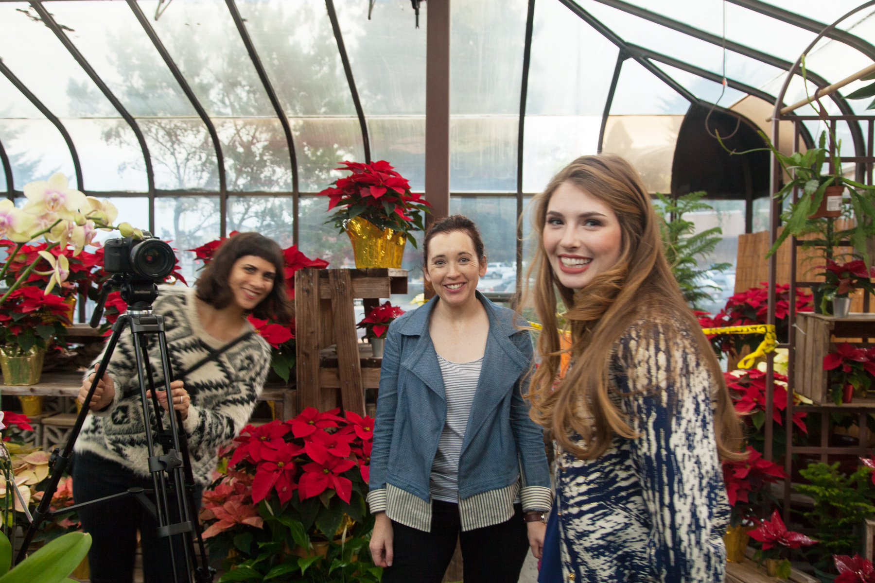
Deva, Christa, and Heather. Deva setting up to record the behind the scenes video for The Penny Rose

Deva, Christa, and Heather. Deva setting up to record the behind the scenes video for The Penny Rose

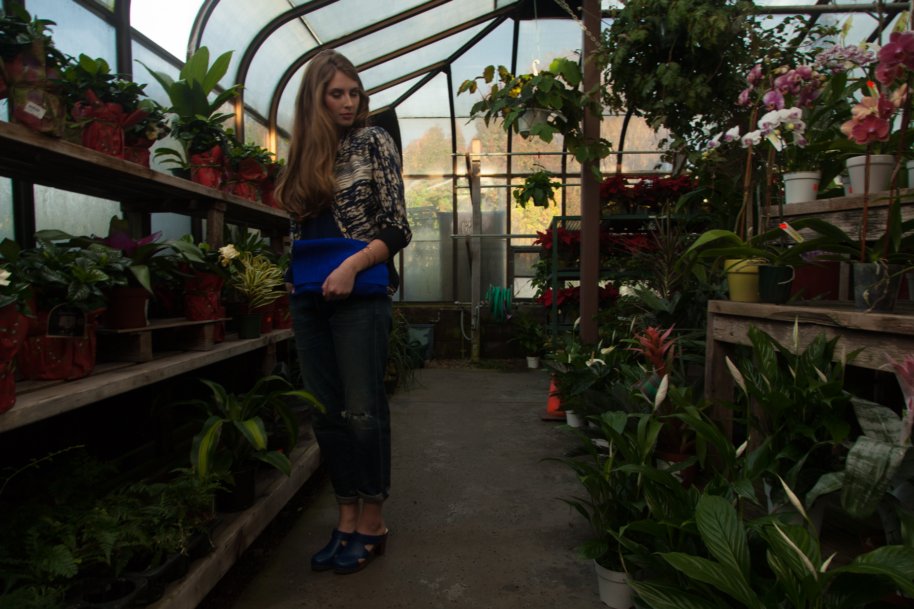
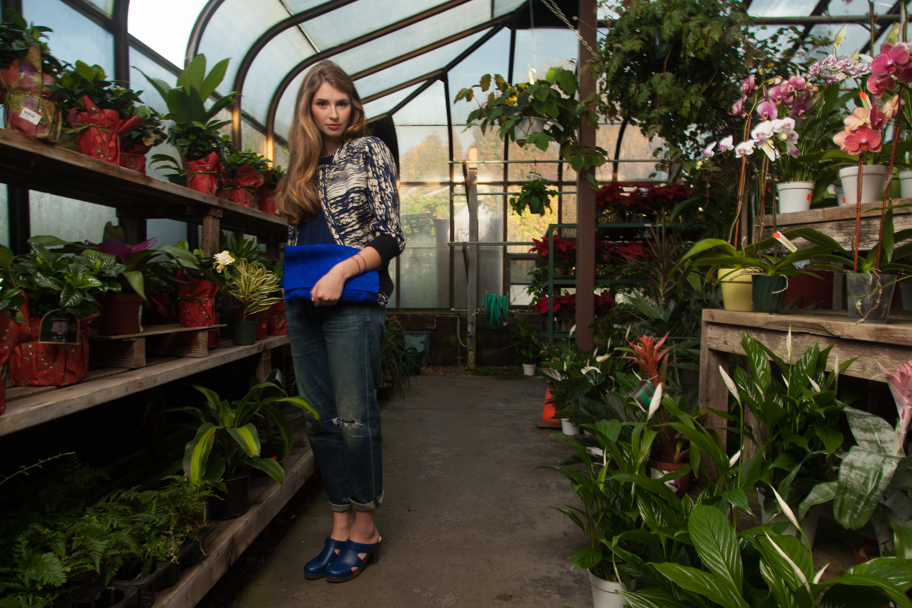
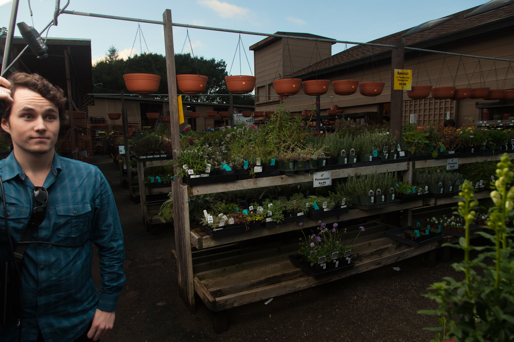
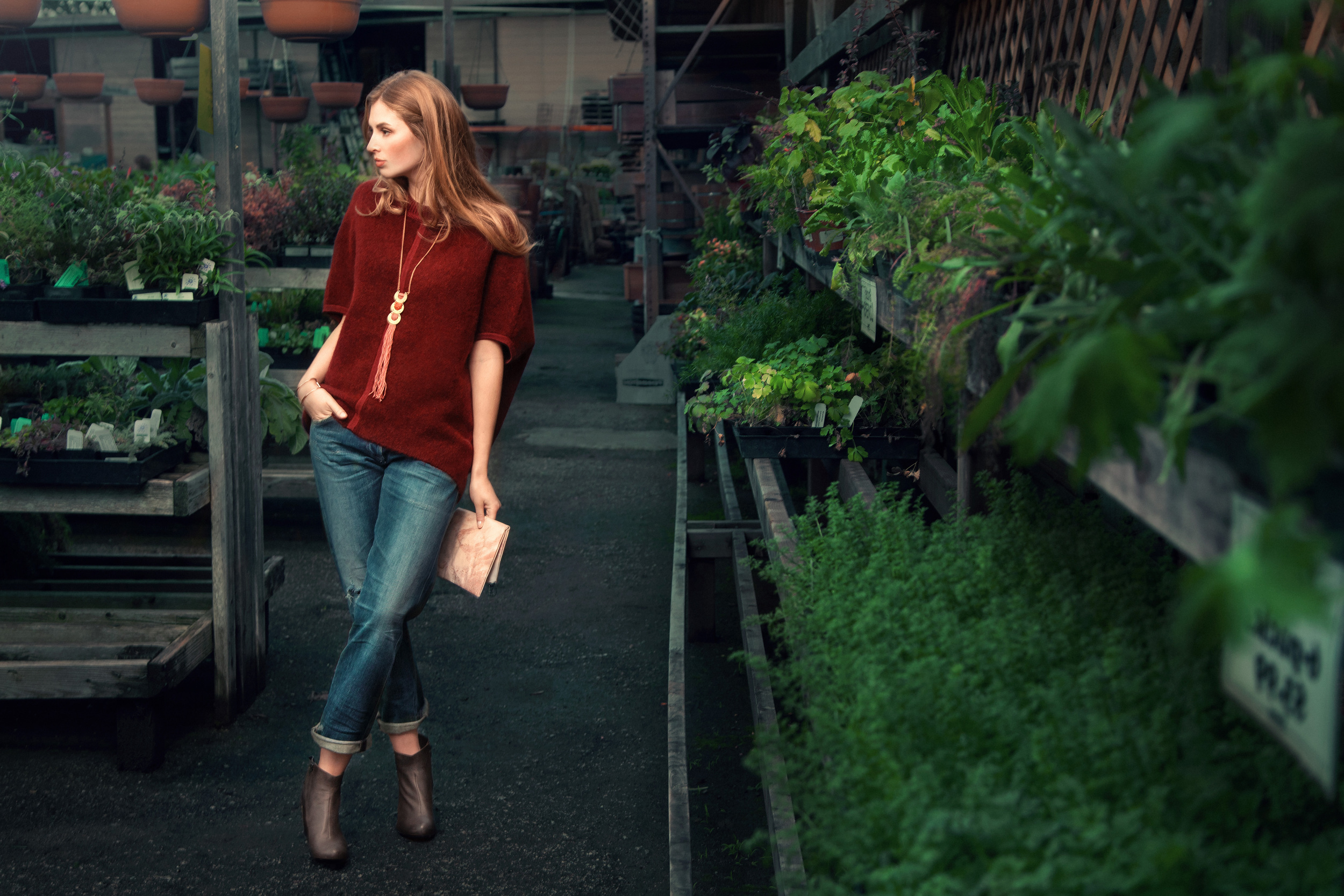
     Below you can see a couple pictures that show the difference between the photos with just natural light and when I add my flash to the mix. Every situation is different and if I was really shooting just natural light I would probably use a wide aperture and just blow out the background to make sure the model looked good. For this shoot at least, I wanted my usual mix of flash and ambient so thats what I worked towards. 

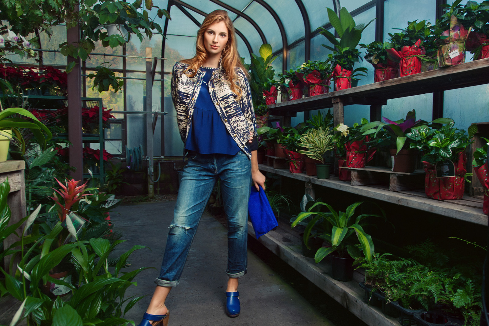
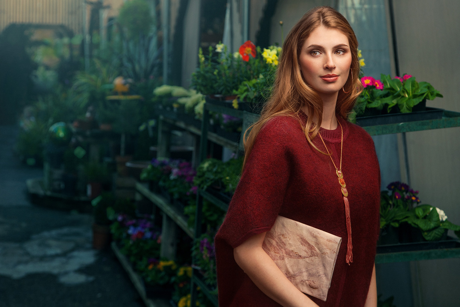
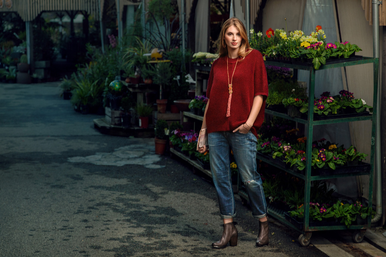
     And here are some final retouched images from that location:

     Sometimes for my shoots for Santa Cruz Waves we would just shoot one look but for this shoot we had two different outfits for her so she got changed and we headed to some other locations. We continued to shoot outside amongst the rows of plants and then went underneath the sheltered area they have for the shade plants. 

     Here are some shots of the 2nd little location:

     Getting a good mix of strobe and ambient was a little more challenging for me out here. The background also, while interesting, required some thought. The final image from here is decent but not one of my favorites: 

I couldn't find a way to make the background look as good as I wanted it to with it brighter than this so the photo overall ended up looking kind of dark. (sometimes easier to just knock down a background than try and fight for the perfect balance).…

I couldn't find a way to make the background look as good as I wanted it to with it brighter than this so the photo overall ended up looking kind of dark. (sometimes easier to just knock down a background than try and fight for the perfect balance). Also, for some reason the skin tone looks a bit punchier than I remember making it but I guess thats alright. They ended up printing this one in the magazine so I'm happy that they liked it. 

     Continuing in the same look, we walked a few feet to a little alleyway location and shot some more:

     And some of the final images: 

     I didn't really get any behind the scenes picture of it but we went to one more little location and shot a bit more. Here is the last image: 

I like the range of color in this one. The cool blues outside and the warm colors around her. I actually have a "Cool Down Shadows" Photoshop action that I made and use all the time to add cool tones to various parts of my photos. Maybe I'll share i…

I like the range of color in this one. The cool blues outside and the warm colors around her. I actually have a "Cool Down Shadows" Photoshop action that I made and use all the time to add cool tones to various parts of my photos. Maybe I'll share it here some time. 

     All in all, a nice shoot. Other than my forgetting to switch on my lens stabilization which would've helped retain some sharpness in some of the scenes, most of the photos worked out pretty well. Its a nice little challenge to walk around a location and work on finding a good way to balance my light with the light that is already there.

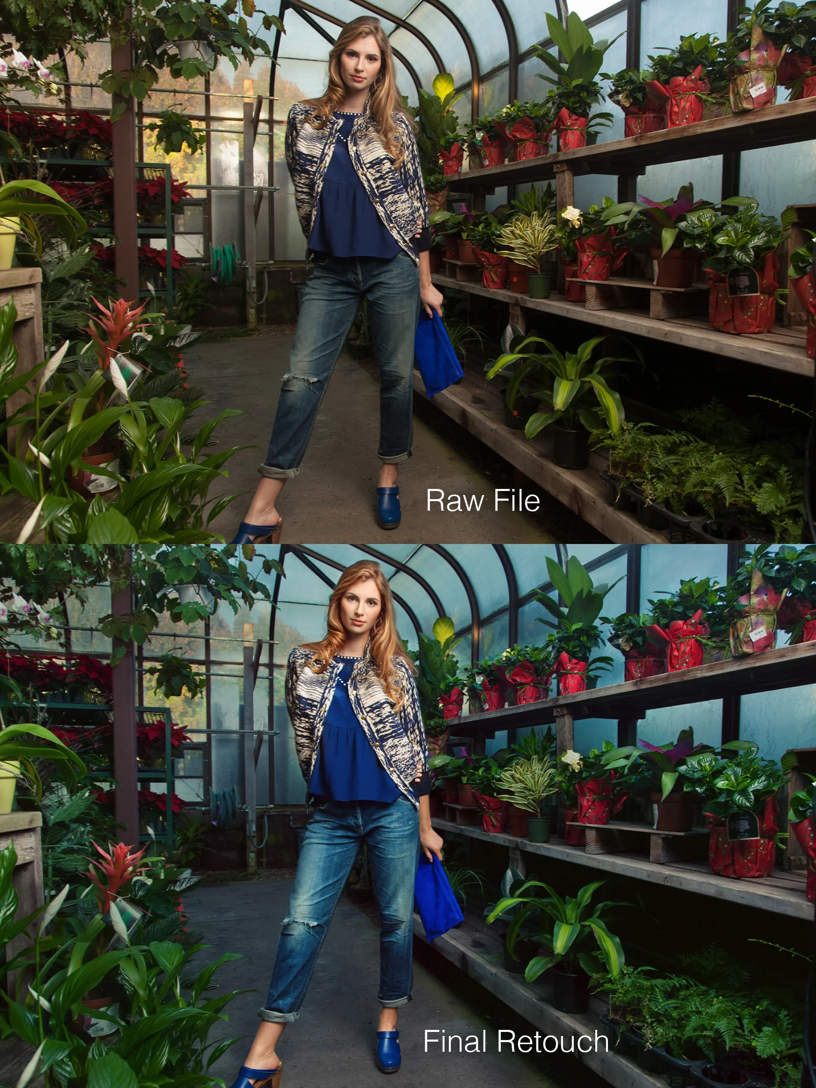
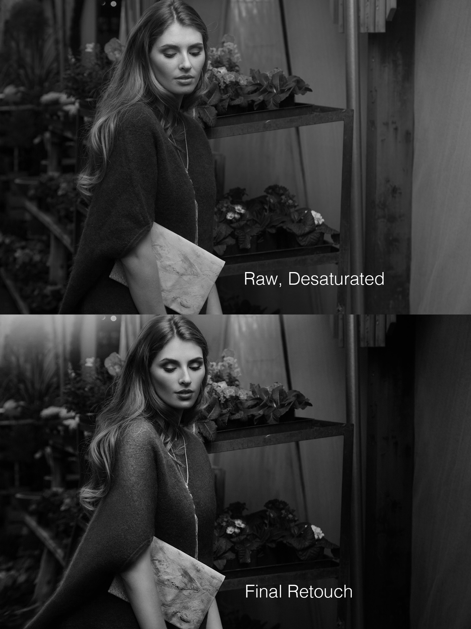
     And of course, here are a couple of before/after retouching comparisons: (original on top, final on bottom)

Did a lot of color work with this and finessed the light on the model. I usually shoot with light that is pretty close to what I want and then retouch the image later into what I envisioned it to look like. You can see in the unretouched photo the r…

Did a lot of color work with this and finessed the light on the model. I usually shoot with light that is pretty close to what I want and then retouch the image later into what I envisioned it to look like. You can see in the unretouched photo the reflection of the light behind her and how all the windows in the original have different looks. I evened them all out with a sort of aquatic blue color that I think went well with the greens and tied in with her clothes. I realize that her foot got cut off so that isn't good but everything else about it was good enough to me that it was worth working on. 

Mostly just basic retouching work on this one and a decent amount contrast added in different ways. 

Mostly just basic retouching work on this one and a decent amount contrast added in different ways. 

     As always, thanks for reading! I actually have a few new creative shoots planned that I want to execute soon so hopefully I can share those before too long. 

Fashion for Santa Cruz Waves Magazine Dec/Jan Issue

     Some months ago I shot some more photos for Santa Cruz Waves Magazine. They have a couple-page fashion section that features clothing sourced from local stores and designers. I do these shoots in collaboration with a great team of people including beauty by Salon on the Square and production by Christa Martin of thepennyrose.com. I was also thankful to have my friend Beau assisting. Another set of hands always alleviates some of the scrambling to make sure nothing gets left behind and the equipment stays in the right place. 

     Because of the lead times of shooting for the printed magazine, we shot these in October for the December/January issue. We weren't sure where to shoot this time because we originally wanted something kind of different from the previous SCW shoot we did at the cliffs/beach but we ended up shoot at Natural Bridges since after scouting, it seemed like it would be interesting enough. To me, these images ended up coming across more as "fall" than the winter season they were for but they still look good so I don't think it was an issue. When Christa and I scouted it out, it was a dark overcast day which gave the beach and the surrounding area a nice sense of damp wintriness that would have been perfect but alas, the sun came out on the day of the shoot. Thankfully though, the sun ended up being pretty low by the time we started shooting so I didn't have to fight with it too much to get the light to work. 

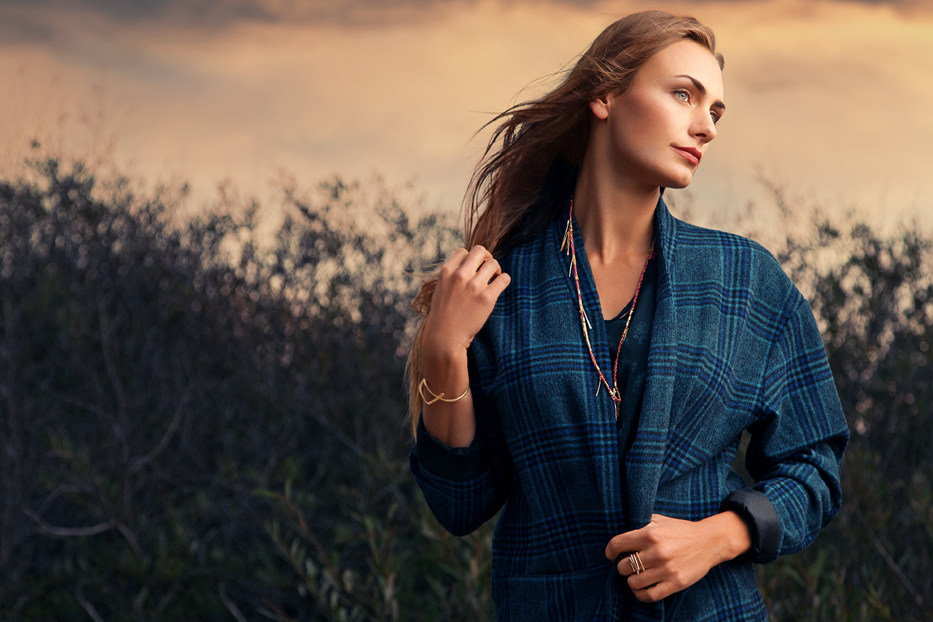
The first little location that we shot at above the beach. Took some retouching to balance out all of the tones but I am happy with this one. 

The first little location that we shot at above the beach. Took some retouching to balance out all of the tones but I am happy with this one. 

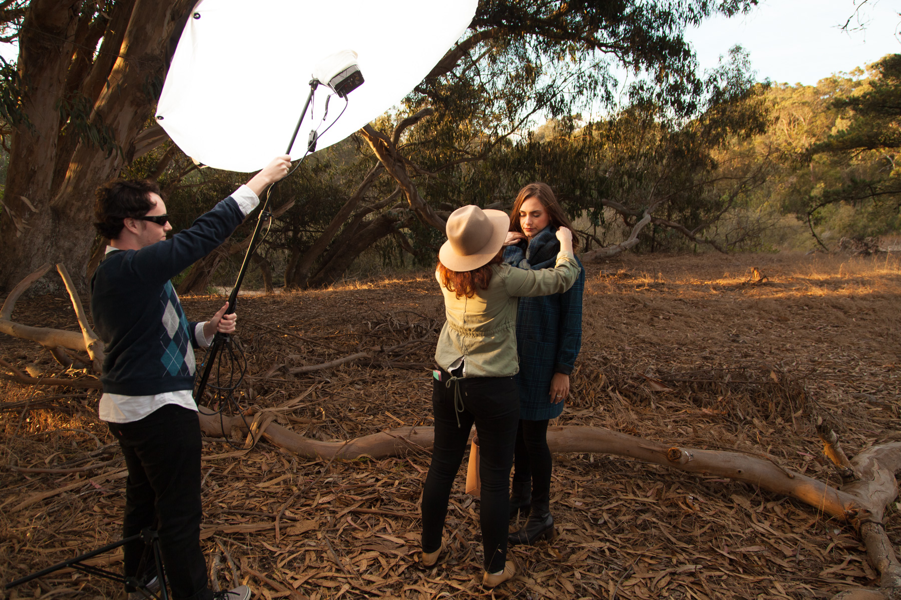
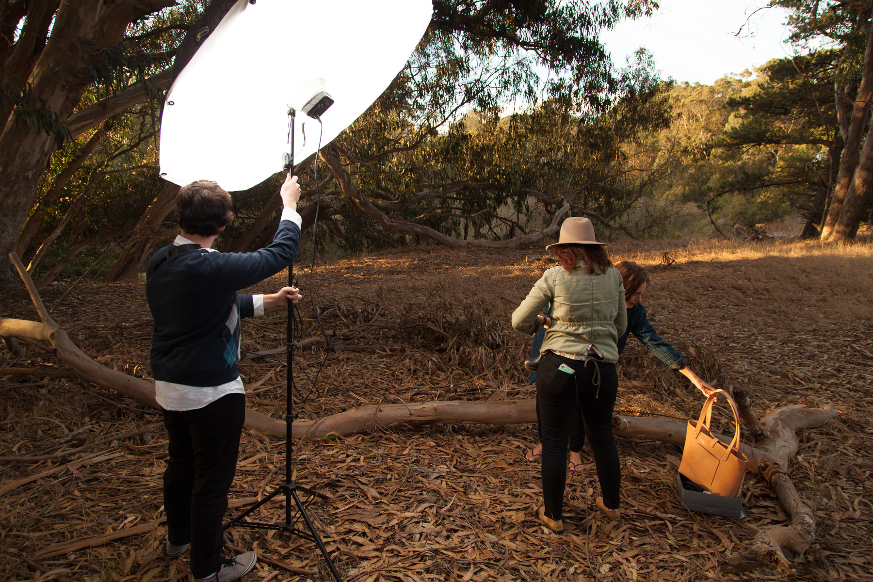
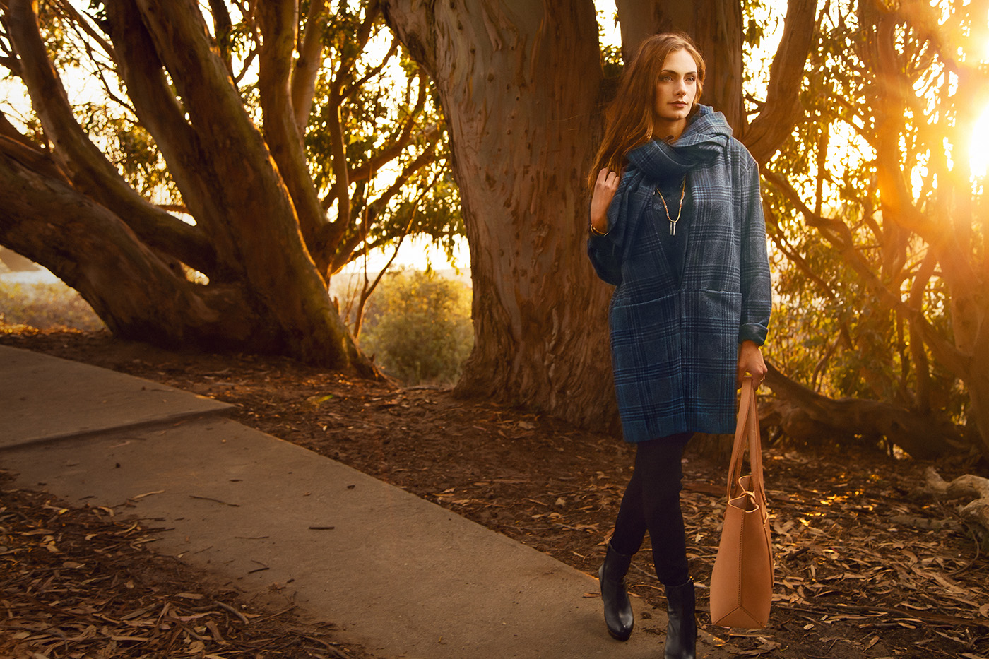
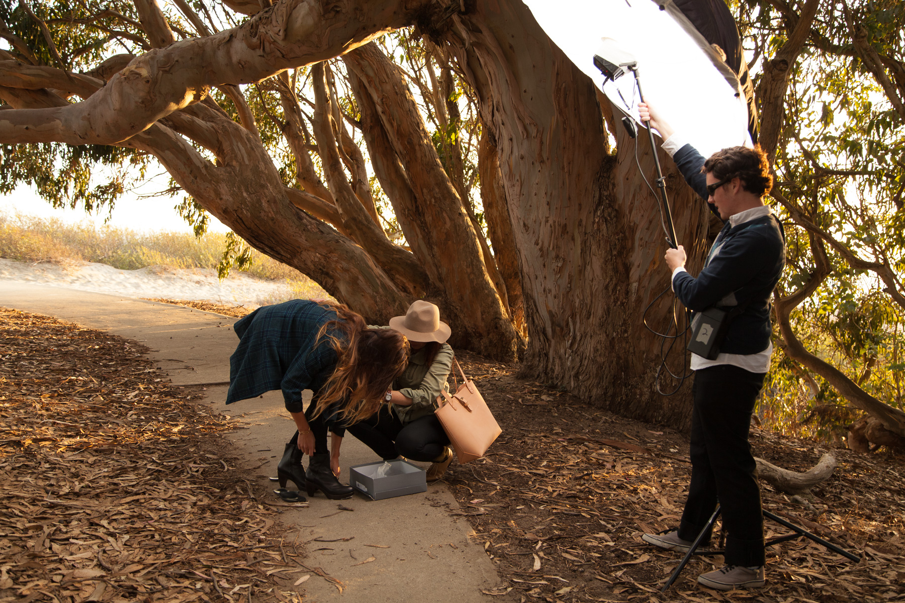
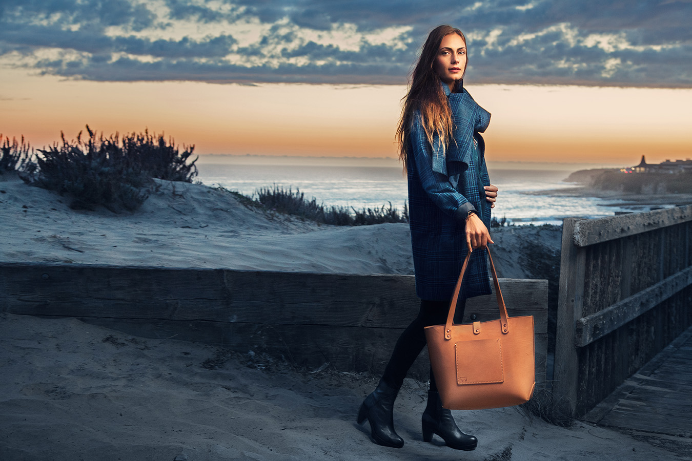
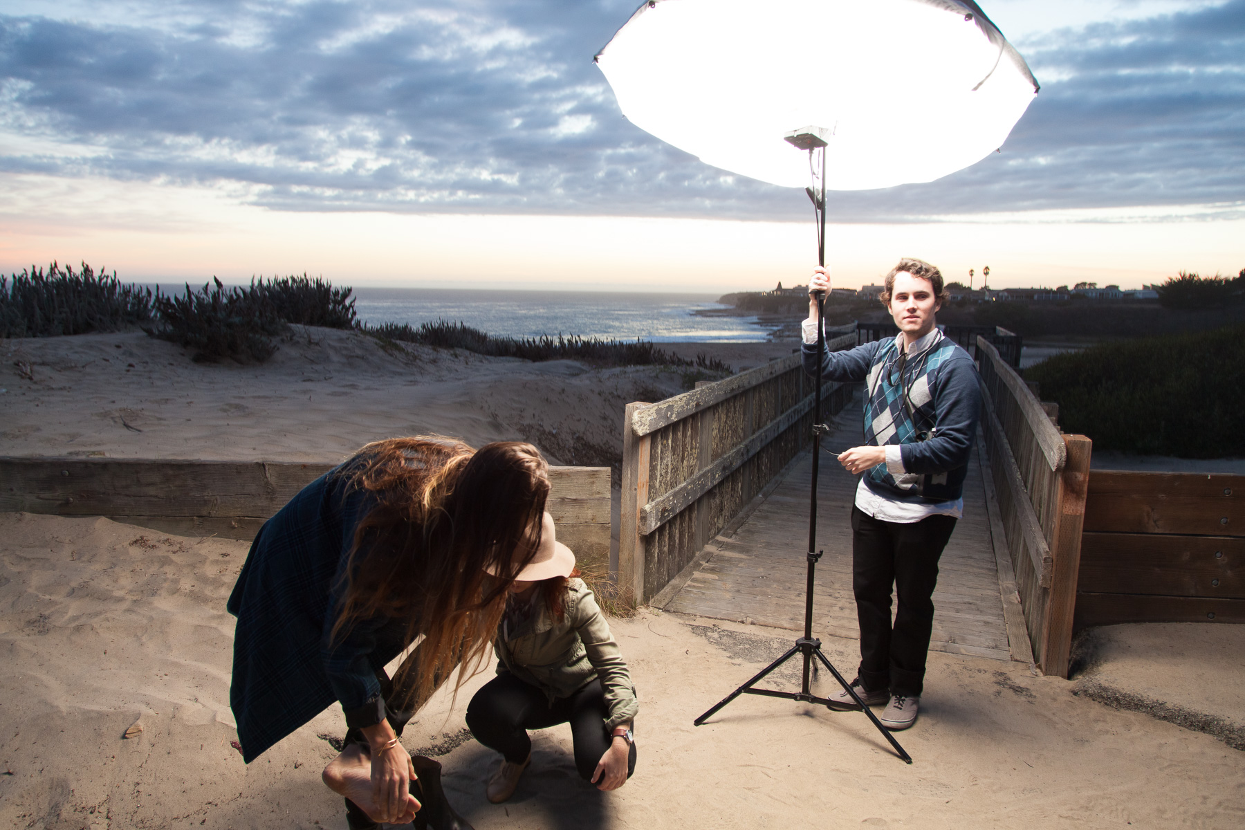
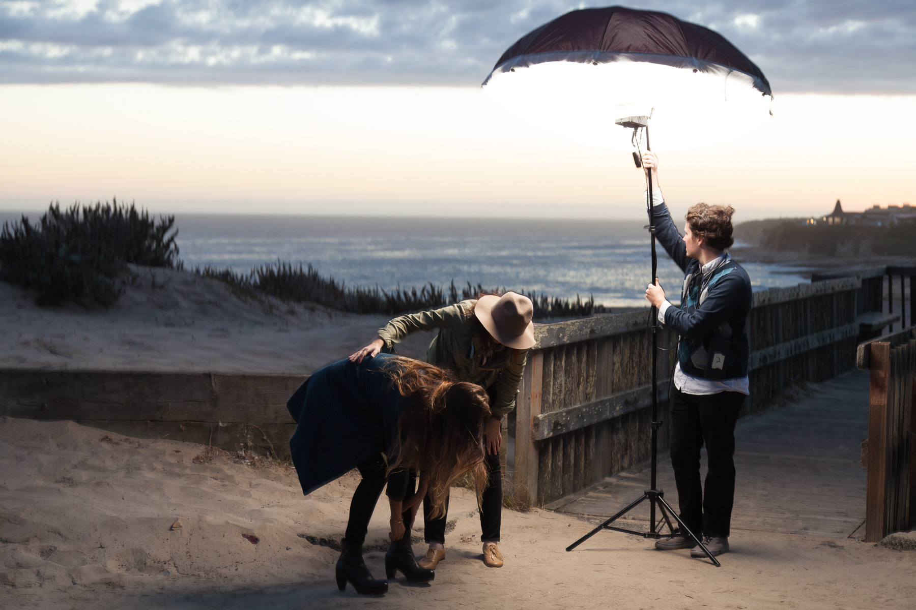
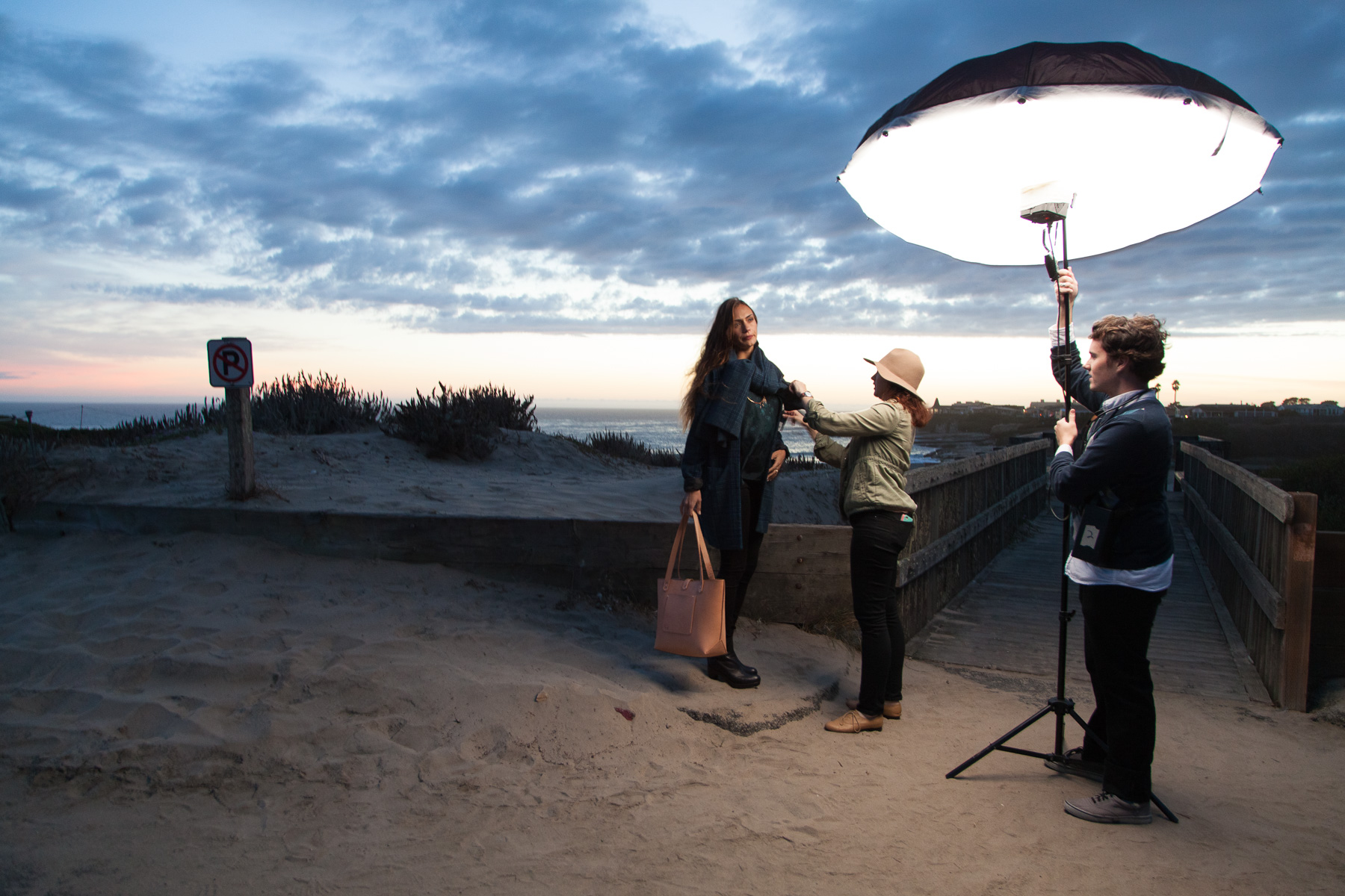
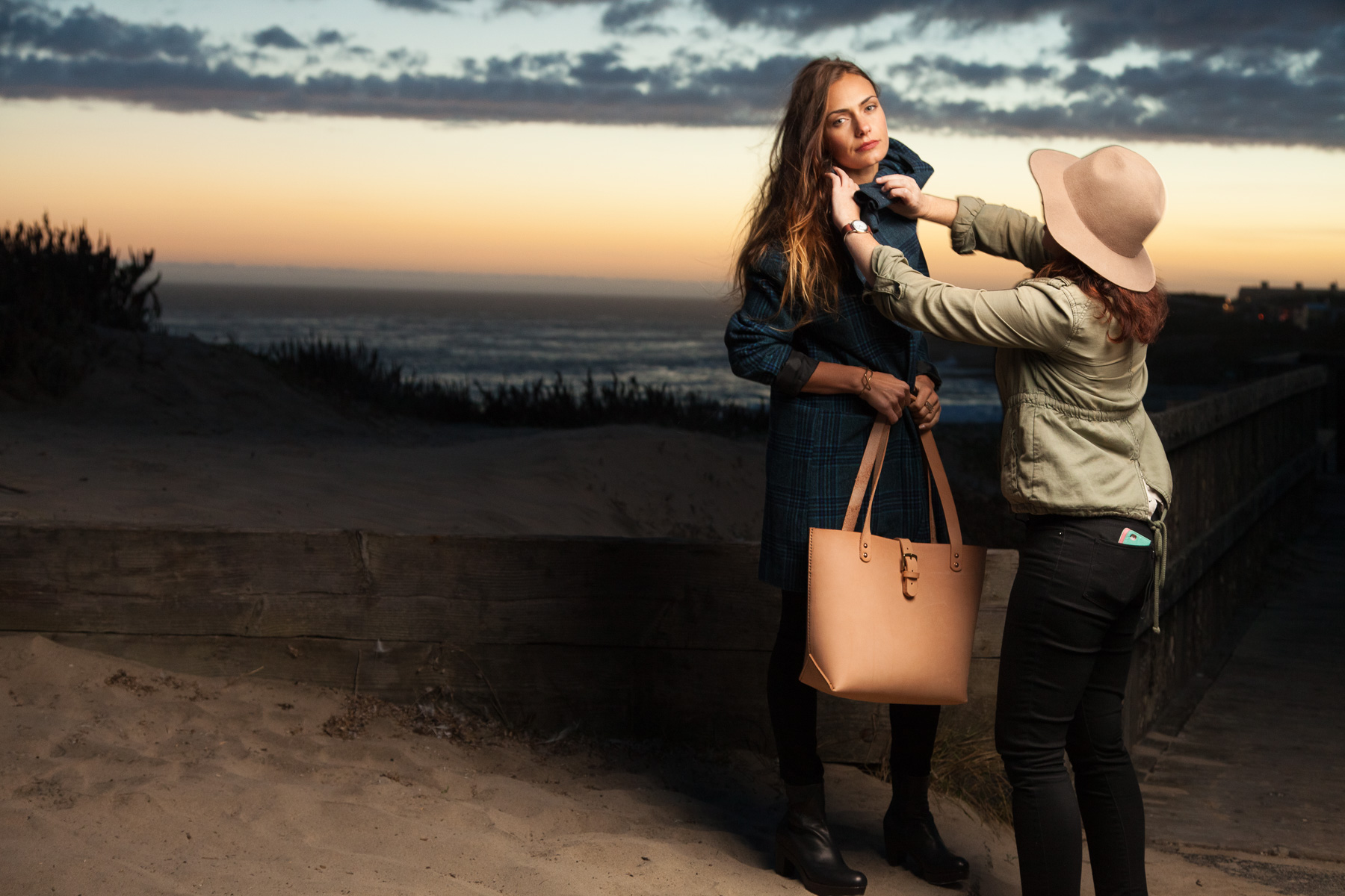
     The look of the photo above, with the mix of artificial and natural light, is a style that I use a lot and I think it has kind of become a trademark of some of my best work. Or at least, my most stylistically consistent. I usually approach something like this as two or three subjects (Background, Model, Clothing/Product) in one. The background itself is a landscape shot that needs to look good, needs to look interesting, without being too distracting from the subject. In a wide shot like this, a considerable amount of work goes into balancing all of the tones in the background to look rich and tonal without displaying too much uncontrolled/distracting contrast. Next of course, is the subject themself. I most always bring along my battery and light system and light them separately form the background. That is to say, the flash is what has the most influence on how they look as opposed to the natural light. It may not result in a completely natural look but I am generally fine with that as long as it ends up looking good in the end. A large, soft light from a high angle is used here as is usual for me. You can see the setup here:

     I always enjoy being able to show a few photos of what the scene looks like from a few steps back. People who aren't familiar with this kind of portrait photography aren't always aware of what the light setup looks like (and how large a light umbrella can be).

     We wanted to shoot in multiple little areas at the location to provide for some variety for the client so we moved on to the path that leads over and down to the beach. The sun was getting lower and provided for some great flare:

Although it may not show the clothing as well as some of the other photos, I'm a sucker for dramatic light and I like how it looks here. 

Although it may not show the clothing as well as some of the other photos, I'm a sucker for dramatic light and I like how it looks here. 

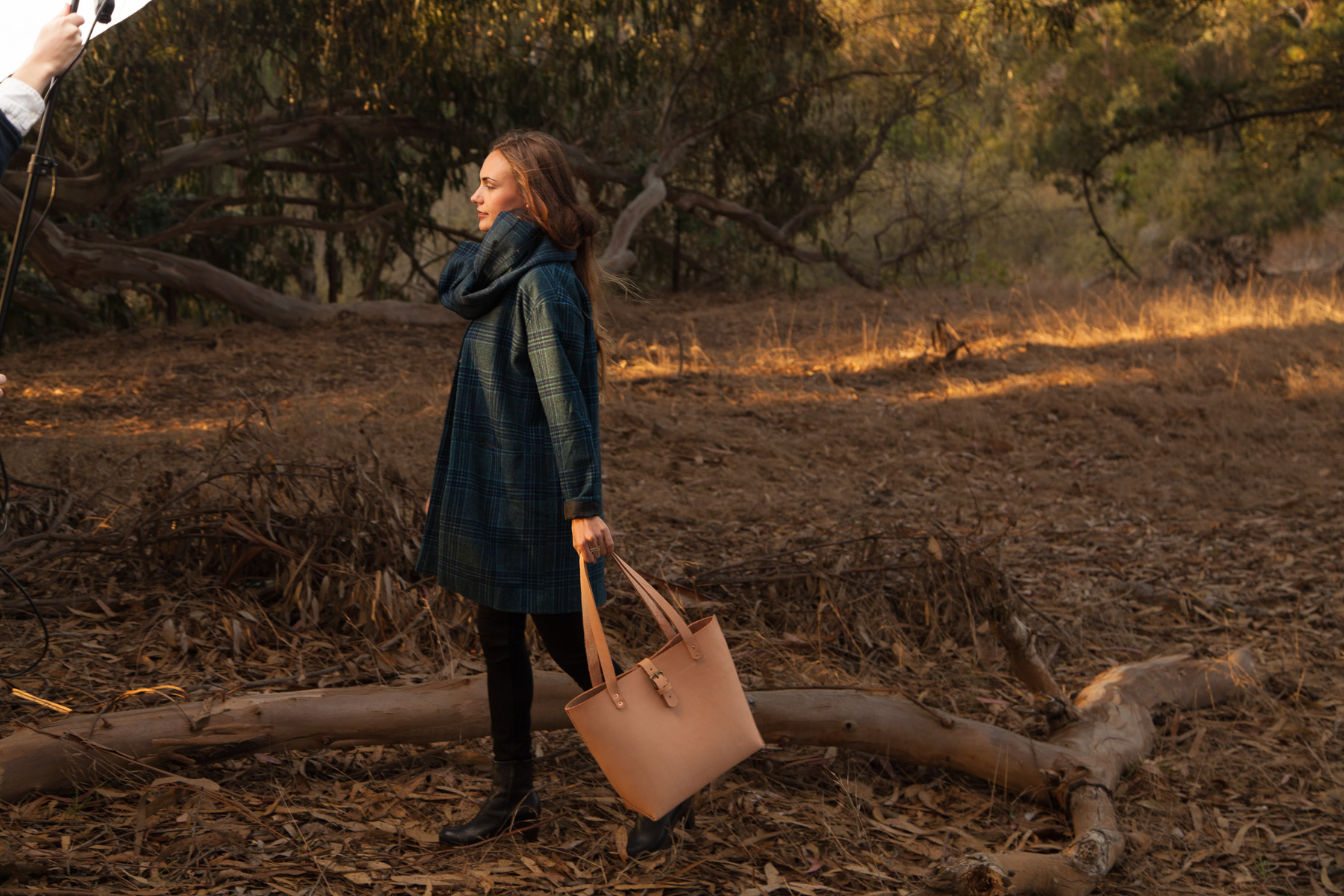
     While the light looks fairly natural and motivated by the angle of the setting sun, I of course, used my flash to illuminate her. Motivating the angle of your light in accordance with the direction of a natural or ambient light source in the background can be a great way to make your light look kind of effortless. That light on her may not be all natural but you look at the photo and want to believe it was. 

Augmenting the natural light with my flash. Here, Beau leans it nearly as close as it will go to her once she is standing and in position resulting in soft light with dramatic fall off.

Augmenting the natural light with my flash. Here, Beau leans it nearly as close as it will go to her once she is standing and in position resulting in soft light with dramatic fall off.

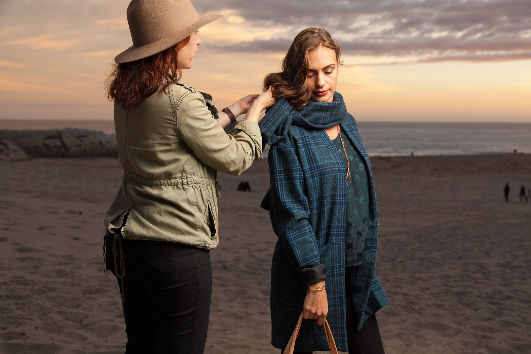
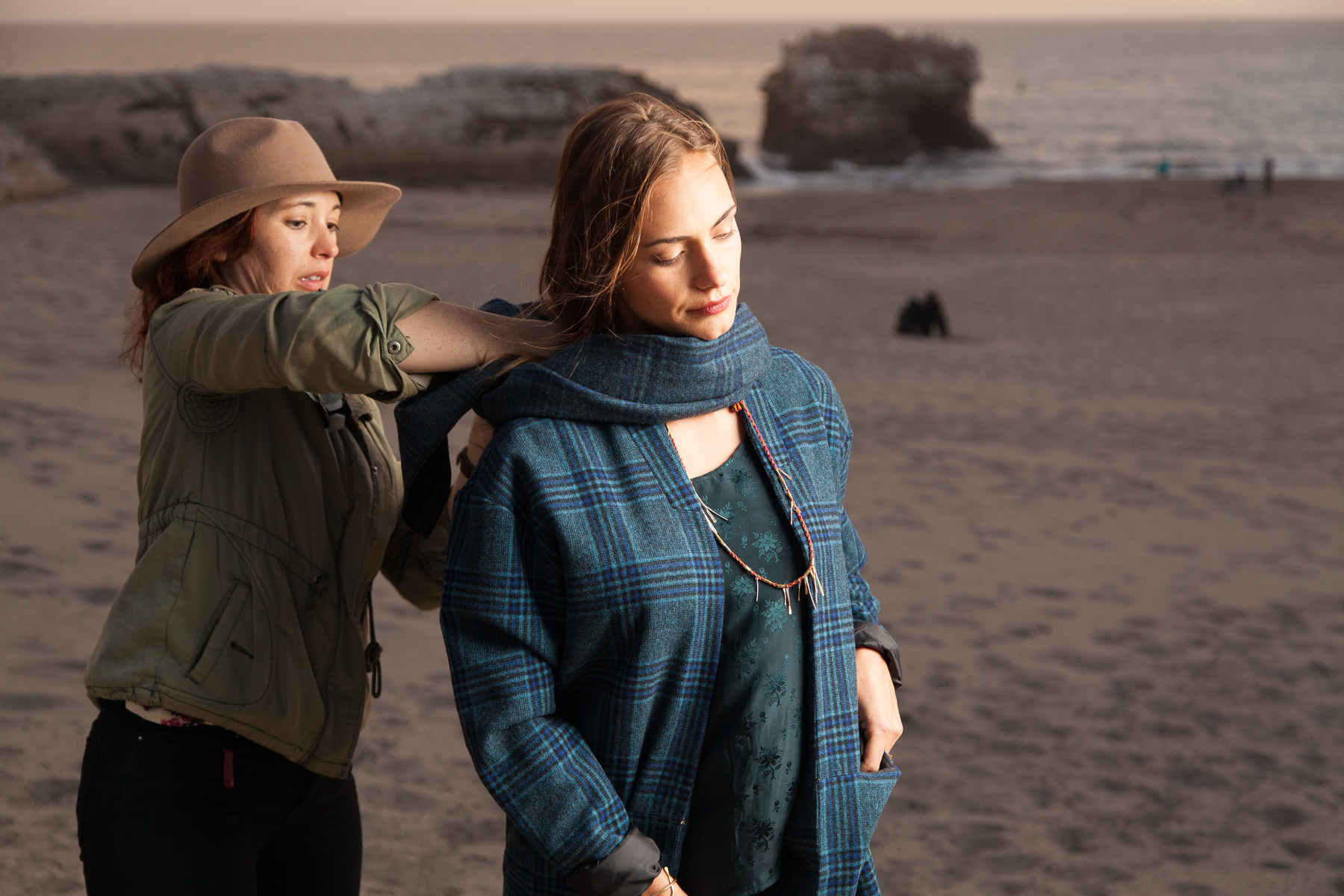
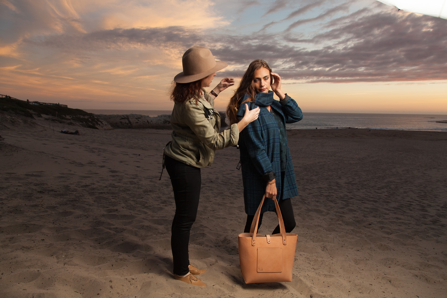
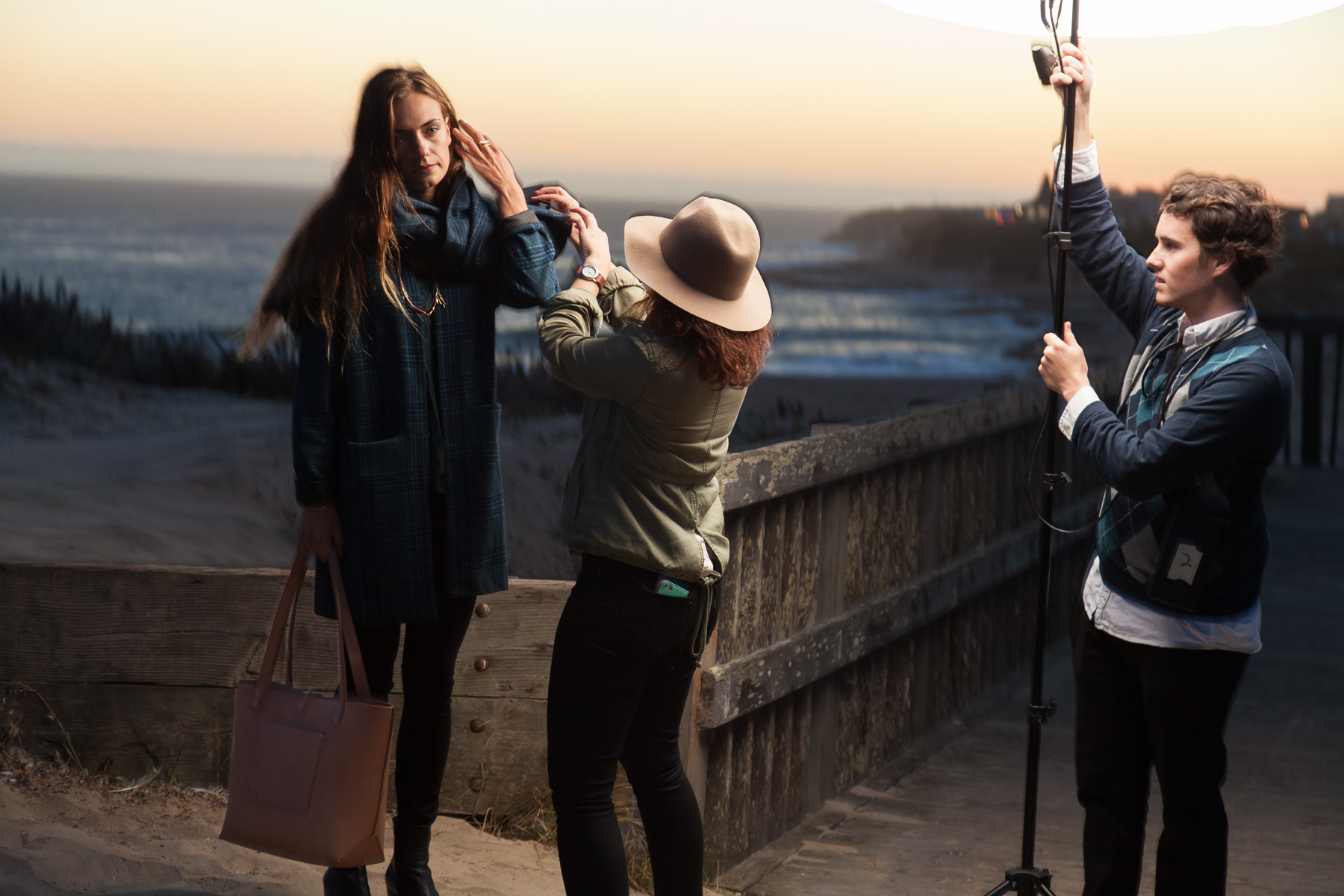
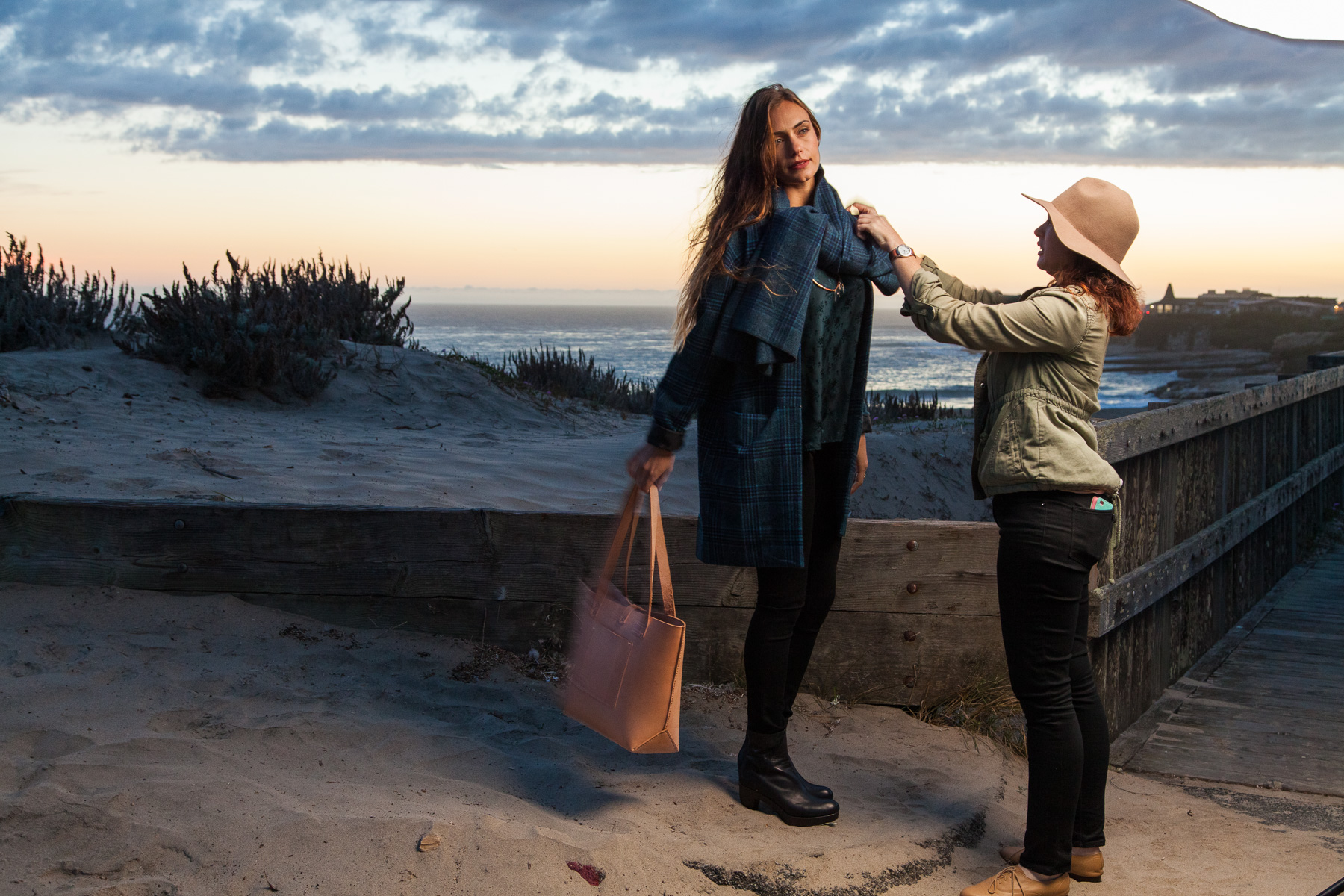
     We then moved down to the sand as the sun began to set in earnest. I generally provide some shots that are framed a bit closer than full length so we tackled those next. There wasn't an outfit change during this shoot so most of the styling fixes were for things like hair or just the position of the coat/scarf. 

Very happy with how the light worked out for this one. The sky was originally a clear grey-blue but after lighting her with that really soft light, the addition of a cloudy sky works better, I think. While it doesn't necessarily motivate the angle o…

Very happy with how the light worked out for this one. The sky was originally a clear grey-blue but after lighting her with that really soft light, the addition of a cloudy sky works better, I think. While it doesn't necessarily motivate the angle of the light on her, the cloudy sky motivates the soft quality of it which makes for less of a disconnect that there would be had I left a clear sky with the very soft light from my flash. Clear skies tend to imply hard light form an uncovered sun. 

See what I mean by unmotivated light? While I think this is a beautiful picture of her, the light looks a little too 'easy' for my taste. I don't want to sound snobbish but this reminds me of some of the work I've seen when people first start using …

See what I mean by unmotivated light? While I think this is a beautiful picture of her, the light looks a little too 'easy' for my taste. I don't want to sound snobbish but this reminds me of some of the work I've seen when people first start using off camera flash and photos become the land of a million suns. I would know, I've been there (and I often still am 'guilty' of lighting my subjects without much regard to compatibility between natural and ambient light). This look isn't bad, I just prefer the look of photos like the one above this where things tend to come together a bit more seamlessly. Pretty happy with how my camera handled the dynamic range of this one. Sun didn't blow out too badly and the shadows didn't block up in a problematic way so that was nice. 

     As the sun had mostly set, we walked back up above the sand and got a few more shots with more of the beach in the background. At this point the light was pretty low and I felt that we had mostly gotten the photos we needed but there wasn't any harm in trying for one more good shot. 

To be honest, I am not a big fan of this one. Partly due to a bit of sloppy retouching that I am noticing now and also because I just don't think it turned out as interesting as it should have. I don't hate it or anything and this one of the ones th…

To be honest, I am not a big fan of this one. Partly due to a bit of sloppy retouching that I am noticing now and also because I just don't think it turned out as interesting as it should have. I don't hate it or anything and this one of the ones they ended up printing so I'm glad they liked it but I think my relationship with the photo is different because I associate it with many failed frames (due to the frustrating lack of light and various other shoot time factors) and a file that was not of the quality that I like to provide. Not as sharp as the others with some weird highlights and shadows. 

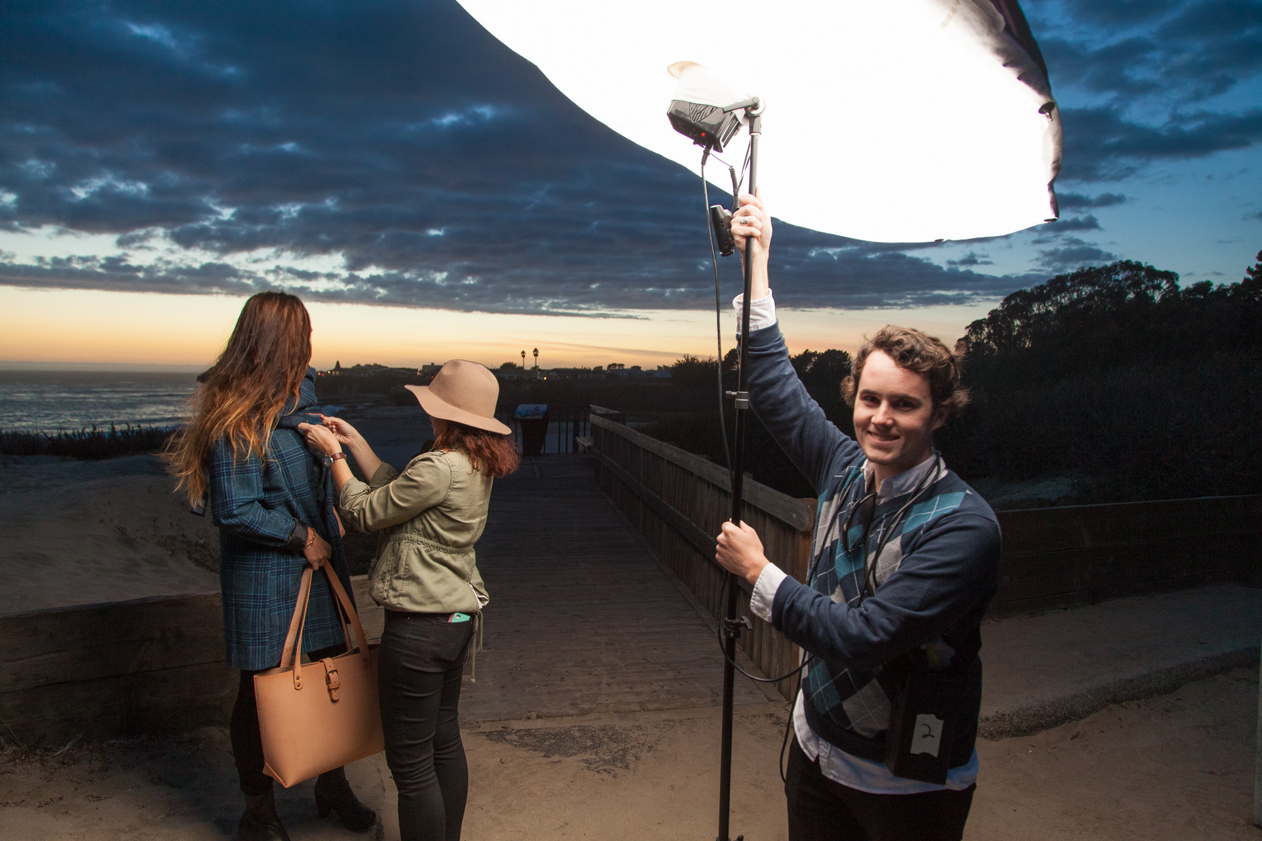
     Even though it might not be my favorite photo from the shoot, I still have some cool behind the scenes shots of when we were shooting it: 

     Overall it was a fun and laid back shoot with a team of people I am comfortable with and had worked with many times previously so that was great. I'm pretty happy with some of the images and happy that I remembered to zoom out and grab a few behind the scenes shots for everyone to see here. You can check out Christa's post on The Penny Rose for more information about the clothing in the photos and find the print edition of Santa Cruz Waves in many places here locally in Santa Cruz. 

     I've already shot another series of images for their Feb/March issue so I'll share those once they have been published later this month!