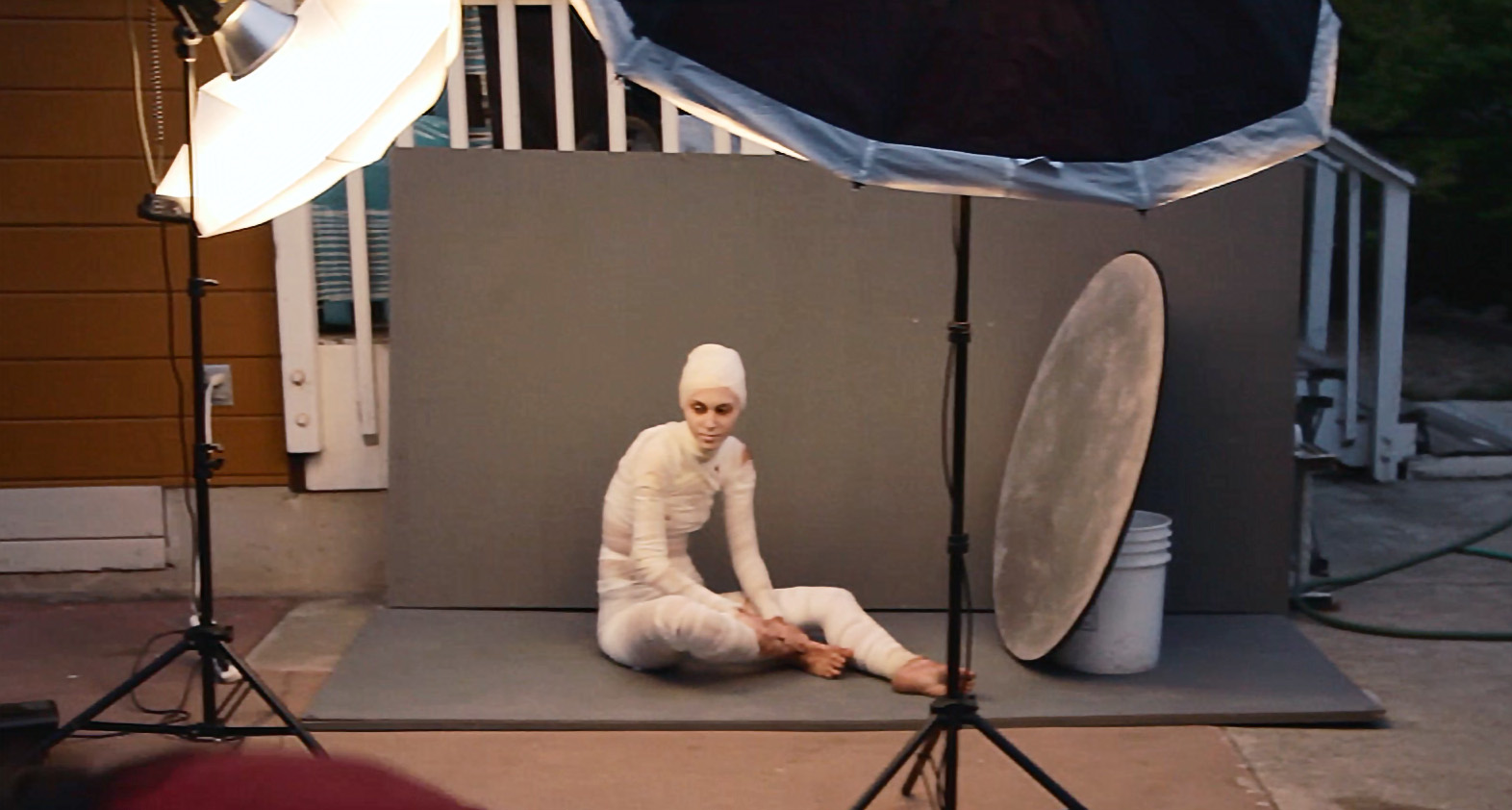
While this isn't super sharp as it is a screenshot from the behind the scenes video we made, it shows the setup of lights and background around Cierra.
As most people who have seen some of my photography can guess, I'm into some slightly darker/creepy imagery. Honestly I don't really see most of what I do as "dark" since it is executed in a very lit and often saturated way but when it comes down to subject matter, I suppose a person completely bandaged with festering wounds isn't exactly a happy, smiling portrait.
October is a pretty inspiring month with the weather finally mellowing out into cooler autumn and of course Halloween at the end of the month. I hadn't been taking a whole lot of personal photos/doing the fine art portrait thing recently and I hadn't really realized how much I missed it until finally doing a few new shoots. The model, Cierra, is a friend of mine who I've known for a while and used photograph a lot but for various reasons hadn't worked with in a couple years. Knowing her look and her ability to move in interesting ways in front of the camera, I thought she would be perfect to wrap up completely and turn into a kind of dead looking sickly person.
Shortly before the shoot I got a new Canon 100mm F2.8L IS lens that I intend to use for some product photography that I sometimes do but given the length and fantastic quality of the lens in general, I was looking forward to trying it out for some portraits.
The Canon 100mm F2.8L IS Macro mounted on my 6D. While built of plastic, it feels modern and very well made. It is relatively large compared some shorter and squatter primes like my 50mm F1.4 or 85mm F1.8 but it still balances pretty well and feels great to shoot. The stabilizer seems to work very well. Even if you are shooting with strobes or high shutter speeds, it can be nice to have a stabilizer viewfinder to help with composition. Focus speed is very fast when you have the focus range limiter switch set to the correct setting for your subject. If you aren't shooting at macro distances, its best to keep it focussing from .5m-infinity so it doesn't spend any time hunting for focus at close range.
In terms of image quality, I'm pretty impressed with it so far. As of this writing (Nov 8 2015) I've only used it for this one shoot but it was super sharp and performed basically as expected. I do a significant amount of research on camera gear/tech and all that I had read about this lens were great things so I can definitely say it seems to live up to its reputation. In fact, I think I saw a bit of aliasing in some of the files. Sure, I may have exacerbated it with a bit of over sharpening but still, this lens provides some really sharp results. Always better to have something too sharp than not sharp enough. I bet the crispiness/possible aliasing was a result of me being used to having to do much more sharpening on the files I get from my 24-105mm than the files from this lens and sharpening too much. Regardless, I'm happy with it and look forward to using it for some more shoots in the future.
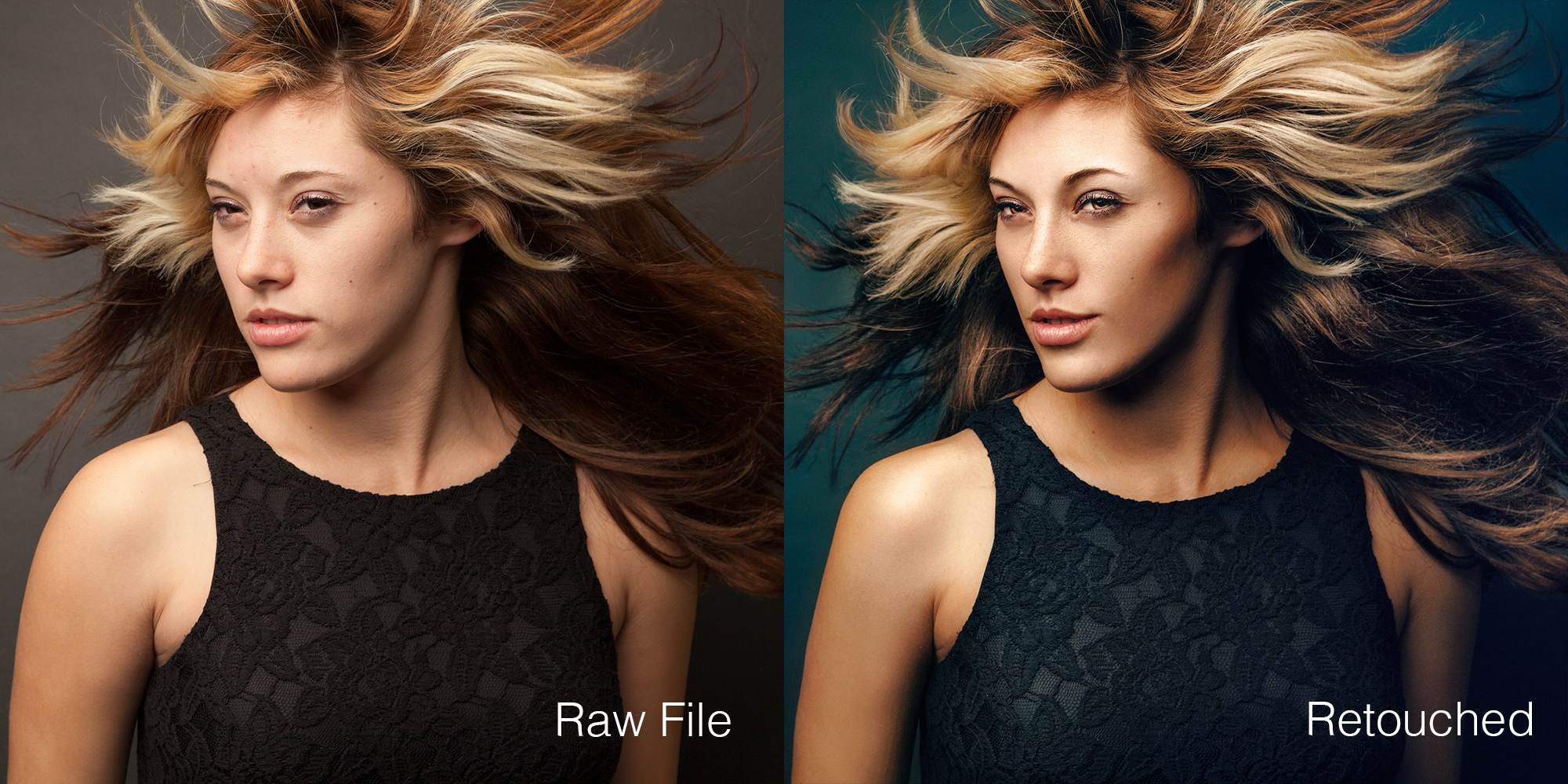
New lens thoughts aside, this shoot was really fun. I'm always looking for cheap but visually impactful ideas and this kind of sick, decaying look was just what I was looking for. The gauze was acquired easily after a quick search on Amazon and the rest was mostly just staining it with a mixture of coffee and tea and then wrapping it around her. She did some makeup too of course but it wasn't anything too extreme. A lot of the grossness of the look comes from the overlaying and painting of textures in Photoshop. You can see the extent that retouching played here:
There weren't any massive changes. Just a bunch of little things. It was fun being able to spend time retouching the skin to look more textured and gross as opposed to the usual cleaning and fixing that goes on with that.
I was lucky to have a friend with me during the shoot who could take a bit of behind the scenes video too so I edited that together and you can see some of the shoot here:
Overall I was pretty happy with this shoot. It was one of those things where I had a rough idea of how I wanted everything to look but hadn't really visualized it in detail and figured it would all come together during the shoot. Luckily, it did. I'm most happy with the the way the light looks and how the background worked out. There isn't anything particularly striking about the light, I suppose, but I think its well balanced and I love achieving that kind of soft, luminous quality with a few diffused sources. The background was made of a couple thing wall stands that I had used in years previous to show my work against when I was doing a little local art show. I weathered and stained them a bit and they looked perfect for this shoot. Clean enough to kind of look like a studio background but rough enough to hint at a kind of darker, creepy location.
Its funny, I had written half of this blog post in November of 2015 (up to the retouching before/after photo) and then never finished it until now, July 2016. I guess I just assumed that I had finished it and it sat there as a draft for all this time. Looking at this again makes me realize how much I need to do more creative stuff. The weddings I've posted about shooting this year have been fun learning experiences but my heart still lies with the more darkly beautiful things. Hopefully I can keep that going.
All of that said, here are the final images from this shoot:


