Some months ago I shot some more photos for Santa Cruz Waves Magazine. They have a couple-page fashion section that features clothing sourced from local stores and designers. I do these shoots in collaboration with a great team of people including beauty by Salon on the Square and production by Christa Martin of thepennyrose.com. I was also thankful to have my friend Beau assisting. Another set of hands always alleviates some of the scrambling to make sure nothing gets left behind and the equipment stays in the right place.
Because of the lead times of shooting for the printed magazine, we shot these in October for the December/January issue. We weren't sure where to shoot this time because we originally wanted something kind of different from the previous SCW shoot we did at the cliffs/beach but we ended up shoot at Natural Bridges since after scouting, it seemed like it would be interesting enough. To me, these images ended up coming across more as "fall" than the winter season they were for but they still look good so I don't think it was an issue. When Christa and I scouted it out, it was a dark overcast day which gave the beach and the surrounding area a nice sense of damp wintriness that would have been perfect but alas, the sun came out on the day of the shoot. Thankfully though, the sun ended up being pretty low by the time we started shooting so I didn't have to fight with it too much to get the light to work.
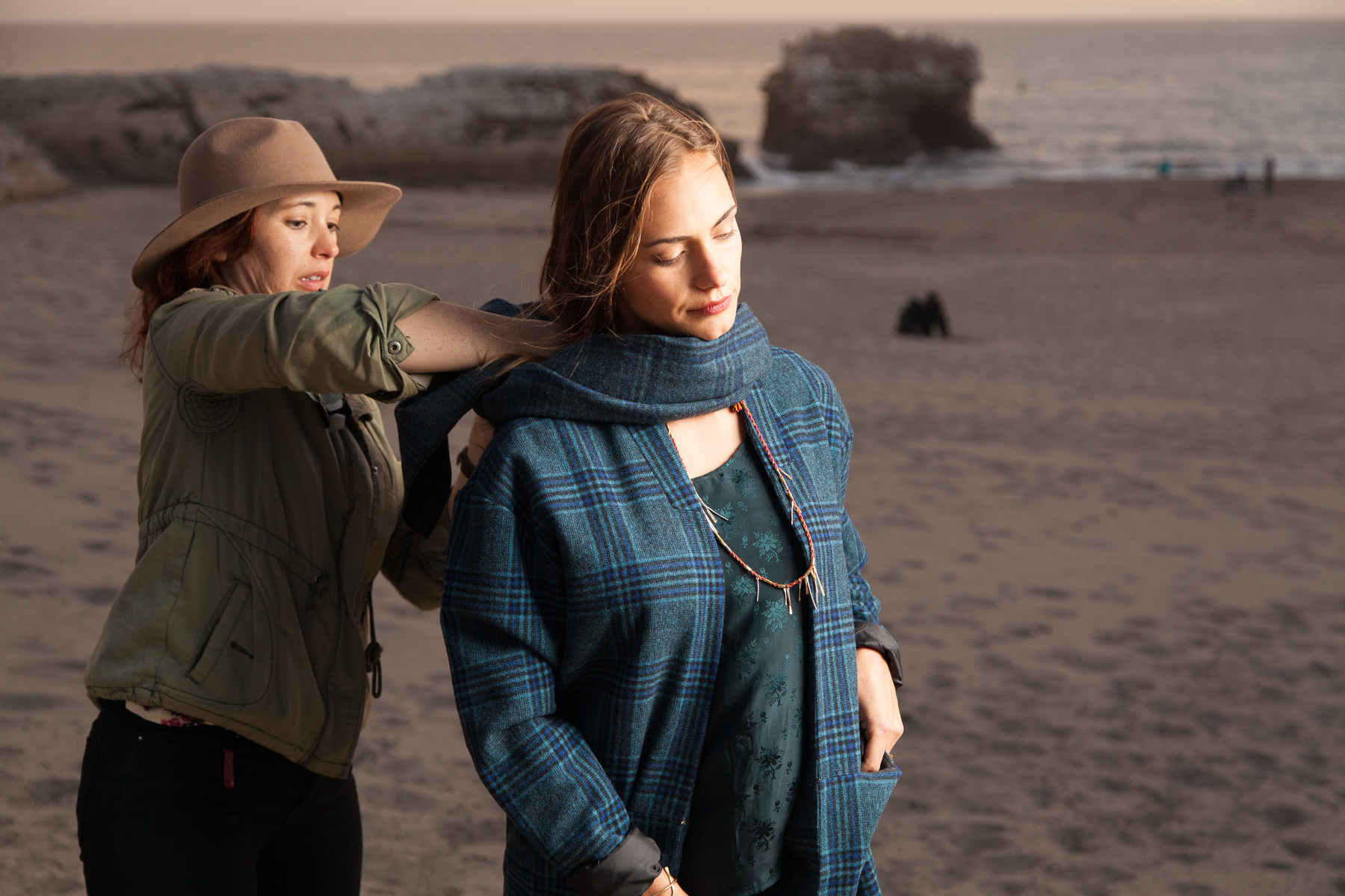
The first little location that we shot at above the beach. Took some retouching to balance out all of the tones but I am happy with this one.
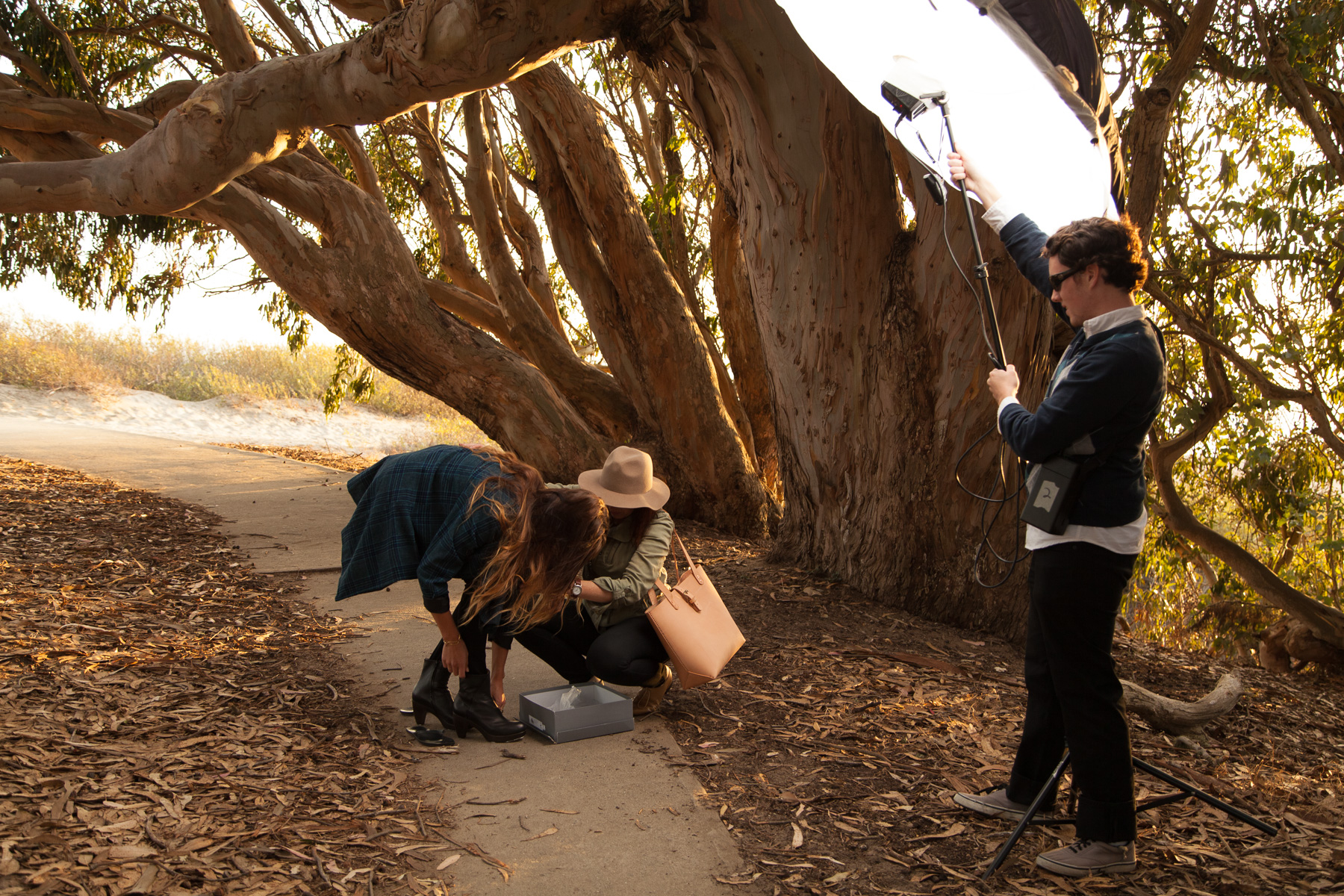
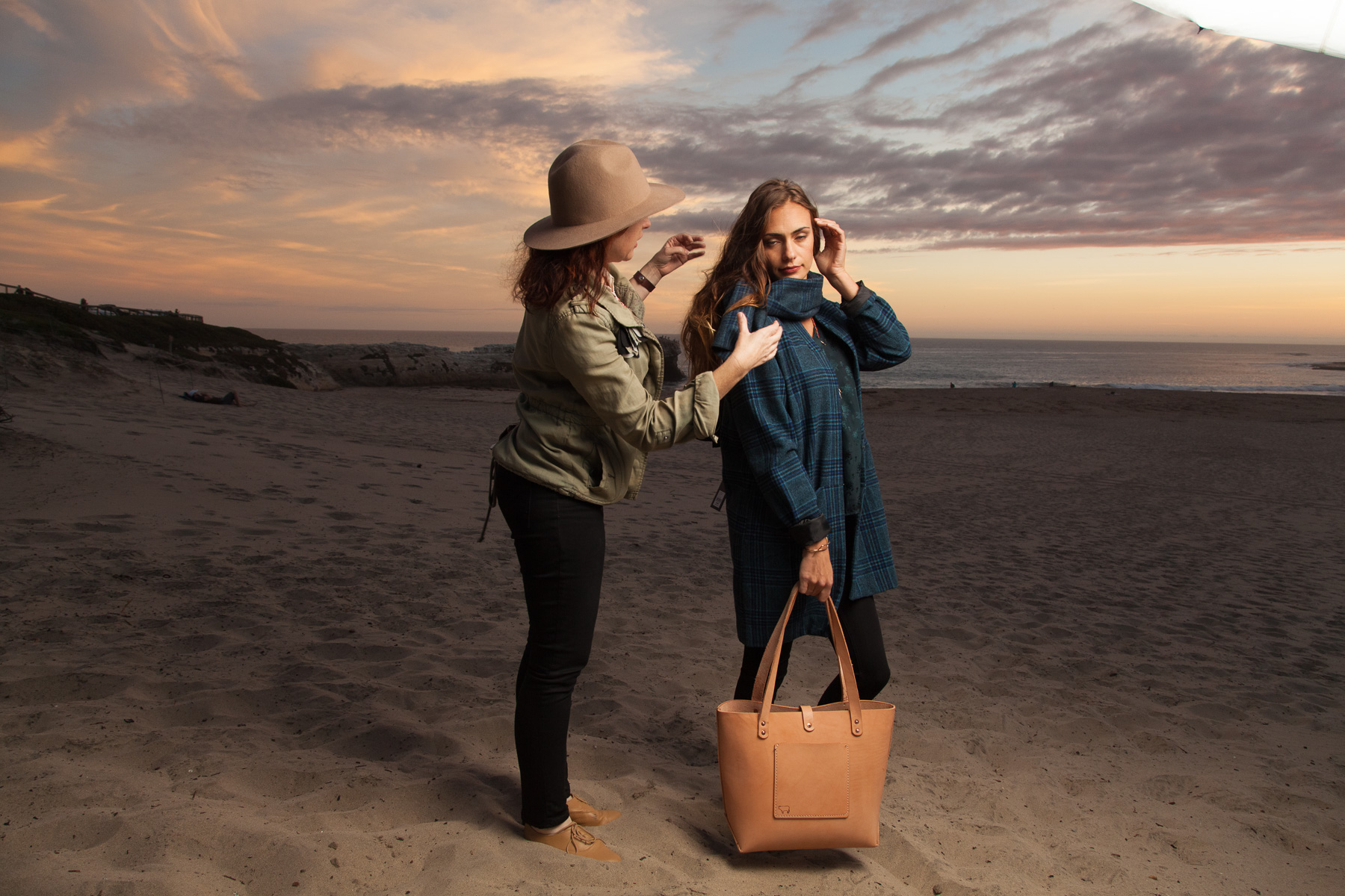
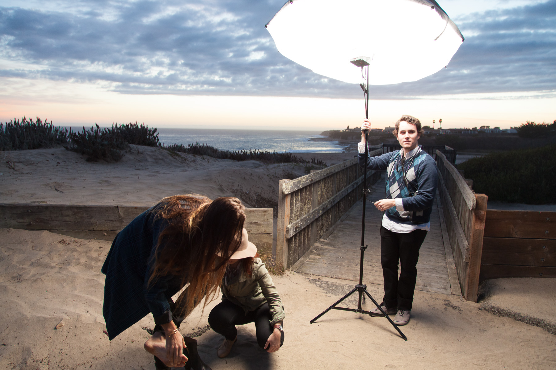
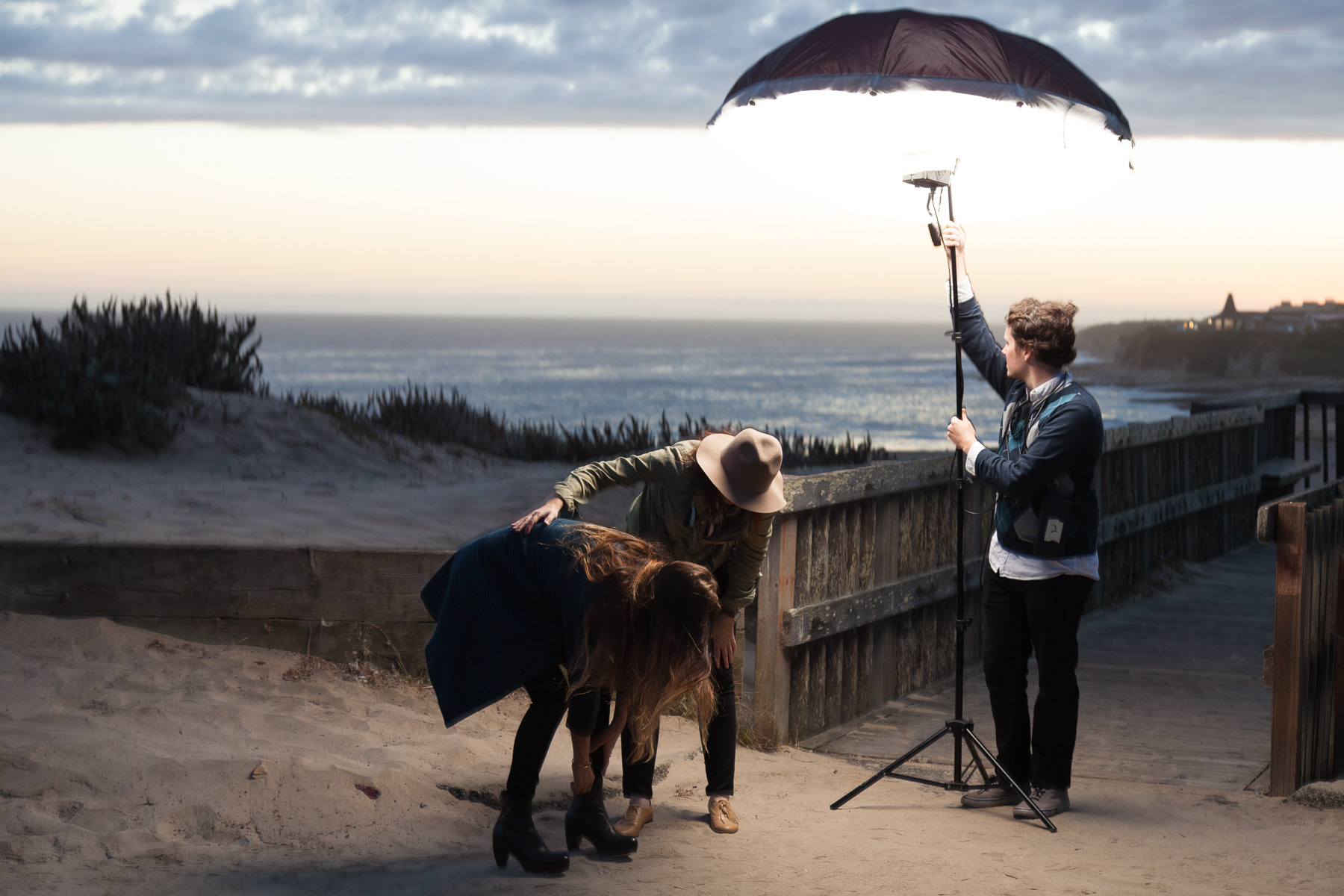
The look of the photo above, with the mix of artificial and natural light, is a style that I use a lot and I think it has kind of become a trademark of some of my best work. Or at least, my most stylistically consistent. I usually approach something like this as two or three subjects (Background, Model, Clothing/Product) in one. The background itself is a landscape shot that needs to look good, needs to look interesting, without being too distracting from the subject. In a wide shot like this, a considerable amount of work goes into balancing all of the tones in the background to look rich and tonal without displaying too much uncontrolled/distracting contrast. Next of course, is the subject themself. I most always bring along my battery and light system and light them separately form the background. That is to say, the flash is what has the most influence on how they look as opposed to the natural light. It may not result in a completely natural look but I am generally fine with that as long as it ends up looking good in the end. A large, soft light from a high angle is used here as is usual for me. You can see the setup here:
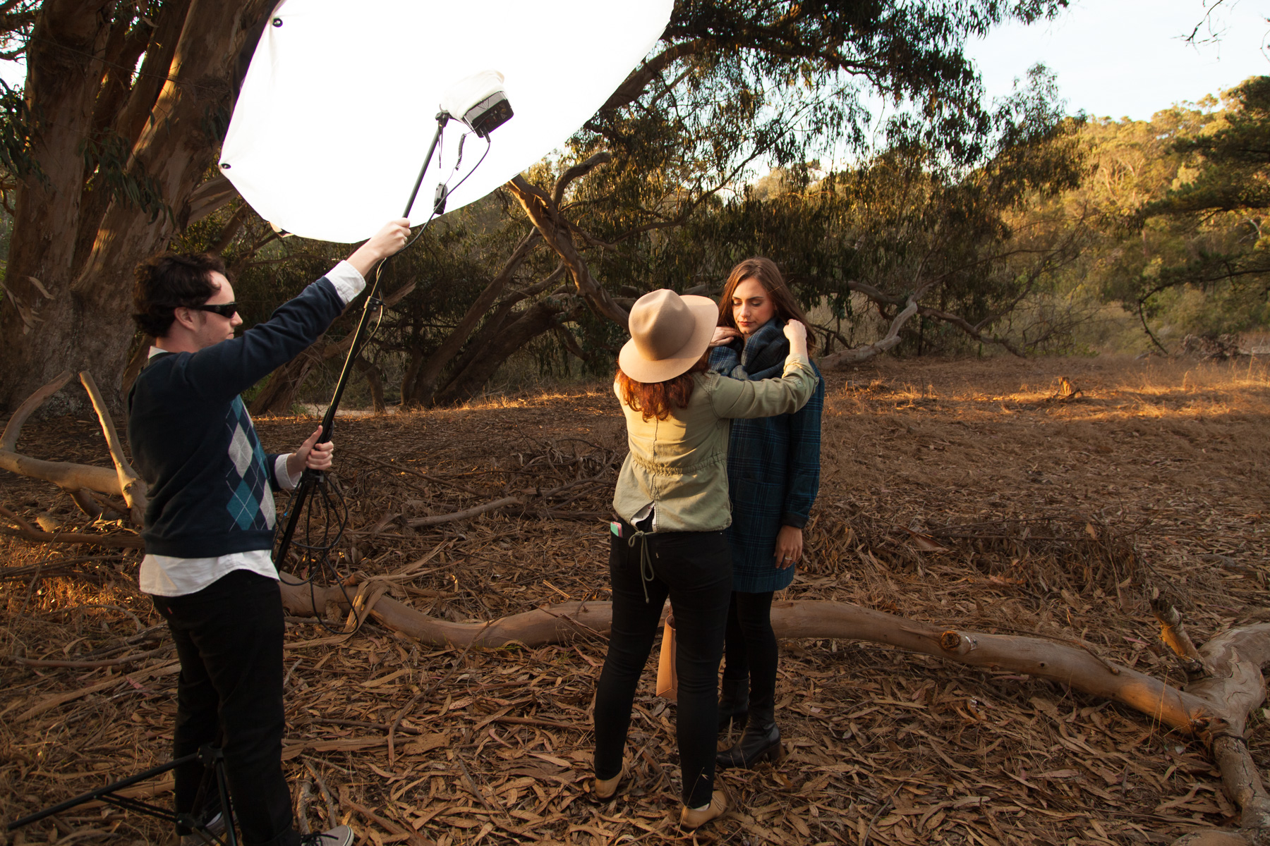
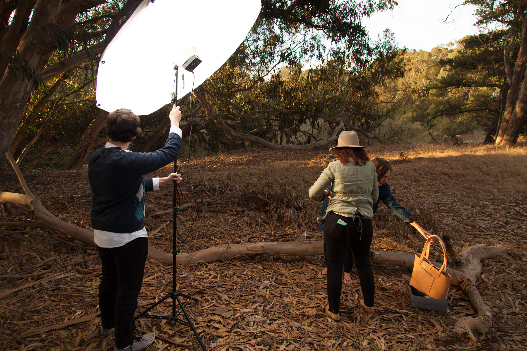
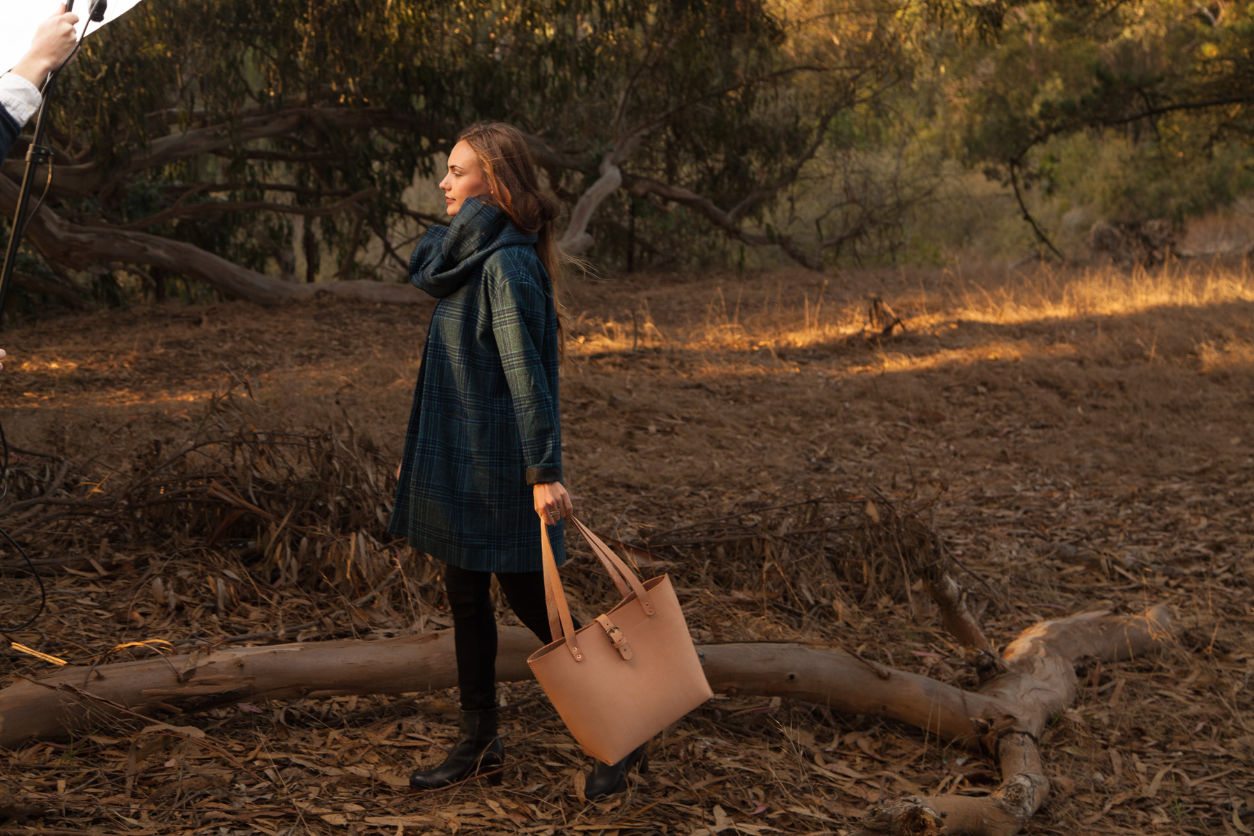
I always enjoy being able to show a few photos of what the scene looks like from a few steps back. People who aren't familiar with this kind of portrait photography aren't always aware of what the light setup looks like (and how large a light umbrella can be).
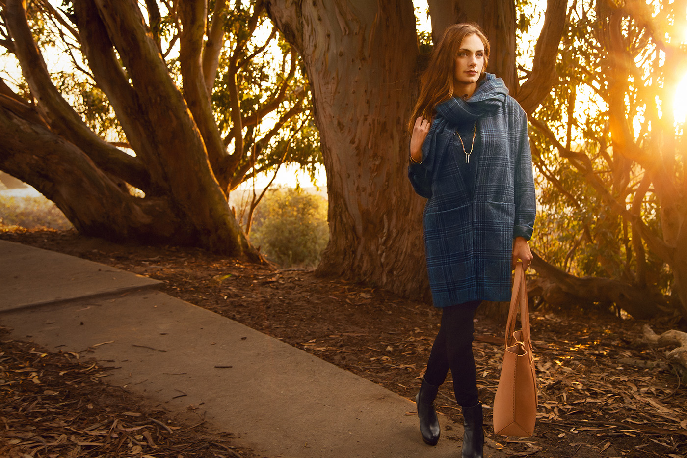
We wanted to shoot in multiple little areas at the location to provide for some variety for the client so we moved on to the path that leads over and down to the beach. The sun was getting lower and provided for some great flare:
Although it may not show the clothing as well as some of the other photos, I'm a sucker for dramatic light and I like how it looks here.
While the light looks fairly natural and motivated by the angle of the setting sun, I of course, used my flash to illuminate her. Motivating the angle of your light in accordance with the direction of a natural or ambient light source in the background can be a great way to make your light look kind of effortless. That light on her may not be all natural but you look at the photo and want to believe it was.
Augmenting the natural light with my flash. Here, Beau leans it nearly as close as it will go to her once she is standing and in position resulting in soft light with dramatic fall off.
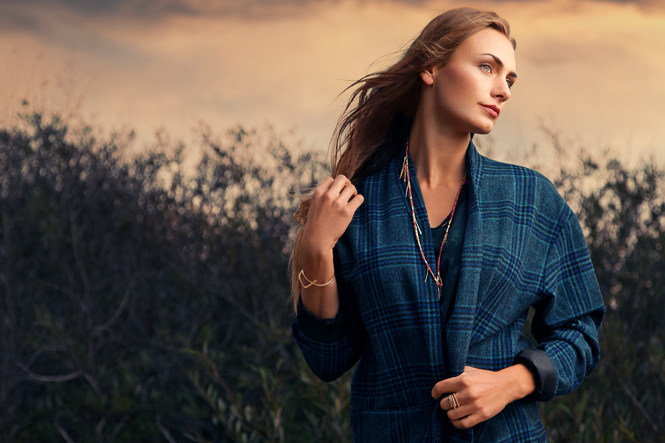
We then moved down to the sand as the sun began to set in earnest. I generally provide some shots that are framed a bit closer than full length so we tackled those next. There wasn't an outfit change during this shoot so most of the styling fixes were for things like hair or just the position of the coat/scarf.
Very happy with how the light worked out for this one. The sky was originally a clear grey-blue but after lighting her with that really soft light, the addition of a cloudy sky works better, I think. While it doesn't necessarily motivate the angle of the light on her, the cloudy sky motivates the soft quality of it which makes for less of a disconnect that there would be had I left a clear sky with the very soft light from my flash. Clear skies tend to imply hard light form an uncovered sun.
See what I mean by unmotivated light? While I think this is a beautiful picture of her, the light looks a little too 'easy' for my taste. I don't want to sound snobbish but this reminds me of some of the work I've seen when people first start using off camera flash and photos become the land of a million suns. I would know, I've been there (and I often still am 'guilty' of lighting my subjects without much regard to compatibility between natural and ambient light). This look isn't bad, I just prefer the look of photos like the one above this where things tend to come together a bit more seamlessly. Pretty happy with how my camera handled the dynamic range of this one. Sun didn't blow out too badly and the shadows didn't block up in a problematic way so that was nice.
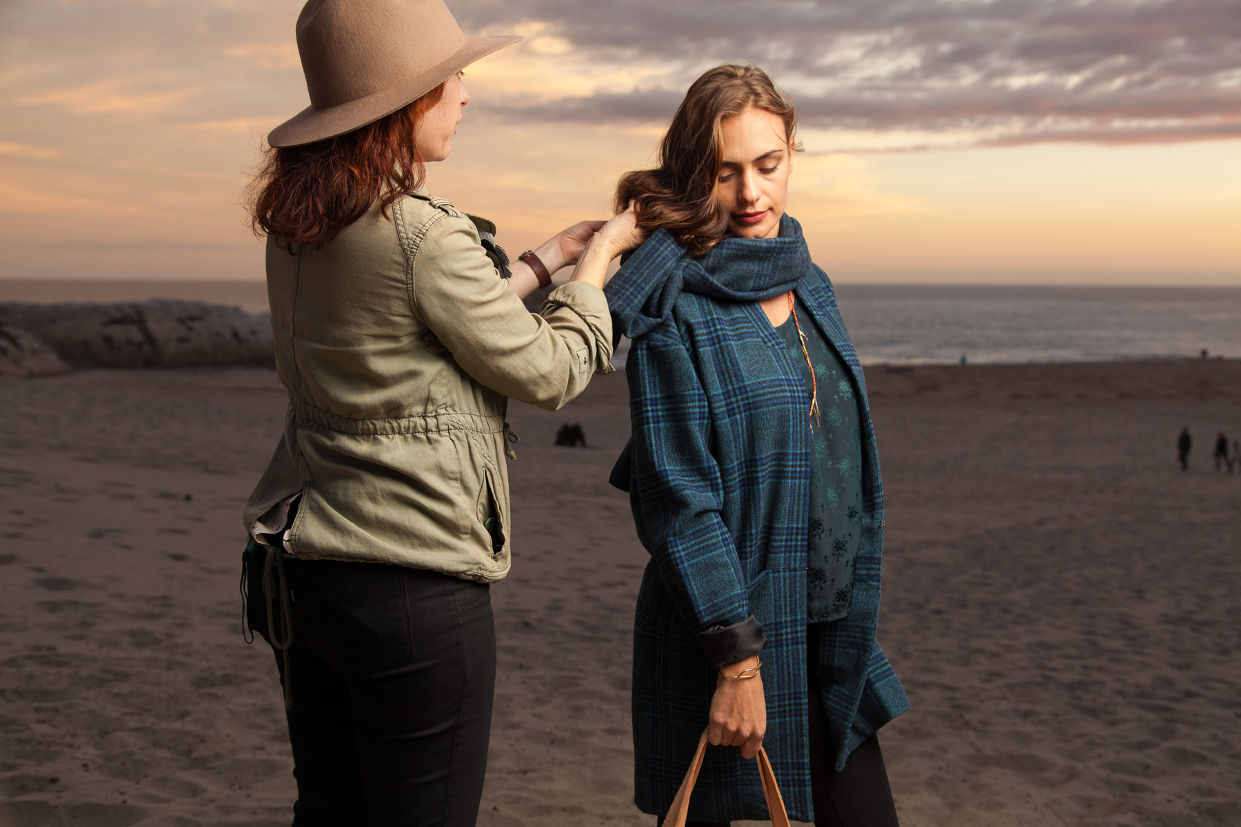
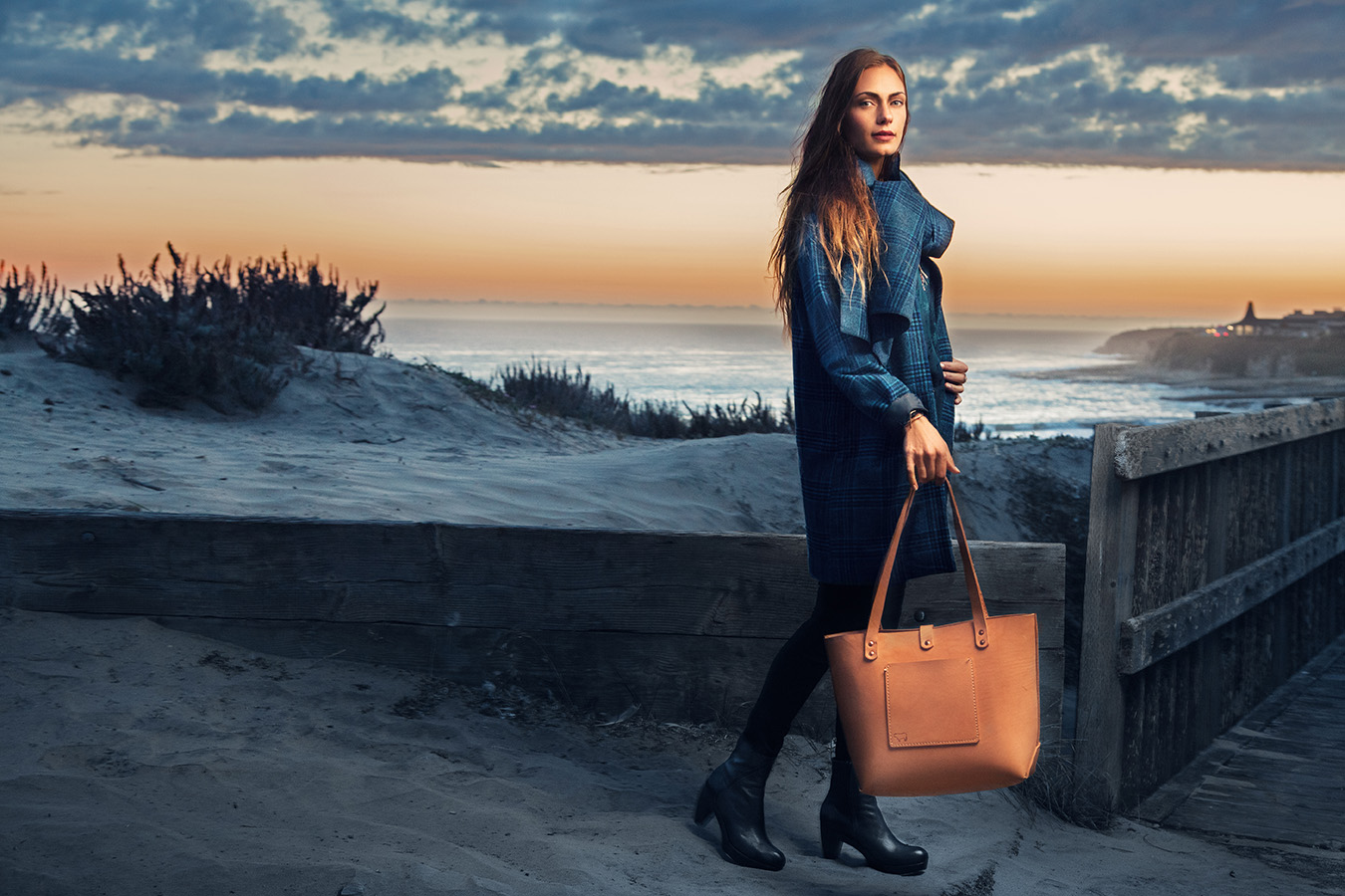
As the sun had mostly set, we walked back up above the sand and got a few more shots with more of the beach in the background. At this point the light was pretty low and I felt that we had mostly gotten the photos we needed but there wasn't any harm in trying for one more good shot.
To be honest, I am not a big fan of this one. Partly due to a bit of sloppy retouching that I am noticing now and also because I just don't think it turned out as interesting as it should have. I don't hate it or anything and this one of the ones they ended up printing so I'm glad they liked it but I think my relationship with the photo is different because I associate it with many failed frames (due to the frustrating lack of light and various other shoot time factors) and a file that was not of the quality that I like to provide. Not as sharp as the others with some weird highlights and shadows.
Even though it might not be my favorite photo from the shoot, I still have some cool behind the scenes shots of when we were shooting it:
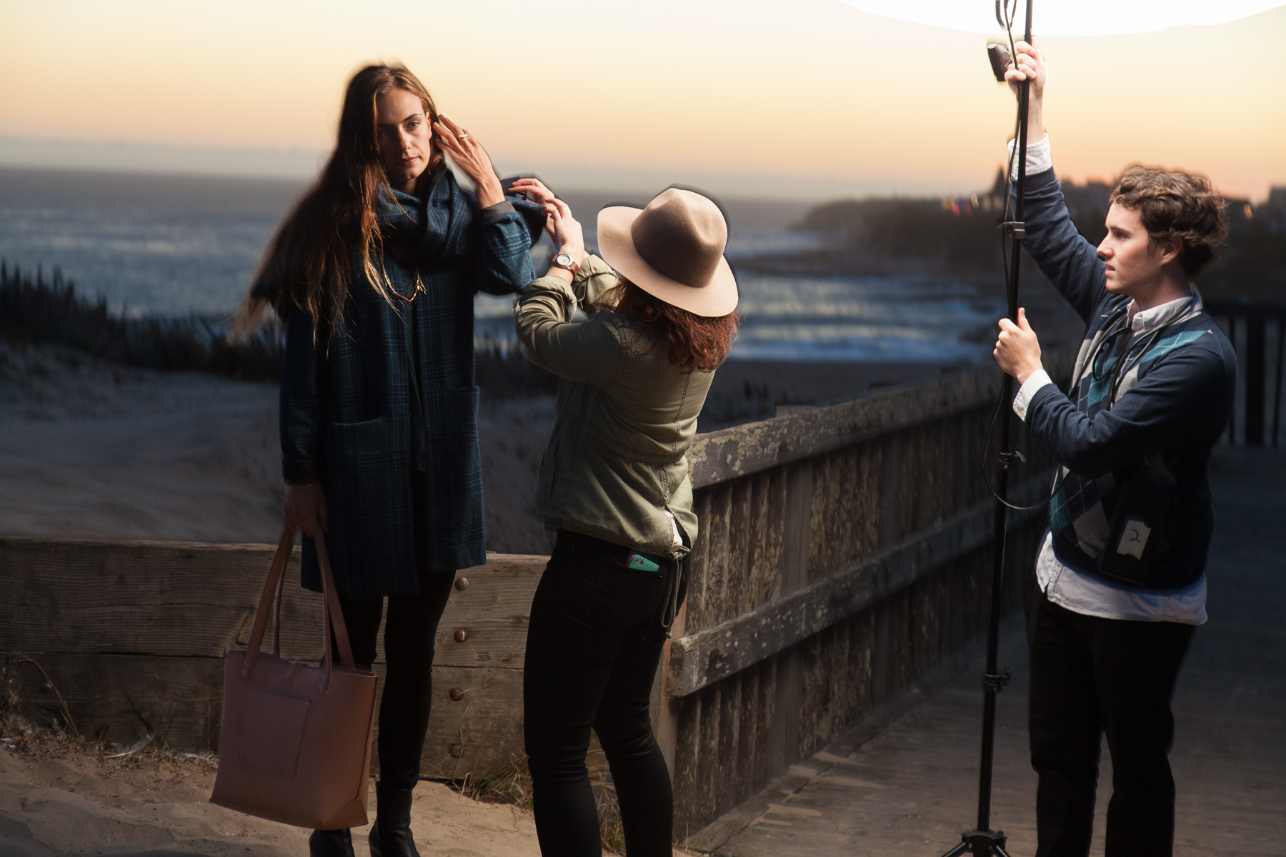
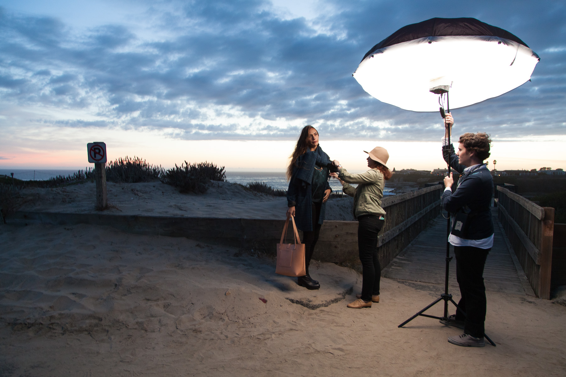
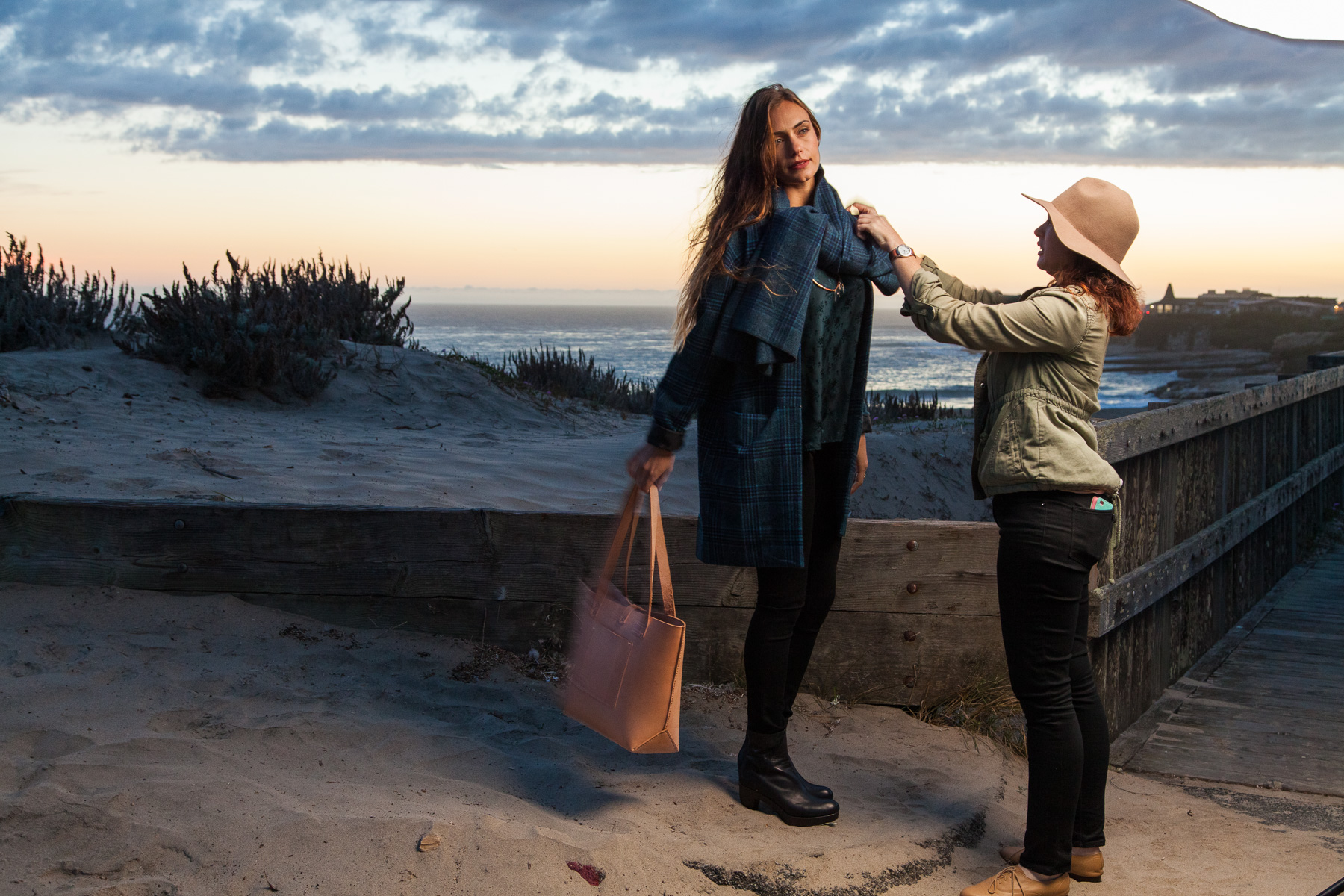
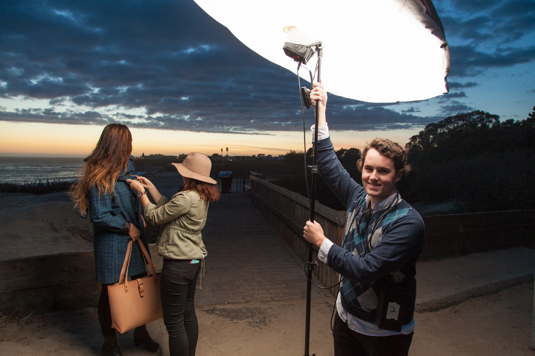
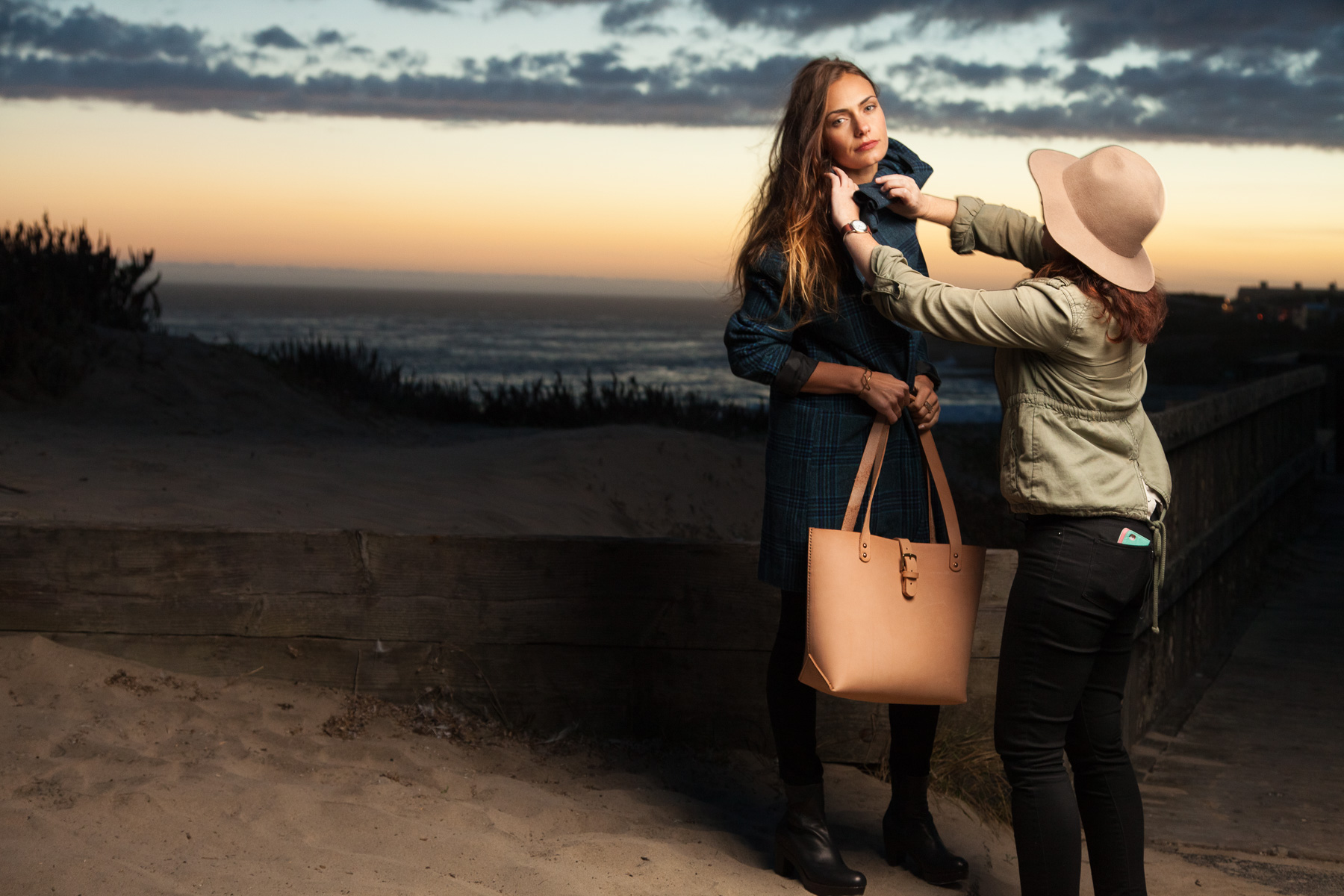
Overall it was a fun and laid back shoot with a team of people I am comfortable with and had worked with many times previously so that was great. I'm pretty happy with some of the images and happy that I remembered to zoom out and grab a few behind the scenes shots for everyone to see here. You can check out Christa's post on The Penny Rose for more information about the clothing in the photos and find the print edition of Santa Cruz Waves in many places here locally in Santa Cruz.
I've already shot another series of images for their Feb/March issue so I'll share those once they have been published later this month!


